Poster fonts. We believe that professional designers will willingly agree with the statement that poor typography makes the design look amateur. That’s why they are especially picky when it comes to choosing the right fonts. It’s rather difficult to explain why typography is so crucial for a website, but we’ll take a stab.
"The business of clothing the word with visible form has fascinated the mankind since the earliest days of his history."
Emil Ruder
- It’s safe to say that typography is a part of an art. You put as much work into it as you do into font selection, layout, colors, photography and other aspects. Using the default fonts or font styles which don't match your layout will make your art piece look unfinished and cheap. Using fonts that have seen their heyday such as Monotype Corsiva and Impact and Comic Sans MS also won’t make your website trendy. Need a handwritten font? Please look for something else ... Comic Sans MS has been beaten to death and there are millions of other free choices out there. If you really care about your art, don’t restrict yourself to the fonts provided with your system.
- Always remember that typography reflects your viewpoint, attitude, personality and atmosphere. No matter what style you prefer: vintage, modern, handwriting or other, it tells something about whatever work it is and tells something about you. Making a poster and using Arial or Times New Roman means this aspect doesn't come through at all.
- Typography is a part of brand identity. Any reputed organization should have certain typefaces that can be associated with it. They are as much a part of the organization's identity as the logo and official colors you choose.
- Polished typography is an index of professionalism. Not putting thought into typography comes off as unprofessional. What do you feel when you see the signs posted in Times New Roman or Arial or two signs posted in the same building with differing font styles? Maybe the cringe? Such things make us believe that people who made the signs simply did not care or were disorganized.
- Aside from that, typography affects readability. Make an experiment: try reading an infinite document written in Arial and Microsoft Word, and try reading a 100-page document typeset in LaTeX. If you manage to get yourself through the former, the result will be the hurting eyes and reading with a snail speed. Likewise, posters as well as websites should have fonts that are catchy, yet readable.
Frank Chimero, for instance, compares a typeface to a party. What’s your party? Is it a wedding reception, a BBQ with friends, a graduation or birthday party? You wouldn't request your guests to come to a BBQ in tuxedos, and you wouldn't set the presidential seal in Comic Sans, would you?
Look at choosing the fonts this way: even if visual communication is not your direct responsibility, you communicate visually every day in your letters, memos, websites, and so on. So, having some basic knowledge of typography is helpful, just like having a decent handwriting before we started to write on computers only.
But don’t worry; of course there are levels of interest in typefaces that go further than what you need to do as a designer. You don't need to become a sommelier to choose a decent bottle of wine from time to time, or know every detail about Apache to choose hosting and set up your own website. You can use the same approach to the typography. Thus, some still choose to go all the way because they like the subject that much. As you may have noticed, when you learn how to differentiate between lots of different things of a certain type, you begin to notice it everywhere. In other words, after knowing just a little more about fonts, you begin to appreciate the differences between them, and notice it everywhere. People get riled up about typography because they can differentiate and identify fonts and instantly see how cliche it is, how it could be made better, or really appreciate how it fits into what the text actually says.
Once you get into the typography world, there is no escape because typography is everywhere and your vision has already permanently changed. Still, there is nothing bad in this turnabout. Now we will give you two main reasons why.
- Knowledge of typography helps the designer more effectively create and convey a message.
- Having knowledge of letterforms is part of designer's toolbox. It’s harder to make effective communication without it.
The fact is that typography is a science. It is governed by some basic principles that will never change. Poor typography affects readability in a very direct way which most people will notice. Yes, everything is that simple and logical.
To top it off, please note the expressive ability of a font to communicate inarticulate feeling. This can drastically improve your text. For example, a plain font like Helvetica is good for communicating a declarative thought. An ornate font with serifs and curlicues will communicate feelings of complexity, romance, art and nuanced relationships.
We are not kidding. An expert designer will never underestimate the importance of typography and never get enough of new, beautiful fonts. Today you will have one more possibility to fill your font library with free posters-style fonts. But make no mistake, you can use them not only for poster designs, but also to emphasize your titles, headings, slogans, banner messages and so on.
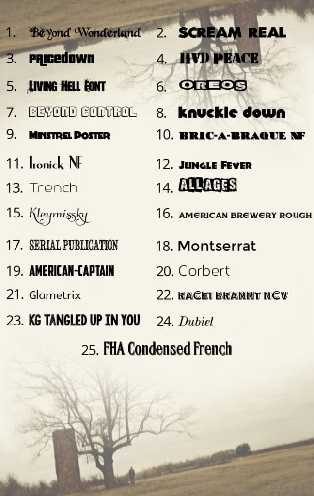
If you are one of our honorable constant readers, you probably know the procedure. Just look through the fonts presented on the poster below, remember the numbers of the ones you like and click the relevant links placed under the image. They will lead you to the download page.
* * *
1, 2, 3, 4, 5, 6, 7, 8, 9, 10, 11, 12, 13, 14, 15, 16, 17, 18, 19, 20, 21, 22, 23, 24, 25.
If you are still not enough of new free super-duper fonts, here is a pleasant bonus for you: click here and browse the resource. Did you know about it before? The content will perfectly fit custom-made fonts connoisseurs.
* * *
How did you like our collection of free fonts for posters design? Have you chosen anything? We hope you had. Do you share our opinion about typography? Maybe you have your own standpoint on the matter? If you have your own quick tips, secrets and advice that you are ready to lay open to the community, they are welcome in the feedback section.

Experienced writer passionate about highlighting all the topics related to web, design, marketing, SEO, and more. Follow Helga on Quora.
Get more to your email
Subscribe to our newsletter and access exclusive content and offers available only to MonsterPost subscribers.

Leave a Reply
You must be logged in to post a comment.