65 Web Design Trends of 2020 – Complete Edition
Just like the spectators at the theatre are waiting for their favorite actors to play their parts in the performance, web designers and developers meet every New Year looking forward to the new trends that will appear on the stage very soon.
It's been 1 month left before the much-anticipated celebration of the New year 2020. We have just celebrated the New Year, so it’s time to talk about latest website design trends that are likely to spread in the course of 2020. Only lazy bloggers don’t talk about trends now and we are not from their cohort.
There is only one problem with the trends and we will try to solve it for you. There is always too much information on them on the net. We have read nearly 70 articles, which took us nearly 3 days to go into the heart of the matter.
However, you will be able to get the whole collection of 2020 trends in web design without any tedious research. We guess our version of this useful reading will take you not more than half an hour or maybe even less. Moreover, you can skip the trends you are not interested in at the moment and look through the information that is crucial for the time being. We made up a kind of article plan for the purpose. Each item is an anchor leading you to the relevant information. We want to be a one-stop-shop for you, hopefully this will work out.
When people meet the New Year, they always recollect the best moments of the previous year and the best things that had happened to them. We observed a lot of great trends in 2019. Some of the trends listed below reached or have almost reached the top of their popularity, so we are waiting for their further development and improvement in 2020. In other words, please don’t be surprised to meet your good old 2019 buddies on the list.
We tried to summarize, systemize and put into order all the available material for you, hopefully this will help and you will start to feel perfectly comfortable speaking about web design trends of 2020.
Why Is It Important to Follow Web Design Trends?
What's the purpose of your website? Aside from having good photos, your web page needs to have a certain background that can attract the web audience and convey emotions. Need an example? Just think what attract you on Instagram? That's a stunning presentation and well-thought-out organization of branded profiles that encourage you to stay on a web page for longer. The succes and growing number of sales through the network confirm this trend.
What's the trick? A customer thinks that he pays for a product, but in fact he focuses on the image that stands behind it. While perceiving a catching presentation of a product or a service in a specific surrounding, a customer imagines how cool this product will on him.
The same techniques are applied to web design. An attractive and memorable web page can capture a user's eye, encouraging the audience to discover more about your brand or order your services.
1. WHAT WILL NOT CHANGE
1.1 Mobile-first
Now it’s official: there are more people browsing websites from mobile devices than desktop computers. In 2019, we’ve seen the rise of micro-interactions, roll-out menus, and custom icons. This trend will not change, but only gain momentum. In 2020, you will no longer need a website that is just responsive; you will need one that is mobile-first.
1.2 Load time
This is a little bit controversial. In 2019, many experts believed that clean minimalistic websites would take over the internet because of their fast loading speed. But that didn’t happen.
Instead, we see how new technologies are adapting video and photo content to the needs of the mobile-first era. In 2020, designers and developers will continue seeking a compromise between creative Java designs, full-width original content, and decreased load time.
1.3 Chatbots
E-commerce websites will still need to convert in 2020, and chatbots have proven to be an effective way to do it. In 2020, the online buying experience will continue striving toward greater personalization and more sophisticated AI technologies. So, in 2020, we will see smarter and more interactive chatbots on top e-commerce websites.
2. WHAT TO EXPECT IN 2020
Now let’s move on to the main web design trends we’re expecting to see in 2020.
2.1 FLAT AND NOT-SO-FLAT
Flat design, as a website esthetics, has been with us since 2017 and is here to stay. Web owners love flat design for better mobile experience and higher SEO rank. Designers and users enjoy smooth layouts, bright beautiful imagery, and lots of whitespace.
Flat web design philosophy postulates that a site with fewer images can be as impressive as its image-heavy and slow loading analog from the 2000s.
Looking at the below examples, who wouldn’t agree?
SNOWWHITE.IO
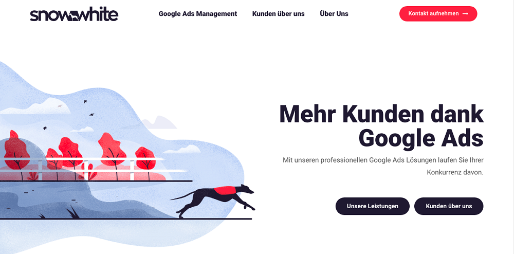
Here is an example of a beautifully made flat design website. There are few illustrations, but all of them are very captivating. When you travel through the website, you see that every new page features a different illustration. Traditionally for flat design, there’s ample whitespace and easy navigation.
DESIGN IN SILICON VALLEY
This website demonstrates what flat design can deliver if you add heavy animation and interactivity to it. The pages feature lots of texture and beautiful transitions. Viewers may even get a little overwhelmed by what’s happening on the website. It seems, however, that this is exactly what the designers were after.
The semi-flat approach allows adding depth and motion to your minimalistic designs and having all the benefits of flat with you. In 2020, we will see even more variations of this.
LO PESCE
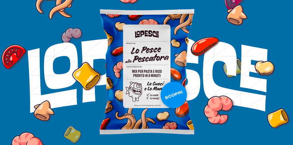
WEBSITE
This design features awesome product photo compositions with custom illustrations, Parallax, and nice interactive elements. I also enjoyed the animation that makes the page feel heavy and deep under your scroll. Here we can also see how far semi-flat web design will reach in 2020.
2.2 FLOATING ELEMENTS
In 2020, website designs will defy gravity. This trend is not completely new: we all remember that chaotic layouts were already trending in 2019. Next year, we will see many interactive elements popping up here and there, changing shapes and waiting for a cursor to hover over them.
Open compositions will also be the mainstream of web design in 2020. So, prepare to see designers ditching borders and leaving interactive 3D elements to float on the pages.
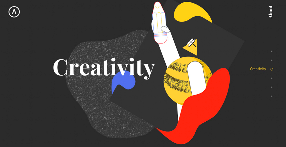
GRETA MADLINE
Here we see how one interactive 3D object can set the tone for the entire website and add a playful edge to it. When you move to other pages of the website, you will see many more creative design elements. It features cute animation, scroll effects, handmade illustrations, and bold color combinations.
1948
This website invites you to use your keyboard to produce sound effects and see the 3D objects dance in the air. The design is both minimalistic and very engaging. It combines different types of communication with visitors, so you just can’t stop until you’ve seen everything. In 2020, websites that offer such unique experiences will be rocking the web.
2.3 GEOMETRY
Just like colors, shapes can be used to make accents and communicate ideas. Geometry acts as a compromise between harmonious minimalism and broken asymmetric experience. Both will be popular in 2020.
Shapes can add balance to the craziest web designs. Geometry is present in different elements: buttons, frames or illustrations. Every shape brings about specific associations and has its own meaning. When used wisely, shapes can become key elements of a website design.
Let’s look at some amazing examples.
TEDxBETHESDA
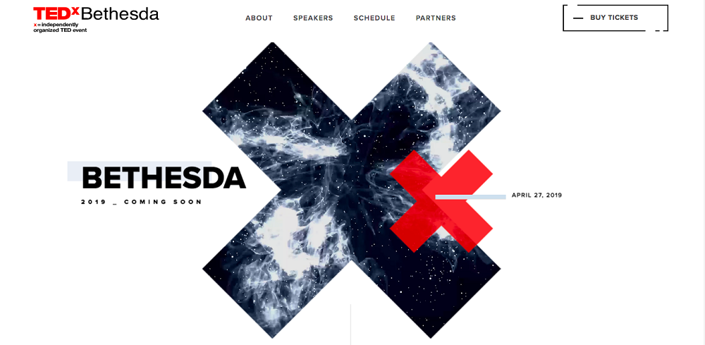
Full of texture and color, these shapes on the center glue the viewers’ eyes to the page. Here geometry is used to make accents and allude to the big red cross at the TEDx stage. It is combined with asymmetric grids and nice particle backgrounds.
CWORKS
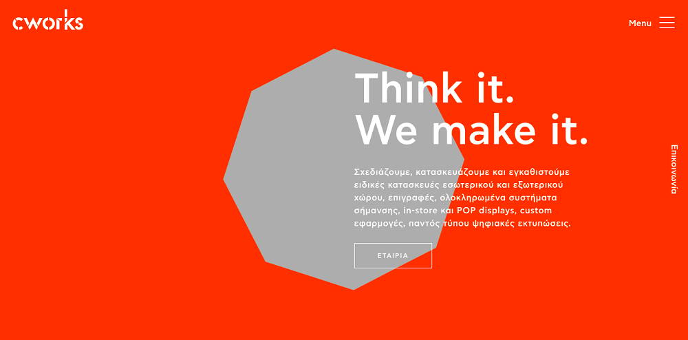
In this example, interactive shapes are used to create backgrounds and image frames. Combined with bright colors and scattered typography, these elements demonstrate the key trends of 2019-2020. Note how beautifully lines are used to highlight the menu tabs.
SMULTRON
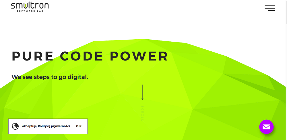
Here we see a beautiful animated shape that responds to the cursor movement. As a key element, this interactive shape sets the tone for the whole website. I also love the geometry-inspired icons and the crispness of this design.
2.4 VIDEO BACKGROUNDS
Video backgrounds are somewhat less popular now than they were in 2016 because of the increased importance of the load speed. However, in 2020, we will be seeing the evolution of video integration in web design. This is because video backgrounds are proven to increase website conversions. Viewers will stick around to watch the video if it has captured their attention. You can also tell an entire brand story with one video without using any words at all.
Let’s look at how these websites do that.
LIVING MEMORIES
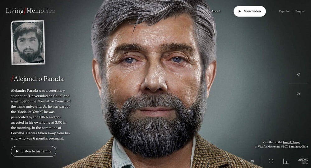
WEBSITE
This website integrates a video intro, background music, and widescreen photos. The portraits are breathtaking and high-res. Clickable old school photos used as menu tab icons complement the design. With all that said, it is the video that brings together all the design elements and tells a unique story.
DESCENTE FUSIONKNIT
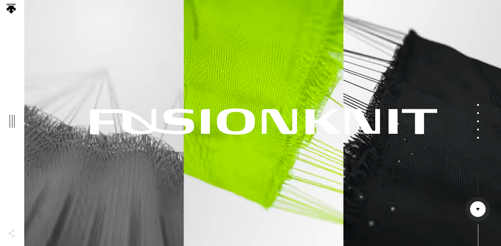
WEBSITE
The video on the homepage of this website sets the tone and induces an emotional reaction from the audience. You simply can’t stop watching these fabrics being knitted and pieces being sewn together. This is how you do visual product storytelling. The website also features irregular grids and complex layered layouts.
2.5 BROKEN GRIDS
The love for asymmetry has begun in 2019 and will stay with us in 2020. The grids we were all used to help add content to a website in an aligned and consistent way. The layouts made with grids look symmetrical and structured. There’s a way in which such predictability makes it easier to consume information.
However, the new trend of using asymmetric grids and creating a “broken” experience for the viewer is at its peak now. Designers layer content modules, colors, and textures to achieve a depth effect. This dynamism helps to engage viewers and emphasize the most conversion-oriented sections of the website.
By the way, having a broken grid is not identical to having no structure at all. Sloppy websites are still out of trend.
MATHIEU LEVESQUE
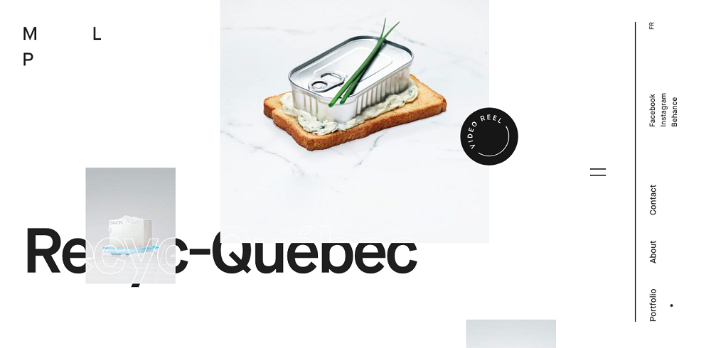
As you scroll down this website, you see asymmetric modules moving at different speed and captions coming up and disappearing from view. When the photo meets the text, the type changes as if lurking from behind the photo.
These effects make the website look both asymmetric and harmonious. The viewer gets the impression that the perceived chaos of this layout is very carefully thought through.
FEMME AND FIERCE
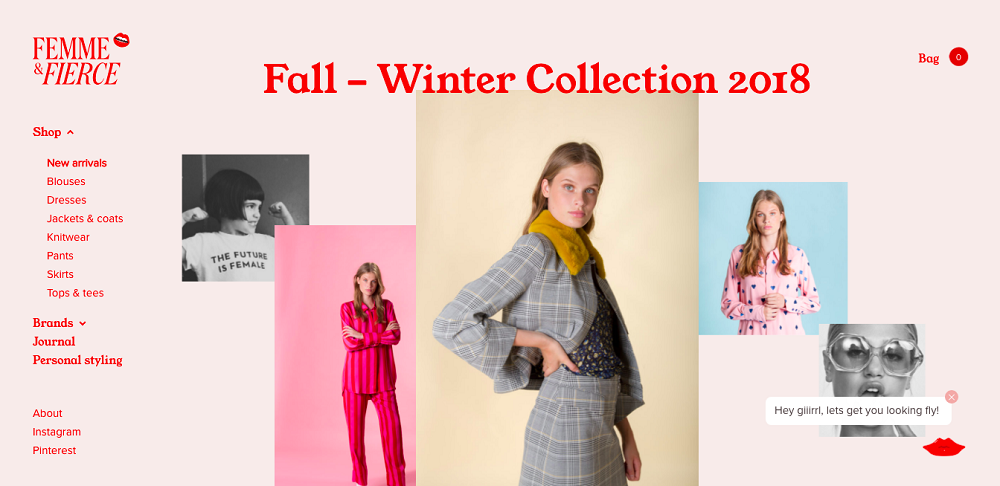
This design combines brutalism, asymmetry, and animated scrolling. As a result, we see a very balanced and minimalistic website with a youthful edge to it.
The old-school font types and pinkish palette balance the design, making it chicer. When you hover on each product photo, you see animation that involves custom-created icons. The website looks like a classic fashion magazine that has been remade for the young and fierce audience.
2.6 EXPRESSIVE TYPES
Bold typefaces have been rocking website design for quite a while now. Also, we see a lot of ruined, messy, 3D-filled or cropped types. Larger than life text and bold fonts set the atmosphere of the website and create accents where you need them.
Geometric types add a cutting-edge feel to the design. Clear and minimalistic, they can offset the complexity of layouts and animation used in the same design.
Handwritten types, in turn, add a cozy and charming feel to the website. They are used in combination with sketch elements, cartoon-like illustrations, or on their own. In 2020, we will see them bold, expressive, and asymmetric.
LA ROULOTTE
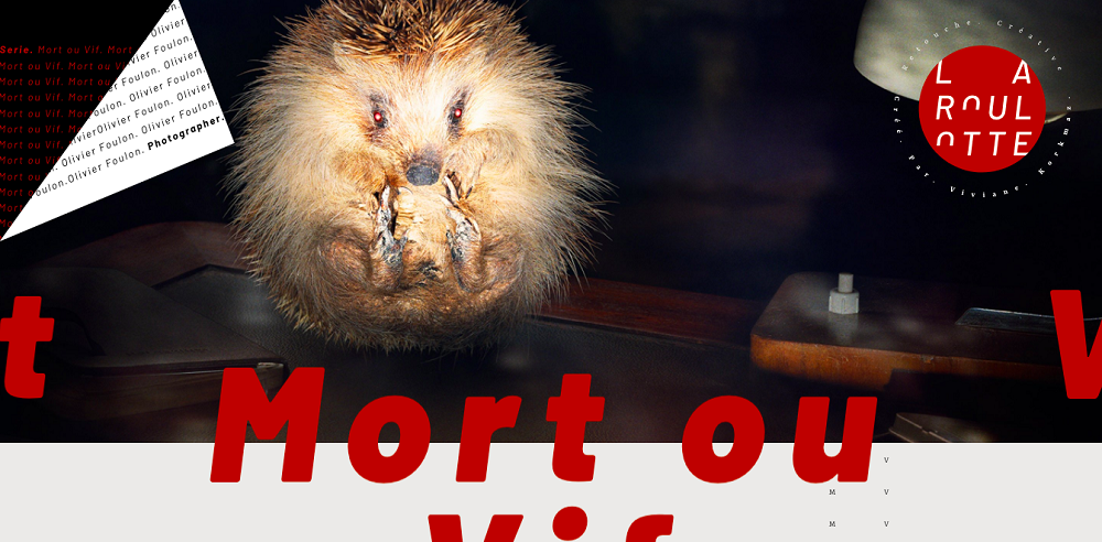
Here we see an awesome combination of irregular animated layouts, geometric shapes, brutalism, and of course, statement types. The design creates an impressive broken experience. Note how the letters are cropped and scattered across the layouts.
The red color makes the type even more expressive. Also, notice how beautifully the logo combines a geometric shape with cropped letters.
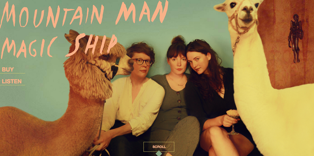
MOUNTAIN MAN BAND
This homepage features big hand-written letters done in an irregular, sloppy manner. When you scroll down, you see animated text rendered in geometric types and bleached background images. The color palette is awesomely muted. The design looks warm and cozy, inviting the visitor to stay longer and have a good time.
2.7 DAMAGED, LAYERED IMAGES
The overall trend of destroying everything - from backgrounds to typography includes breaking and experimenting with photos. What would have been unthinkable a few years ago, like a damaged character photo on the homepage - will be seen on many websites in 2020.
Not only do web designers damage and glitch images, they also write over them and put all kinds of elements over photos to add complexity. Overlapping elements, duotones, and messiness will still be trending in 2020.
KYOTO-OKAZAKI MEIJI SAKABA
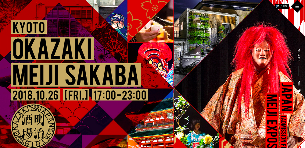
The complex design of this homepage features asymmetrical images sharing the red color palette and overlain with glitched shapes. The designer uses both vibrant red and muted beige colors and bold plain types.
If you scroll down, there will be more geometry, glitch, and expressive handwritten fonts. Overall, the website is mesmerizing.
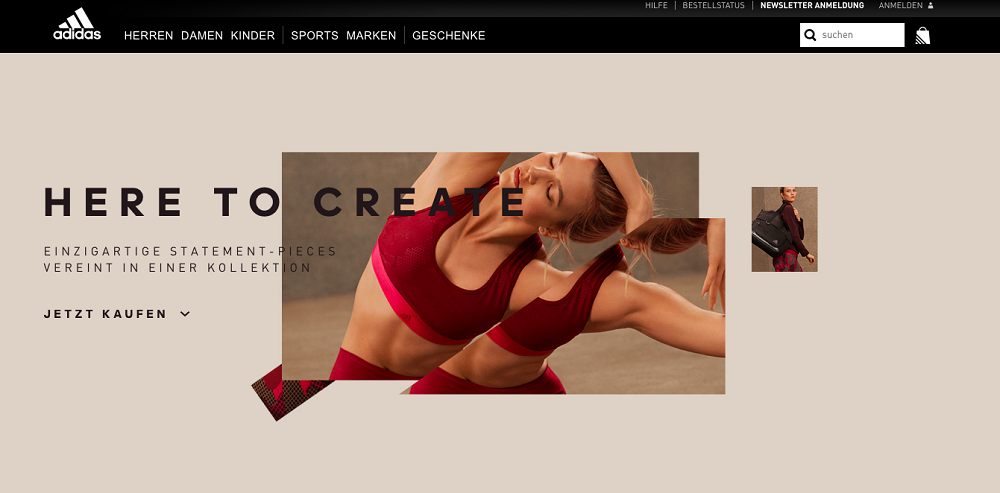
ADIDAS WOMEN
WEBSITE
The big split across the image looks like a broken mirror and makes us see images in double. The rest of the design looks very minimalistic - with lots of whitespace and more traditional typography. As a result, all views are glued to the video as if displayed on a broken monitor.
2.8 CHAOTIC INTERACTIVE TEXTURES
When it comes to backgrounds and textures, the same “brokenness” trend will no doubt apply. In 2020, we will still see a lot of sepia and micro-damaged or bleached backgrounds.
Designers use both worn-out looking textures and futuristic animated patterns. There are basically no rules. Lately, as the website interactivity trend is also gaining momentum, we see more and more interactive animated textures. We will also see a lot of embedded videos that serve as textured backgrounds rather than a traditional storytelling element.
HUMAN ALWAYS
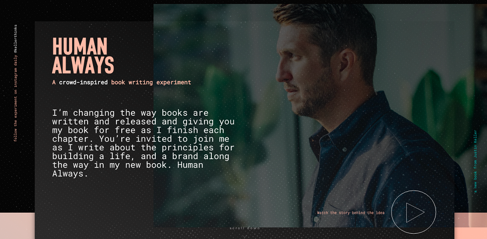
With a nice muted color palette and micropatterns that look like damaged texture, this design looks deep and inspiring. There is also a lot of geometry in the design: edgy rectangles are combined with fluid rounded shapes to create complexity.
There is a minimalistic-looking sidebar menu and a slider down the page. Due to this combination of elements, the website looks both experimental and rooted in tradition.
DRIP POP
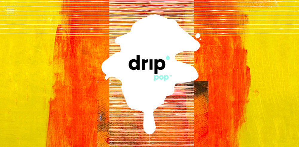
This website looks tasty and vivid. The designers used chaotic animated patterns as a background texture on the homepage. Before you scroll down the site, you pause to see more of these awesome color drops.
Down the page, there are animated realistic photos. Against the flat-inspired design of the page, they look huge and delicious. The combination of material design, horizontal sliders, and complex animation captures attention and won’t let go.
DISTINCTION AGENCY
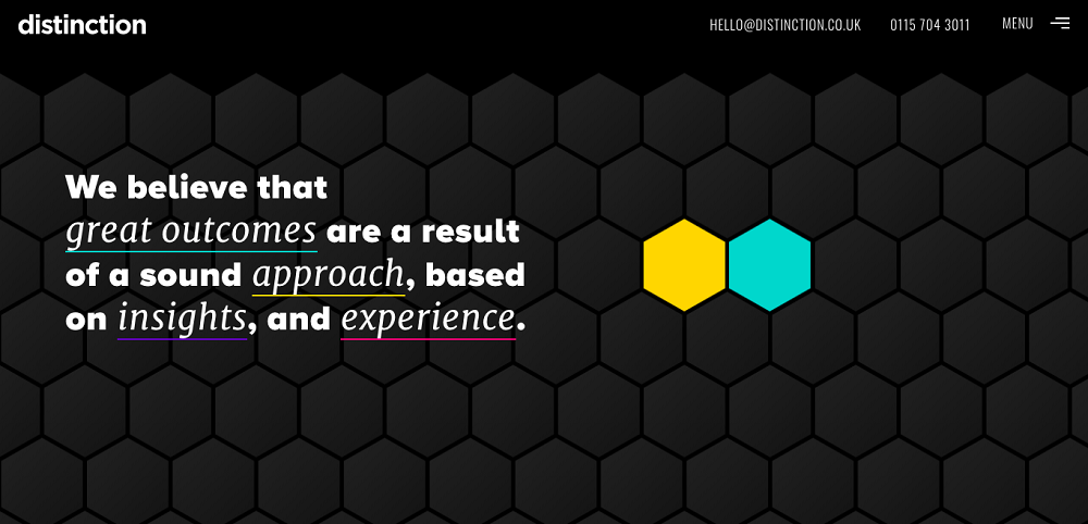
Interactive designs will be everywhere in 2020. In this website, we see an amazing example of an animated texture that changes color and reveals photos. Supplemented with neutral typography and a minimalistic menu panel, this scale-like texture looks amazing.
When you press on one of the highlighted words in the caption, a new flat and minimalist layout is revealed. Here we see traditional animated shapes against a light background.
2.9 DREAMY COLORS
In 2019, we saw a lot of color in web design, and the trend is here to stay. Vivid colors are used in more traditional flat designs or deeper semi-flat layouts. Rainbow palettes and deep, muted pastels will be equally popular.
Next year, the color combinations will resemble rainbows and gradients that were so popular in 2019. Whenever they can, designers will move away from traditional colors to their brighter or deeper equivalents.
At the same time, we are expecting the rise of beige palettes used in combination with more vivid colors and animated elements.
LE PETIT NANTAIS
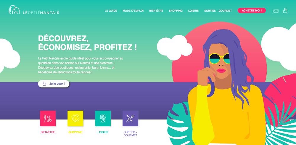
An amazing example of an interactive flat design that combines many of the trends we will be seeing in 2020. The character image is rendered in bright contrasting colors; there are bright icons and animated scroll.
When you click on a menu tab, a colorful and animated transition takes you to another page. Slowly floating elements create a deep feeling that balances the flat-looking illustrations.
SLOW BANANA
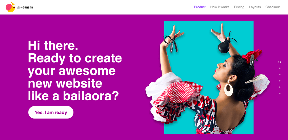
Here we have one more combination of vibrant colors and a passionate character image on the main page. Below, there are several flat design layouts, each with a mono-color vivid background and bold typography. The simplicity of this website makes it look even more awesome.
2.10 BRUTALISM
In 2020, we will be more and more reminded of the dawn of the internet through the brutalism in web design. Those who have grown tired of clean flat layouts will enjoy brutal layouts straight from the nineties.
These websites will feature just too many hover effects, animation, micro-interactions, big types, massive images, and web safe colors. They are not meant to be maximally functional; they choose to overwhelm and impress. Everything will be just a little over the top: colors will clash, words will be difficult to read, and content will be organized chaotically. And of course, there will be a lot of black and white.
ERIK BERNACCI
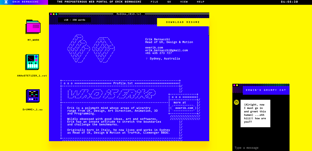
Can you hear the sound of internet dial-up? I felt very nostalgic (and old) while looking at this website. The designer combines old-school web safe colors with naive animation and awesome icons.
This design seems brutal and sentimental at the same time. Every element has been carefully crafted to fit the whole picture of an old website with an ironic edge to it.
ROMAIN GRANAI
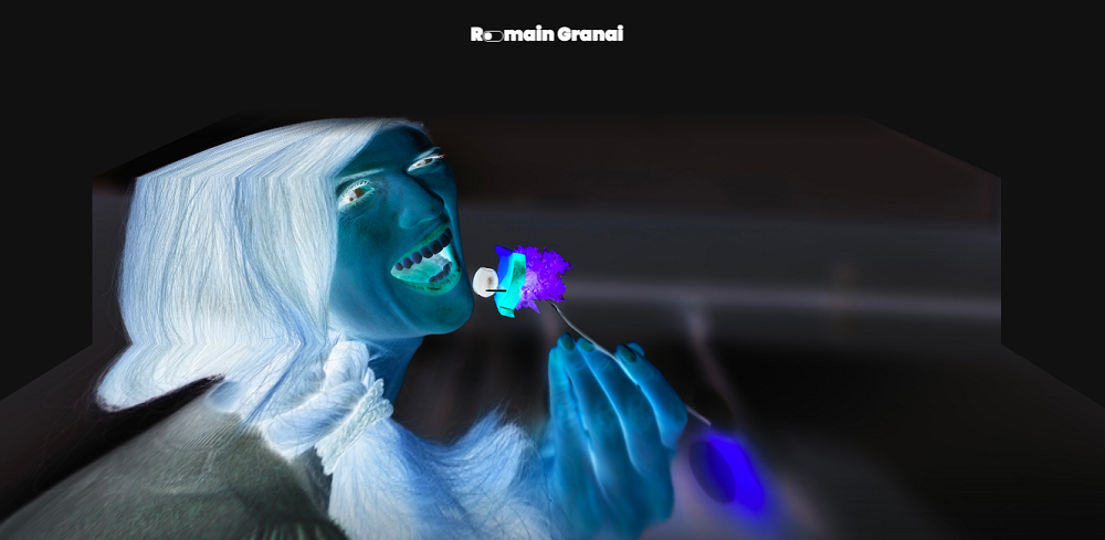
This is another variation on brutalism with a special twist. We see a lot of glitched elements, as it was trendy throughout 2019. They are backed up with massive typography and rather vicious scroll effects. This design overwhelms and leaves a lasting impression. There’s also a mobile version, make sure you check it out!
2.11 HAND-DRAWN ILLUSTRATIONS
Watercolor illustrations, pastels, and sketches are nothing new in web design. In 2020, we will see even more of them. Unique drawings will be getting even more complex, dynamic and interactive. If, in 2017, it was enough to create an original hand-drawn design for your website, now the illustrations should engage viewers and respond to their actions.
The use of illustrations throughout the website should be consistent. You cannot put a nice drawing here and there and call it a day - all the typography, micro-animation and backgrounds should fit into one experience.
A+SMITH CREATIONS
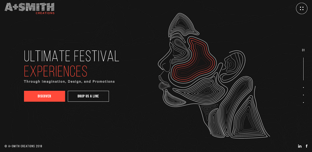
This beautiful black website features an elegant illustration on the homepage. As you scroll down, one element of it comes to the fore and gets surrounded by text.
This website looks both artistic and minimalistic. The CTA elements are highlighted with red and other lines remain light and subtle. The company logo features similar wavy lines and acts as a nice accent in this design.
HISTORY OF AMERICAN MUSIC
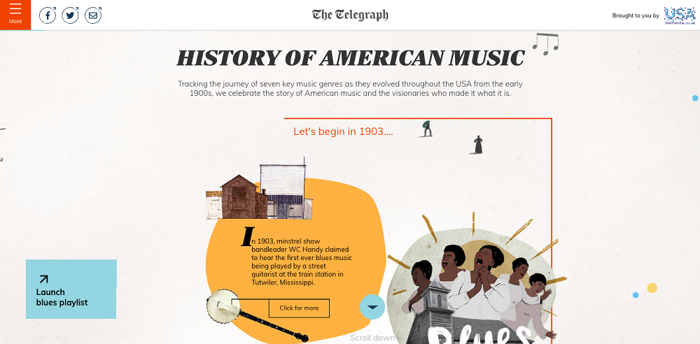
Here’s an entirely different website that uses hand-drawn illustrations as both design and storytelling elements. By scrolling down you reveal the timeline of American music rendered in awesome interactive illustrations. You can also launch a jazz playlist right on the website to get a comprehensive impression.
2.12 INTERACTIVITY
As you’ve probably noticed from the examples I gave above, web designs involve creating more complex and dynamic experiences for users. We will see a lot of integrated videos, micro-interactions, animated scroll, etc. New animation technologies like SVG mean that there will not be any loss of quality in your animation when viewed on a mobile screen.
GARBAGE 31
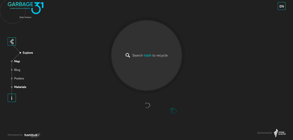
This awesome website by a Ukrainian creative team brings interactivity to the next level. You are immersed in the experience from the very first seconds. To enter the website, you need to empty a bag of trash with a knife. Then, the website invites you to find a place to recycle different types of trash.
The design is very minimalistic; the main accent is on the interactive and functional part. Nothing distracts your attention from the main task - finding the right recycling location.
COCOON
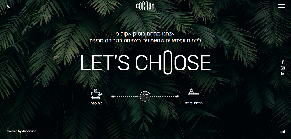
The experience on this website begins with a simple yet lovely interaction where you choose the section you want to enter. This design also features beautiful animated transitions. They vary from page to page and make the time you spend on the website even more engaging.
There are also dynamic grids, custom icons, and lots of nice photo content to amplify the impression. The website looks slick and technological.
2.13 OLDSCHOOL AND GAME-LIKE
The brutalism trend goes hand in hand with the trend for making designs that resemble old video games. Even non-gamers will feel sentimental when they see Nintendo-like elements on a website. This aesthetic spans across generations and gives a playful edge to any design.
When animated and interactive, game-like elements immerse viewers into a Nintendo experience. In such a way, one can easily increase the time visitors spend on a website.
ALL
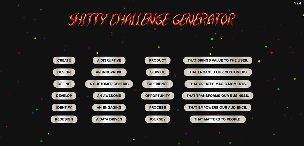
This website delivers all the main trends of 2019-2020 in one package. It encourages the user to interact and build a creative challenge. Then, the user gets invited to a crisp one-page website with a brutalist and Nintendo-like feel to it.
The design features lots of micro-interactions, bold animated letters, cartoonish icons and pop-ups, and nice handwritten typography here and there. The huge logo on the homepage interacts with you as you hover over it.
PRAZE OR HAZE TRUMP
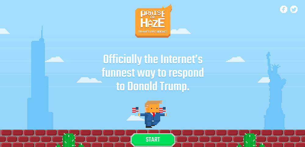
WEBSITE
Although rather controversial, this design offers you an opportunity to play with a character that resembles a famous politician. This funny website seems to aim at lowering the ideological and political pressure through a video game imitation. But still, this design is very much in line with the trends we will see in 2020.
2.14 3D OBJECTS
Over the last two years, using 3D elements in web design has become a common practice. In 2020, designers will be integrating 3D objects into complex layered layouts and make them interactive.
The line between real objects and their 3D analogs is more blurred than ever. Also, dynamic 3D elements will be moving more and more naturally to create a smooth organic experience. Natural materials and round shapes will be inspiring more and more 3D designers in 2020.
POOR FOLK KABAKOVS
Here we have a beautifully layered homepage design with small 3D objects that act as texture. Under the 3D pattern, there’s a big caption sliding into view and a video background. Such complex experiences are what we will expect from a website in 2020.
The website has a somehow chaotic feel to it. There are images popping up irregularly and text overlaying them in some places, but the overall impression is of a modern web design masterpiece.
ESPN NBA's SIGNATURE MOVES
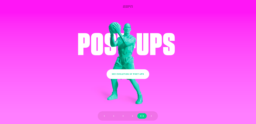
In this example, we see the history of basketball told using sleek 3D figures of NBA players. This design features all the important trends of 2020 - vivid colors, large types, interactivity, and video integration.
Well, I guess that’s all. I hope you enjoyed this read and see you in 2020!

Did you like the collection? Please drop me a comment!
Also, subscribe to our blog to see more like this.
2020 web design trends digest contents (click to jump):
- Layout >>
- Imagery >>
- Animation >>
- Scrolling >>
- Usability >>
- Loading >>
- Designer's Toolkit >>
- Coding >>
- Futuristic Forecast >>
- Final Ideas >>
* * *
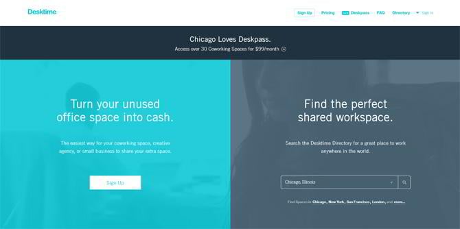
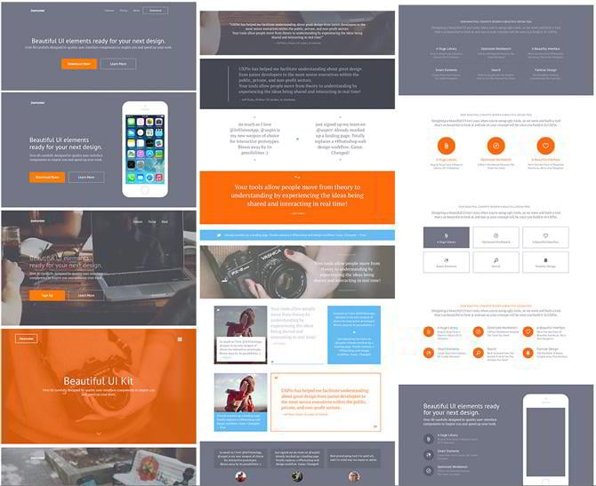
Split Screen
This layout type was one of the dominating trends we've observed in 2019. Split Screen is basically a layout where the site is split in half: 2 different images with 2 different intentions and CTA.

Bolder use of colors
Web apps and sites have tended to stick with "web-safe" colors. Blues, muted colors, red for alerts and notifications. In 2020, we expect to see a lot more variation in brand colors, leaning towards saturated and vibrant ones. Maybe they will look even neon or fluorescent.
Typography
Typography is the art and technique of arranging type to make written words become more attractive. As designers are improving all aspects of design, typography must be included in. Flat design and minimalism already harness the power of big, dramatic typefaces to make a strong statement. The forthcoming year will bring more adventurous use of artistic fonts and creative type treatments on websites.
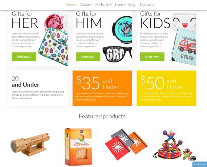
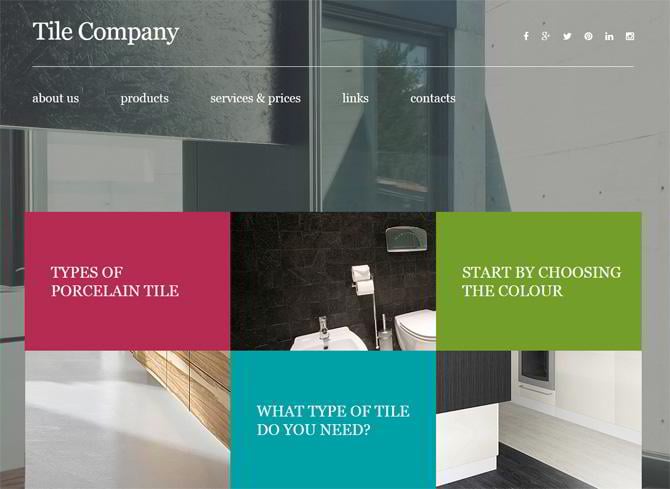
Blocks Grid
Blocks grid is especially good for eCommerce sites. It is very effective in displaying products. The page doesn't look messy at all. Besides, you can play around with the size of the blocks to emphasize the importance (the bigger - the more important).
Though you may not be able to catch the realistic view of grids, the fact remains that grids are very much existent on every mobile’s interface. No wonder, these grids are considered to be the elementary design path from where you can kick-start your mobile apps design task.
What’s more, 2020 will see more playful web layouts that deviate from a rigid grid design. Certainly, storytelling and high interactivity encourage this kind of soft rebellion against the classic grid.
There is an opinion that grids on demand will replace Bootstrap, Foundation, and UI Kit.
Maybe it's time to read up on Susy 2? What do you think? Bootstrap and Foundation have done wonderful things for rapid prototyping, but as of now, they're feeling pretty rigid as design platforms. If you've spent much time using them, then you know that it's very difficult to go outside of the grid blocks in an elegant way. You also know that the JS and CSS files generated by the base level framework are nasty. UI kit was a big step in the right direction, but it's still a grid system that you need to trim to fit your project. Susy 2 takes a bit of time to wrap your head around, but once you get it, you are able to invoke grids on demand for elements that need them while sticking to your own lightweight design the rest of the time.

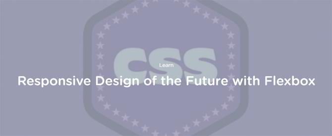
Flexbox will redefine responsive grid systems
Flexbox is now supported by all modern browsers, which means cleaner CSS, faster websites, and fewer layout hacks just to get something to be vertically aligned. Flexbox responds to browser window changes naturally, so rendering the popular responsive grid systems become unnecessary.
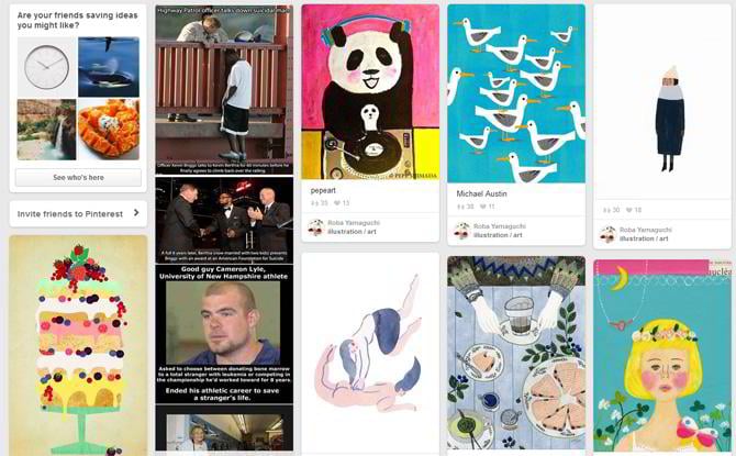
Card Layouts
Pioneered by Pinterest, cards (which are very close to grids) are everywhere on the web because they present information in bite-sized chunks perfect for scanning. Each card represents one unified concept. Since they act as “content containers”, their rectangular shape makes them easier to re-arrange for different device breakpoints.
No header/footer
The website looks unusual without menu and tabs (to be more accurate, when they are hidden). This gives a wonderful clean effect. The users are focused only on the things that are important.

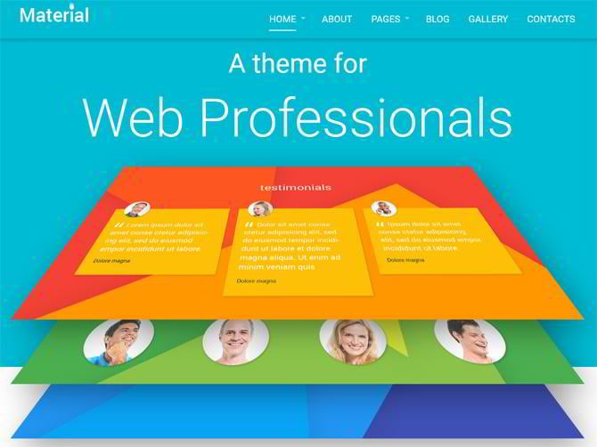
The rise of Material Design
Material Design is a design language developed by Google. It has been announced on June 25, 2014, at the 2014 Google I/O conference. Many apps have been utilizing this new design language and we’ll be seeing more websites utilizing material design in 2020.
This trend will be disrupting industries where websites are not that fun to use like airlines, banks, health care, finances and more. Think of funny images, expressions, hidden functionality, smart personalized data and more.

Flat Design never gets old
No matter how many years have gone, flat websites still look fresh and current. Flat style is continuously evolving to the new levels. Actually it is now in its true form. This form is containing both expansion of devices and screen sizes. Thanks to this new form, the principles of flat design will never get away soon. Users will never miss an important piece of content a flat website wants to show.
Semi-flat design
This technique has been around for years but gained popularity only since the last few years. It became popular in very short span of time because it’s quicker and easier for users to comprehend and is able to load more quickly on websites. Flat design trend can be seen everywhere, from blogs of small businesses to the websites of the most iconic brands in the world. It is quite easy to create and manage flat designs. But with the ever-changing trends, designers are likely to add a little extra to the icons, the menus, the illustrations in order to breathe life into the site elements.
Removing non-essential design elements in favor of simplicity
There is an idea/concept in design that a design is complete when all of the non-essential elements have been removed. In 2020 we could be seeing more of this idea come into fruition as sites look to find ways to simplify their designs by removing non-essential design elements.

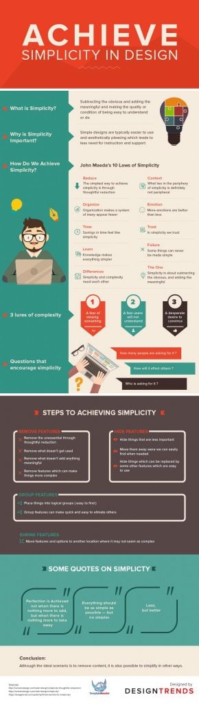
Simplicity seems to share an eternal camaraderie with graphic design. It was in the early 1960s that we witnessed the initial wave of simplicity or minimalism and although there have been huge works with ornamental details in between- yet simplicity is once again back to the fore with full glory today. Talk about one of the most sought-after latest design trends now and you have most of the designers voicing for “simplicity”. So, what is the buzz about simplicity that has led it to dominate over the long-ruling elaborate ornamental presentations? Five points below effectively summarize the importance of simplicity –
Less distraction- A simple design eliminates chances of getting distracted by unnecessary additional features such as sudden clip arts or iffy bevels that otherwise can make the design overwhelming & complicated.
Clear processing of information- Don’t you think that it’s easier for your brain to process data from simple graph rather than from some design with complicated 3D perspective? The answer is definitely yes and here you have simplicity as the winner.
Simple coding- Simple designs do not ask for too much of unnecessary extra work from the development team & your developers would love you more for it.
Speedy loading- A simplistic web design means fewer details which assure faster loading and you will have happy visitors for you.
Aesthetically pleasing- When you can keep things short & simple, you have already mastered the art of sophistication which guarantees an aesthetically pleasing work, loved by all.
The contemporary graphic design scene has got the designers more & more shifting away from the decorative ornate patterns to vouch for sleek simple minimalist patterns. It’s a busy age today where we want everything streamlined so that we can have a faster grasp at the presentations before us and “simplicity” with its minimalist essence & a balanced expression between form & function, fits the bill like a dream.
The following infographic below speaks about the importance and need of simplicity in design as well as reveals the prime laws to achieve simplicity at its best in your presentations.
Fewer pages
If less is more these days, so using a one page design or a simplified multi-page design will attract more users to your website. Visitors often shy away from page heavy sites.
Nobody wants to click multiple pages anymore. With an increasing number of people accessing the internet through their mobile devices these days, one page designs are easy and more convenient for them. And when you’re designing a one-page website, it makes sense to ensure innovative scrolling to make things easier and interesting for visitors.
Fix width centered site layout
Most websites over the last few years have used the “banding” or width: 100 percent design element so that things like images and sections visually stretch the full width of a browser’s viewport. Before this trend became popular, most sites were fix-width and centered in the page. You could tell where the site ended on either side.
Vintage Style inspired by ‘80s
The colorful era of bulky computers and massive cell phones of the early ‘80s and ‘90s is the main source of inspiration for the latest flavor of the vintage trend on the web. Pixelated icons and text, galactic backgrounds and interactive moving stars and planets will be around a lot in 2020 web design.
Custom homepages are going to stay for 2020
A custom homepage is an interesting invention. Basically, it’s meant to take the main purpose of the site – its main goal – and put it on steroids by introducing a highly optimized look. That look is meant to grab the visitor’s attention and don’t let go until they’re led to a specific action.
Custom homepages are basically a kind of a landing page. To some extent they differ from the rest of the website design and are often more visual too.
A good custom homepage provides a better way of welcoming a first-time visitor and is more effective at telling a story.
Using different geometric shapes
This was a winner trend for the last couple of years. It’s expected to make waves in web design industry this year too. For long rectangle page layouts have been the first choice of website designers. But we’re likely to see more and more designers put in conscious efforts to come up shapes other than a rectangle in the year 2020.
There are so many other shapes of geometry that can be and are being used for designing websites. It’s something that yields the power to enhance the overall voice of the website design. Apart from helping users navigate the site easily, it catches the eyes easily too.
Ghost Buttons
The fashion of using loud and flashy buttons is gone. Usage of ghost buttons, also called transparent/hollow buttons, is another trend that will rule the roost in 2020. Ghost buttons include only the outline of a button along with a word or two in simple typography in the center. And this is what makes them look attractive and immediately grabs people’s attention. Due to their nature of being less obtrusive, ghost buttons help sites highlight more of the content they want audiences to actually see.
An emphasis on originality
The biggest problem with the current design trend is that it's very difficult to be original. This is a side effect of mass adoption. We guess that originality is going to come in the form of an increase in custom drawn elements combined with carefully produced animations. With the passing from grace of flash, a dearth of HTML5/JS/CSS3 animation libraries have sprung up to help with this. There is no one-size-fits-all technique for achieving originality, so most of the well done executions will involve a good deal of effort and planning.
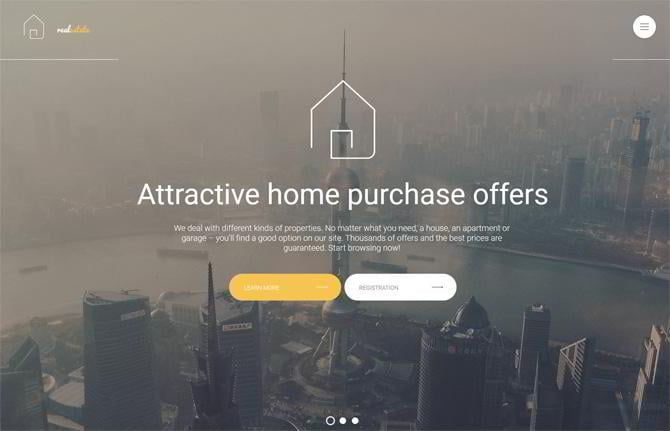
Single image
This is a great trend - a big image smacking right into your face. It is captivating and focuses attention on the content. No distraction, everything is just clean and neat. Increased bandwidth, wide browser support of HTML5 video, and ways to serve high resolution graphical assets selectively to devices with retina screens, all add to the popularity of gorgeous HD background images and videos on websites growing even stronger in 2020. This will be especially true in industries like real estate.
The most interesting thing about a full screen layout is that it makes it easy for users to find, understand and comprehend the information they’re looking for. You can easily use a video or image of the product or service that you are providing that helps in engaging the customer.
Want to differ from the competitors? Then, just don’t embrace the large-header-background-image trend.
Full screen background video
Full screen background video is a rising trend of web design. This perfect automatic background video will definitely catch the visitor’s attention. Background video also elevates the value of the website. But it doesn’t distract anyone from the content; in contrast, it supports audience to get attention in the Call to action button. As far as we can know, a video background is really making impact to design.

Reality-imagination blur
The next step of gamification and design is emerging with a blurred line between what’s real and what’s created or imaginary in web design projects. And the results are pretty stunning.
From virtual reality to websites that let you make choices to find new content, this type of customization is personal and users seem to really like it. This trend also includes creating imagery that looks real, but you know that it is not.
Natural stock photography
Designers will start to pay even more attention to imagery as natural looking stock photos connect with people on a whole different emotional level. In 2020, we’ll be seeing more amazing photos implemented in websites.
Some websites are opting for using their own photography on their home pages or blog posts instead of picking a stock photo. Other websites are ditching stock photography for videos, infographics, or even GIFs to help convey their message.
Icon sets are another stock element that’s being dropped in favor of something more custom. There are thousands of sets out there, so it’s easy just to pick one and run with it, but that little extra touch of creating custom icons can help set a site apart from others.
Vibrant custom illustrations and iconography
High pixel density monitors have revealed that standard image formats don't always work as expected on the modern web. Using .jpg and .png files can result in a pixelated look on retina displays, which spoils the aesthetics of a website. Today, wider browser support for Scalable Vector Graphics (SVG) and easily implemented icon fonts are a fantastic answer to this problem. As a result, we’ll see more web designs showcasing colorful custom illustrations, as well as stylish hand-drawn icon fonts and SVG icons that remain crisp and beautiful at any screen resolution.
SVG has been in use for many years. And it still holds extreme importance. With SVG, images maintain their clarity and sharpness on all devices. It packs all essential web elements together with design elements to fit well to all screen sizes. W3techs.com reveals that currently, only 1.3% of all websites use SVG. But we’re sure to see it prevailing the world of creative web design in the year 2020.
Animated story
While having amazing content, it is always crucial for a website to be able to tell a story through this content. Web design in 2020 will likely focus around helping tell a story for users because animated storytelling is really awesome. Users like stories. Websites telling stories immediately capture visitors’ attention. It’s cool when you scroll further down the page and the website tells you the story about the company.
Dynamic backgrounds
Dynamic background could be anything from using a powerful image to a 3D background or even a video. Adding a video at the background is perfect for drawing immediate attention of people because the human eye is drawn to movement.
We’re sure to see more of dynamic backgrounds on the web design arena in 2020 because they make visitors want to see more and know the story behind the moving images.
More Static Content / Less moving parts
Many professionals believe that the slider is the first thing to be eliminated in the realm of having elements slide, fade and scroll on the page. We will see more static designs with less moving parts. Users want quick and digestible content and designers and developers alike must work to deliver content that is direct without distraction. However, galleries and slideshows are still an effective way to showcase multiple images without overburdening the users on photography sites, product showcases, and portfolios.
By the way, websites with slides can become an alternative to websites with sliders. They are a kind of sliders evolution. Sliders were aimed on allowing websites to move images within a frame to showcase content. Full-screen slides, where each slide refreshes the entire screen with new content can work with a click, scroll or timed effect. Users can navigate forward and backward for an experience that is almost physical. Expect to see plenty of sites using this concept in the coming months.
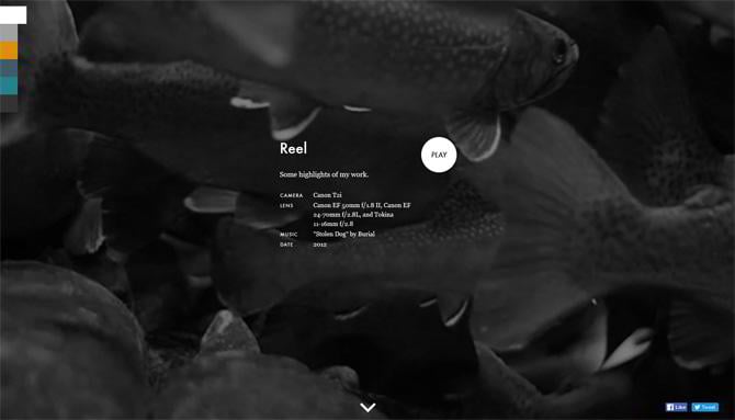
Cinemagraphs
Cinemagraphs are also enjoying widespread favor. These are still images with a selected animated portion, usually a subtle detail that aptly draws the attention of website visitors. They’re not new, but the success of “live photos” on the latest iPhones, which look quite close to cinemagraphs, and robust browser support for HTML5 canvas, play a key role in cinemagraphs being listed as a design trend of 2020.
Micro experiences
What we are envisioning here are self-contained workflows that grow as they are interacted with. For example, a homepage may have 3 or 4 call out areas that have an obvious intention like registration, a tour, product offerings, etc. Initially they will have a small amount of content geared toward the begging of interaction. Once you trigger a workflow it will launch a mini application that will complete its intended purpose. Clicking on a registration element will alter that area into a registration wizard either directly in that area, optionally changing its location and size, or in a modal window.
These experiences may be simple or complex, but they'll have the goal of simplifying the initial navigation paths while still presenting a variety of choices without being overwhelming. They'll also have the side effect of reducing page changes and scrolling for tasks which can be completed in a few clicks. Instead of the ubiquitous scrolling header image, these micro experience cells or cards can be self-contained showcases for a particular area of business.
This technique could be particularly useful in web applications where, instead of transferring to a new screen to enter some data or complete a task, the cell simply adapts to allow the task to be completed right there on the spot.
Long Scroll
Long scroll is very engaging indeed. This layout kinda tells a story to the visitor, without having to click anything at all. Apple is one of the sites that do this very well. Most of new site designs today tend to be longer when scrolling through the page. As mobile devices become more popular, it’s becoming more commonplace for sites to opt for scrolling instead of linking as a means to display content, especially on their home pages.
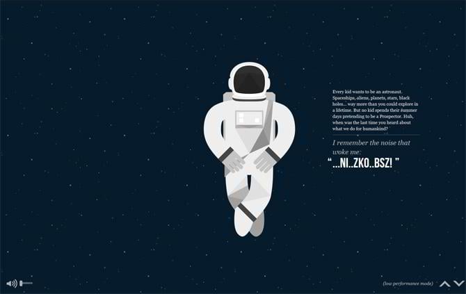
According to recent study by UX Movement, most visitors prefer up and down scroll design than the usual click navigation of one page to another. It can be vertical or horizontal, swiping or animation scrolling. We’re likely to see more of innovative scrolling in 2020. So, don’t forget to incorporate the innovative scrolling feature to attract more visitors to your website in the year to come. It will also ensure that visitors spend a longer time on your website. Remember, the idea is to make things more fun and convenient for your visitors. NASA Prospect is a perfect example of such innovative scrolling. This amazing scroll site never fails to keep its visitor engaged and entertained.
Parallax scrolling
Parallax scrolling effects are really cool if you ask us. In short, they’re all about creating an illusion of 3D motion and depth by altering the speeds at which both the background and the foreground scroll.
When done right, it gives the website this unique feel and makes everything very pleasing to the eye. Not to mention dynamic.
The most common application of the parallax effect is to use either one image in the background, two images (one “closer” to the screen than the other), or even a video, and then to put a block of text in the foreground.
Scrolljacking
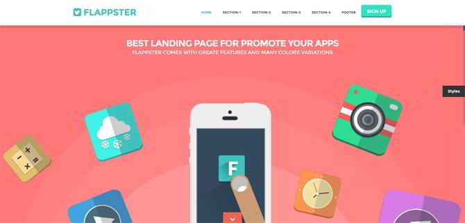
Although scrolljacking has received mixed reactions, many websites are at least trying out this feature. In fact, there are HTML5 templates like Flappster for product demos which include scrolljacking. If you use these templates, make sure you have thoroughly tested them for every element that could break your site.
One thing that web developers must keep in mind is that if you implement scrolljacking, try not to mix them with other plugins to your page, like horizontal infinite scroll, for instance.
Another feature is to add anchors, with proper title texts so that screen readers can read them out when they are focused. From the point of accessibility, implementing scrolljacking could be analogous to tabs, especially in defining anchors and their ARIA roles.
Scrolljacking is a difficult technique to implement itself and making it accessible is easier said than done. As we’ve seen, many netizens have voiced their concerns about the matter and we believe you should listen to them and stay away from it.
We suspect that as soon as Apple moves away from this feature, its fans will follow suit.
Page height reduction
This is more of a hope than a prediction. The common belief out there at the moment is that this trend of more vertical scrolling and less clicking will continue to grow. Sometimes, endless scroll ends in a lousy user experience. People like the use of scrolling as a way to phase in small portions of content or trigger animations, but scrolling or swiping 50 times to view the primary site content is going too far.
If sites were to consider their content and the goals of the interaction a little more, clicking to trigger a drill down into the site wouldn't be such a bad thing. Combined with micro experiences and modern front end programming, a mouse click or screen tap doesn't have to mean a jarring page refresh any longer. We believe that sense will prevail in the next iteration.
Accessible data for making data-driven design decisions
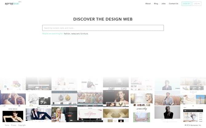
Web design is a profitable business, so it needs to start speaking the language of business. That means metrics, click-through-rates, conversions, channels, in short, analytics. If you are a freelancer, you likely will have hands-on access to these business intelligence tools. If you are not, companies like Apropose are working to make big data accessible to designers. The current iteration of Apropose is not there yet, but they are one of the leading teams founded with that goal in mind.
Performance budgets
It becomes obvious that design is becoming less about aesthetics and more about the overall user experience. A fast loading site that gets the user to their intended destination first wins.
We are already starting to see this with many of the more performance focused brands.
Considering how fast the UI responds will be just as important as how it looks.
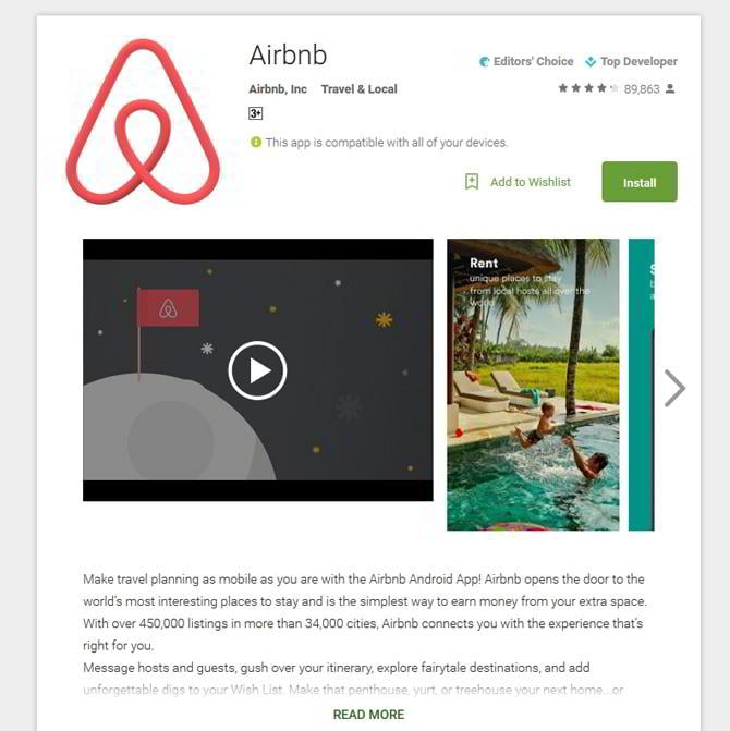
Immediate response UI
The days of save buttons and secondary action UI elements are on their way out. This is evident in most modern web apps. As we move closer to enabling web apps to perform like desktop applications we will see this adopted across the board. The technology is here, design will follow right behind. Some examples include anything in the Google Suite as well as other apps such as Airbnb.
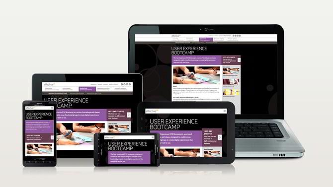
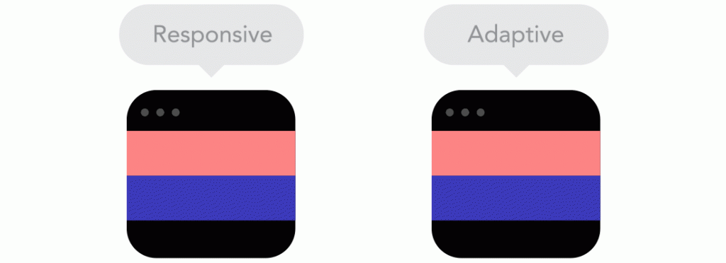
Responsive design
Responsive web design is becoming less of a trend and more of a best practice. That happened thanks to the rise of mobile internet usage. It’s safe to say that responsive design isn’t going anywhere soon, as it represents a relatively simple and cheap way for businesses to build a fully-functional mobile-friendly site. There’s no doubt that responsive design is highly useful and versatile, but it also should be lightning fast in order to deliver a great UX.

The proliferation of UI patterns
Modern web is often blamed for sites similarity. But having a similar look isn’t necessarily a bad thing. There’s no real reason to reinvent the wheel. UI patterns must guide users through a smooth experience. While some criticize patterns use, there’s no doubt that their widespread use makes the function easily recognizable for users.
For example you’ll find an account registration pattern whenever you try to register for a site. There might be a form to fill out or a button that’ll allow you to use a social account to sign up. Multi-step form wizards are also effective since they “chunk out” the required fields, reducing friction and encouraging users to flow through the process.
Designing in modules and components instead of entire pages
Web design is moving toward modular and component design instead of mocking up entire layouts and comps for a particular web page. These components often involve designing how the search function will work, how the navigation will be laid out, etc.
We’ve matured into knowing that we have repeated elements on different screens, and that these elements need to be designed both so that they work independently but can still work with the rest of the site.
Not only are we more concerned about how these components look in terms of design, but they all carry their individual functionalities with it too. Designing with components and modules allows the same functionality to be replicated no matter where it appears on the site.
Forms and inputs go full-screen
This trend has come from the wide-spread adaptation of responsive website design. This happened for several reasons: keeps another screen from being loaded, gives more screen space for easier touch by fingers on touch screens, and encourages users to complete the form (for those forms that present one input at a time).
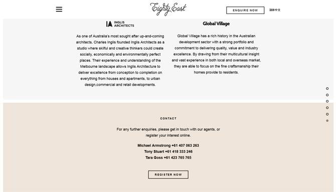
More sites and apps are going with the full-screen forms and input screens (such as signups and logins). Click on “login” and or “contact” and you may be greeted with a full-screen overlay with the form needed instead of being sent to a different page. A great example of this is Eighty East’s contact form.
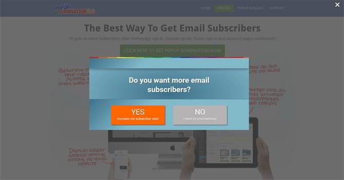
Passive aggressive pop-ups
Web community believes that there are two serious UX crimes at play nowadays. The first is house ads. They are terrible. Pop-ups used to be bought by brands in the name of content marketing. Presumably this is because they generate lots of newsletter sign-ups, but this is a boorish ad format, and it just comes across as desperate.
The second crime is one of messaging. Depending on where you draw the line, you might not consider this web design, unless you think that content and user experience are fundamental. So what is the message here, apart from ‘Sign up yo our newsletter’ or ‘Download our ebook? The message is, if you don’t sign up, you (the user) are … we’ll leave the ending to your imagination.
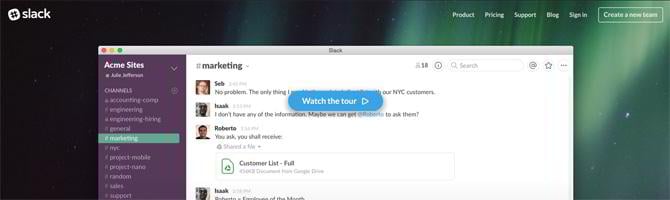
Live product previews
Landing page design has seen incredible growth stemming from greater Internet speeds and browser capabilities. One major trend we’ve noticed is the addition of live product previews on homepages or custom landing pages. These product previews are meant to give potential users a glimpse into how the product operates. Take for example Slack’s product page. It features a video tour and vector graphics covering the Slack interface. These product previews are meant to give potential users a glimpse into how the product operates.
But you don’t always need to rely on animations for product previews. Some landings use a simple PNG screenshot to show what the product is and how it works.
Webydo is another brilliant example with a live animation playing on the homepage. This allows visitors to see Webydo in action without having to manually demo the product.
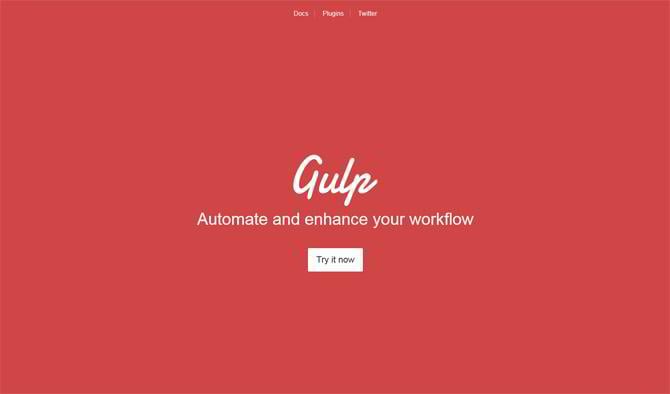
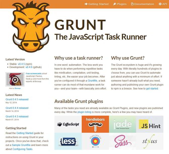
Automated Task Runners
The world of frontend development has changed so much with a handful of new best practices for website creation. Task runners/build systems like Gulp and Grunt are being used much more frequently for a slew of tasks that previously required manual effort.
Automation is the lifeblood of quick turnaround and churning out quality code. Machines don’t make mistakes, so the more you can automate with confidence the fewer issues you’ll have (in theory).
These tools basically run JS code that will automate parts of your workflow, either custom JS or scripts written by others.
Greater focus on UX design
The field of user experience design will continue to grow rapidly with more designers and developers taking notice. UI design is part of UX design but it’s not the final goal. UI is a means to an end, with the end being a fantastic user experience.
Just 5 years ago we were barely familiar with UX or how it applied to interface design. Now we have resources like UX Stack Exchange and free UX e-books. If you don’t know much about user experience then now is the best time to study & learn how UX principles can be applied to all forms of digital interfaces.
The “blur up” method
Blur up is a very interesting concept. It helps load large images by doing a rather clever trick. Facebook actually reports that it speeds up their pages by as much as 30 percent.
The whole idea is to take a really small version of a large image, apply some Gaussian blur to it, display it in place of the original, and then gradually load the large image in the background. This looks much better than having no image at all or looking at the image loading in the background the traditional way.
A really cool trick that we’re likely to see more of in 2020. After all, copying Facebook’s design choices has become somewhat of a standard.
Facebook also applies subtle loading states to newsfeed items, to bridge the user experience gap between ‘nothing’ and ‘something’.
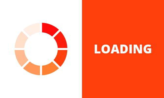
“Loading” animations / preloaders
Loading animations are making a strange comeback. We thought that we done with them somewhere mid 2000s. It was at that point that we finally had the hardware that was able to load any application we might have on our computer without the need to display a loading icon. You don’t see those on your smartphones or tablets either.
Yet, surprisingly, loading animations or icons are back on the web.
Though, keeping in mind the thing about the average size of a web page being constantly on the rise since 2010, the need for loading animations is maybe not that strange.
Their purpose is simple - to entertain the visitor while the page is being loaded.
Not a particularly nice trend, but with growing weight of web pages it’s probably here to stay, although if your website doesn’t load in under eight seconds then something is very, very wrong.
Lazy Loading
On websites that feed content continuously, Lazy Loading aids in viewing immediate website content without waiting for the entire page to load.
This is especially helpful for websites that are highly visual, such as Facebook, Instagram, or Pinterest. In a society where information is constantly being fed into our lives, lazy loading helps to simplify viewing of said content by loading only small chunks at a time.
Sketch App for UI design
Sketch is quickly replacing Photoshop for all UI design tasks ranging from low-fidelity wireframes to high-fidelity mockups & icon design.
Sketch App is a Mac-only application made specifically for web and mobile designers. It offers a smoother work environment to craft vector elements for any interface, yet it also retains many features you’d expect from Photoshop like text effects and layer styles.
While there’s no evidence that Sketch will ever be released for Windows, it has still become a valued choice by OS X users. The simplified workflow and cheaper price tag is giving Adobe a run for its money. If Sketch continues to provide the best UI design experience then it’ll surely continue growing well into 2020 and beyond.
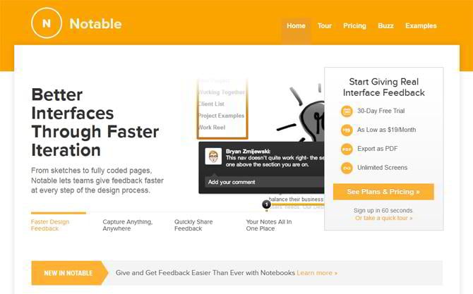
Collaboration tools for design
Instant messaging and group chat has been around for well over a decade. However these resources have traditionally relied on plaintext with some capability to attach files.
A new emerging trend is the ability to share live design documents within chat applications. Notable is one example where annotations and comments can be layered right on top of a document. This gives designers a clean way to share work directly with everyone on a team.
Slack is the most popular chat application at the moment which supports many similar features. The growing Slack userbase has been adamant about creating extensions that greatly improve Slack’s capabilities & tie into other products like Hangouts, MailChimp, and even WordPress.
Package Managers
Digital package managers have risen so quickly that they’re practically a requirement for modern web development. Solutions like Bower and NPM can save a lot of time starting new projects.
Mastering any new technology will take time and comes with a learning curve. But if there’s one thing that every frontend (or backend) developer should know, it’s a package manager. They require some knowledge of terminal commands but once you get used to the process you’ll never want to go back.
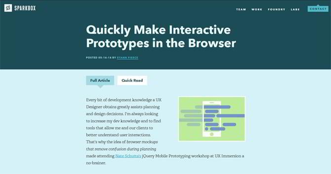
Designers will prototype in the browser in order to focus on interactions instead of layout
The limitations of prototyping tools have always been a pain-in-the-ass to test with real, dynamic content. There are countless Sketch/Adobe plugins to address this. It is becoming the norm for designers to have coding skills, making it more natural to open up inspector to overwrite live pages or throw together a quick jQuery prototype from scratch.
Allowing designers to focus on interactions rather than moving around content and information will allow them think about web in a fundamentally different way. We'll start seeing many more ways to interact at a micro-level on what we have traditionally expected to be static web pages.
Touch-supported website features
Smartphone browsers have always supported touch features for all websites to maintain backwards compatibility. Yet recently we’ve noticed more plugins and custom features appended onto websites with the specific goal of handling touch events.
Plugins like Photoswipe and Dragend.js are built to handle swiping and tapping on touchscreen displays. It seems web developers are not only building responsive websites, but touch-enabled websites too.
If you search around you’ll find some really impressive features built for the web that rely solely on touch events.
The growth of web components
Web components are trying to solve problems of complexity for developers. The WebComponents website (http://webcomponents.org/) has great resources and materials to give developers a jump start into this topic.
While components haven’t particularly blown up to mainstream status, they are being discussed by professional developers around the world. Google has released Polymer which is a framework used for adding web components via JS and HTML.
This may not be practical to use in major client projects just yet. However the technology is available and with a little practice you can master the concepts with ease.
CSS3 will finally impact layouts
Browser support for CSS3 has been growing over the past couple of years, and we're finally reaching a stage where some of the fancy new CSS3 layout modules can be safely used in the wild. Of course there's still a place for polyfills and fallbacks, but the likes of CSS3 Flexbox (Flexible Box Layout) can be handled by the latest releases of all the popular browsers.
It is safe to say that the likes of Flexbox wont be revolutionizing the aesthetics of layout in any dramatic sense – Flexbox offers an easier solution to a layout paradigm that's been in use on the web for a long time now – but it will make for faster-rendering pages that are easier to maintain, and a lot fewer hacks, so it is quite possible that we'll see more creativity in layout as a result.
The trend may not substantially alter the layouts, but the code underpinning them will become simpler and more reliable.
CSS shapes
CSS shapes allow a designer to flow his/her layout into shapes like a circle. The outcome looks really cool, but as of yet, it is not supported by all browsers.
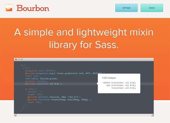
Free Sass/SCSS mixins
Preprocessors have been trendy for years but only recently became mainstream enough to feel ubiquitous across the entire field of web design/development. Nowadays it seems odd to write vanilla CSS when Sass/SCSS can provide so much more.
One benefit is a growing supply of Sass mixin libraries. Simple mixins are like code snippets or basic functions to generate repeatable code in CSS. While you can always write your own, many developers have been kind enough to release free mixins online.
Some mixins come in libraries like Bourbon while others can be standalone items. Try doing a search in GitHub for Sass/SCSS mixins to see what you can find.
Server-side JavaScript
While there have been past options for server-side JS, none have permeated as quickly as Node.js. JavaScript devs have fallen in love with this library and watched it rise into direct competition with other backend languages such as Python or PHP.
Node allows developers to build websites using a single language for both frontend + backend code. And resources like Node Package Manager give even more value to Node.js.
From what we can tell, Node is still on the upswing and continues to gain traction from industry enthusiasts. Whether you plan to learn Node or not, there’s no doubt it’ll continue to grow as a major trend in 2020.
Native JS Mobile Apps
We are big advocates of using the right tools for the job. In the case of mobile app development this means Java for Android, Objective-C/Swift for iOS.
But not everyone wants to learn a new language just to build a mobile app. Thankfully it’s becoming easier for native apps to be created & compiled with alternate libraries such as NativeScript or React Native.
The gap for becoming a mobile app programmer is shortening with the ability to create mobile apps via JavaScript. PhoneGap is yet another option based on HTML/CSS/JS code.
While the creation process does vary greatly, JS is quickly becoming a solution for coders who want to build mobile apps without learning a new language.
Designers learning to code
A hot button topic this year has been the case for designers learning to code. Some designers feel it’s not their job to write code, while others feel it’s becoming the norm & should be embraced.
A good design is just a pretty picture without code. Yet to focus on both requires a designer to spend less time practicing the craft.
So is there a definitive answer? Some would argue that job viability increases for designers who know frontend coding. Yet what if someone doesn’t want to write code? Is it worth learning just to compete?
We feel the clearest answer is to do whatever you want. But it seems this topic is still on the table for many designers who will likely continue the discussion into 2020.
Online learning resources
We all know that now is the easiest time to learn any skill from the comfort of your computer. It seems the online learning marketplace is growing exponentially with new courses and websites popping up every year.
We feel more confident than ever before that we’ll see a rise of online learning. Well-known sites like Treehouse and CodeSchool offer incredible courses alongside newer sites like Bitfountain and Learn-Verified.
If there’s a subject you want to learn, there’s likely a course online – especially if you want to learn digital techniques like UI design or app development.
Free online tools & webapps
It used to be that all programs were run from the desktop no matter what you needed to do. But nowadays we are consistently amazed with how many webapps are available for free online.
You’ll find everything from URL encoding/decoding to a completely free Markdown editor. Even Google Drive has taken Microsoft Office products into the browser (again, completely free).
The current level of computing power and homogenous standards from web browsers offer a seemingly limitless amount of opportunities. Complex tasks like resume creation to image compression can be handled right from a browser window.
Mobile apps design
With the dominant of both mobile apps and social media, most of the traffic comes to website from mobile phones. Building content in mobile apps is necessary because of this reason. It’s quite sensible as just only 14% of time spending on a mobile device is from browser, while the rest of 86% is from mobile apps.
Web designs of 2020 should also be compatible to
Since Internet and Technology is allowing Semantic Web to become a reality, we believe this is to be the next thing designers and engineers will do for 2020 and beyond. In our opinion, they will be focused on improving UX with Wearables, Augmented Reality and Virtual Reality. Who knows how your next monitor / TV set will look in the near future…
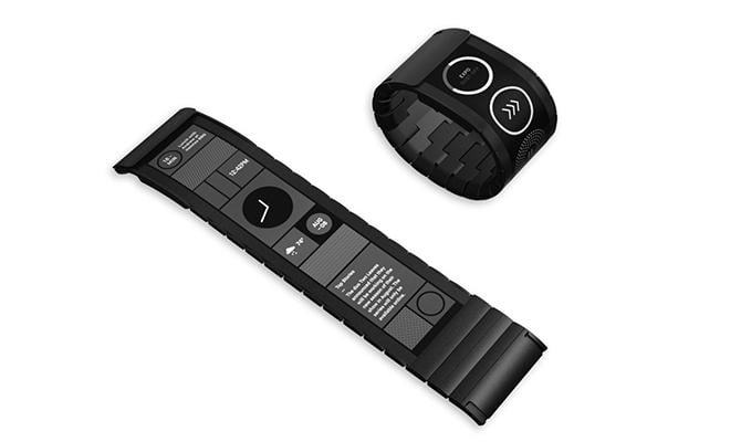
Wearables
Wearables are popping out everywhere and the market is waiting for the "iPod magic" to happen. Sooner or later in 2020 web designers and engineers will find themselves developing for this category. It might not be "mobile first" anymore and will be "wear it first" trend.
Wove is the example of gadgets we are talking of. Everybody is expecting more products of this kind to be developed soon.
Augmented Reality and VR
Same as wearables but this is where all of us are most excited at. Augmented vision gadgets and solutions are getting much more advanced, consumer friendly and available.
HoloLens from Microsoft
and a future product of Facebook, we mean OculusVRacquired by them might make designing for Augmented and Virtual Reality happen in 2020.
From "Retina Ready" to "Augmented Virtual Reality Ready"
Imagine designing for a very interactive environment, where you design the website making visitors extract pieces of data from your site, place it in memory to be viewed and placed anywhere the hardware limits them. Structured data / Micro data will make it happen, just like how Google was able to take bits of information from a well-structured site and present it to SERP.
Artificial intelligence
Artificial intelligence will visibly penetrate the web on our communication platforms. Designers will supply them with human features. The site will automatically adjust depending on each user or viewer.
Surfacing contextual information has made great progress over the past few years. Now, artificial intelligence will help you take action. This is a design challenge because we want our AI to feel so much like you're talking to a human that you won't even notice the difference. We're seeing it on mobile already, but the real leverage is happening in one of the most traditional web mediums - email.
Click these links to get a clearer notion of what we are talking of:
A personal assistant who schedules meetings for you.
Introducing Smart Reply in Inbox by Gmail.
Facebook’s boldest experiment.
Your 24/7 Concierge Whatever you need, 24/7 on demand.
Microsoft’s Xiaoice virtual companion.
To make things short, you have just read our vision of web design trends that will become (or continue to be) popular in the current year. Some of them sound futuristic and some are more down to earth. IMO, 2020 web design trends will still be moving towards designing for Physical / Virtual / Hardware Interaction in Semantic philosophy. And what do you think? What trends are going to thrive in the current year? Please feel free to make your amendments to our list at the comment section. And please don’t forget to like and share the article if you consider it worthy.
Web design is basically the process of creating websites with different aspects and its landscape if constantly evolving. Therefore, every year the web design industry also undergoes through some new changes to stay inspiring and relevant. Further, it’s very common among all designers to believe the fact that changing with the time and trends is a tough part of their job because to keep constantly updated is mandatory.
On the other hand, users demand three parameters from developers and that is the site should be interactive, personal and relevant which further means that web designers are now facing a challenge of developing a site which is as per the needs of their users.

You can also visit various websites that have the best design and it can inspire you to learn the new visuals of the world because watching the work of others will help you to keep on improving your designing skills and you will also be updated with latest technologies.
Check out, some of Best HTML5 Templates!
Why do you need a website for your online business?
You need a website to make your online business more popular. In fact, the site will serve you as the online business platform. You can talk about your company and featured products or services. You can even directly sell products or services through the website. But, for all these things, you need to develop your site carefully. It should be appropriately designed otherwise it would show up a lot of errors or issues. For efficient website design, a few things are required to be followed. You need to learn about various aspects of the website carefully. Also, good website design is following the latest trends.
Top 15 Amazing Web Design Trends for 2020
1. Open Composition
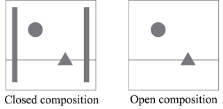
One of the most common and popularly used web design trends is open composition. Basically, it is loosely suspended items that are moving off screen and will gain a popularity basis that only. One example is the website of Romain PSD and distribution of elements on this website shows that it will still exist somewhere beyond the limits of the system.
2. GIFs and Animations
Using animations and GIFs is the other latest trend of web designing. Nowadays, GIFs are everywhere and it’s great too. It provides you a richer product experience and explains workflow in a better way, but keep in mind and don’t overuse them. Therefore, with various GIF creation tools, web designers are not limited to their design process.
3. Fixed Scrolling Navigation
Navigation is made to help users to move from one point to another on the website and by keeping the navigation menu at the fixed place it allows users to navigate the website from any location on the page. This is becoming easier with various plugins easily available on the web. Further, fixed navbar is also very handy for mobile users.
4. Bold Typography

Nowadays, many companies are adapting big and bold typography to make their home pages. In fact, this style works best when you want to keep rest of the pages minimal and clean.
5. Asymmetry
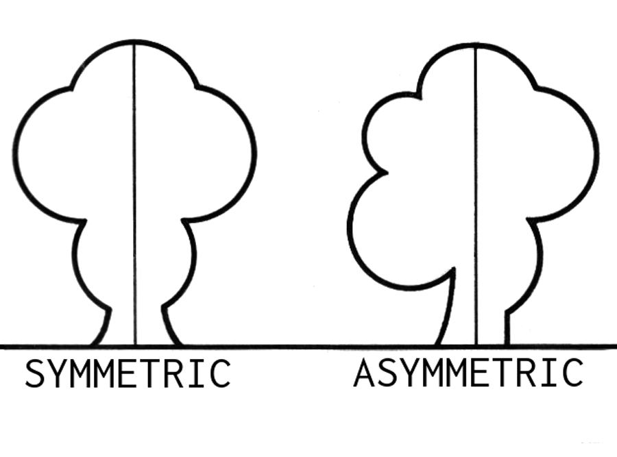
This is the other very famous web design trend and many designers are creating asymmetric layouts with perfect and balanced execution. This is a simple, basic and clean web design trend and anyone can use it easily.
6. Minimalistic Web Design
By using this web design, users are now presented directly with a card. Basically, it acts as entry points which will further become a doorway to more information for users. Various cards can also be used to visually suggest a topic and that too within a website only. One of the best examples of this is the website of Netflix.
This web design will also go for menus and navigation and further keep them as simple as possible because the main thing is that today, people want de-cluttered and visually explanatory web designs. If someone looking for WordPress minimalistic web design then buy stock photoresponsive WordPress theme to showcase their portfolio.

7. Cinemagraphs
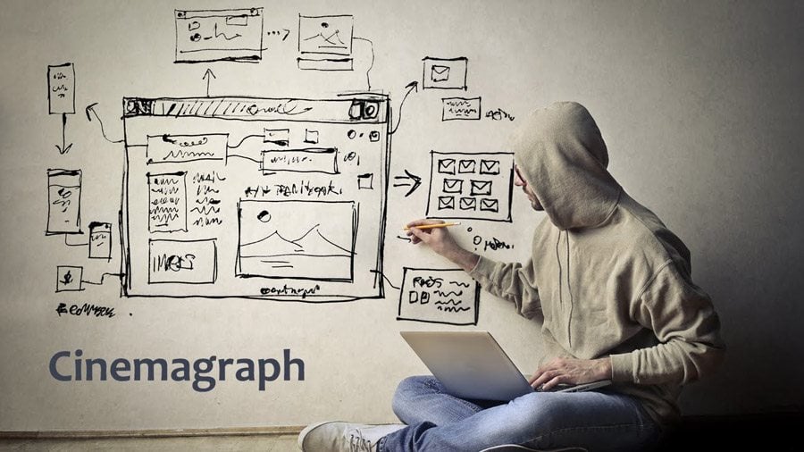
Cinemagraphs are high-quality videos or GIFs which usually run on a smooth loop. It is becoming a very popular way to add visual interest to pages. Its full-screen loops hold the reader’s attention for longer.
8. All Caps Corner Links
This trend is also spreading rapidly among web designers. Almost every professional business and startup is using all caps text styles to create a web design which is more attractive and symmetrical. Further, this web design is also becoming a signature style for a clean and crisp navigation.
9. Decorative Details

An approach to details is also changing from the past few years and there are many elements that have decorative functions. In this web design buttons are rarely created as harsh rectangles with some eye catchy texts inserted in the middle. Further, they are often designed as soft and shifted dashes. Another famous button style is to develop spectacular hovers in the canvas like many websites do.
10. Material Design
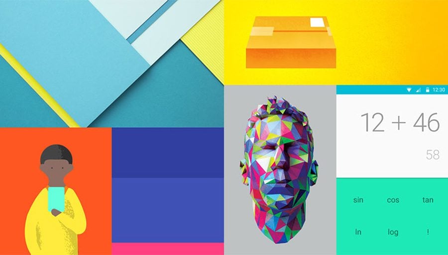
Another superb web design is material design which has been developed by Google in the past few years and after it is being rolled out across its various applications at a very high speed. It is basically a new and innovative way of designing to create a hierarchy of meaning and importance of any page. Further, it also uses various geometric shapes to visually enhance their website and create depth in that.
11. Responsive Website Design
When it comes to website designing, responsive web design is considered as the trend. Today, everyone uses smartphone devices or mobile phones. Website owners must deal with various aspects of responsive design website for that reason. This is a technique of building a website that is compatible with multiple web browsers or web-accessing devices. You can seamlessly open responsive webpage via your Smartphone and laptop or desktop. The site will open smoothly without any hassles. The website shall open without showing up any resolution problems or disarray.
Responsive website designing is the latest trend in the world of website designing, though it must be understood carefully. Not all website designers are poised with knowledge and ability to build responsive websites. Therefore, website owners need to find a professional service provider which is poised with the experience to deliver the best solution in responsive website designing. The aspects of this type of website designing are to be followed carefully. Not all service providers can provide the best responsive website designing support to the website owners.
12. Geometry
This trend is an awesome and easy way to make your site best among others, and I’ll tell you why.
First of all, all those rounds and squares and triangles look very minimalistic and we already know that minimalism is a trend. People like when their eye notice what they want and need right away and of course, it is good for a seller as well.
Secondly, our trendy simple minimalistic elements won’t overload the site, so the speed will be also on top.
And the last reason is just that it looks cool.
13. Broken grid
Instead of using straight and formal lines for headers, ads, whatever you need, use a broken grid. You’ll see how your text becomes more catchy and let the reader notice what you say!
Can we relate this trend with Geometry and Assymetry? Yes. So you want to double your being in trend? Experiment with the grids and layouts.
14. Following Search Engine Guidelines
Even a few years earlier, people were not careful when reading search engine guidelines before developing websites. But, things have changed quite drastically these days. People want to follow search engine guidelines so that their sites can eventually become the perfect platform for business transactions. Most importantly, it will help the businesses to grow quite popular via search engines. In other words, the websites that follow search engine guidelines will obtain obvious business marketing benefits. It will help the businesses to grow optimally.
Following search engine guidelines for website designing will surely help you to keep pace with the latest website designing trend. It will help your business to move towards success. It will help your business to obtain better business benefits. Secondly, it will help your business to grow optimally. The most important thing is that your business shall have a better presence on the internet due to effective business marketing through the search engines.
15. Effective Website Marketing with Social Media Buttons
Today, every website should have provisions for online marketing otherwise it is futile to have a site. You need to incorporate social media buttons or widgets to make your website accessible. This will help your business to gain more exposure, which will undoubtedly lead to high profitability. To make your company long sustaining, efficient and seamless website designing planning is needed. Most importantly social media integration is essential these days to gain more business exposure. It is imperative to use social media correctly, and if that happens, it will be a matter of time for your business to taste the highest form of success.
What’s Next? Top Web Design Trends in 2020
In this section, we will discuss the web design trends that will dominate in 2020 and beyond. This includes current trends that will reach their peak in the near future or new trends that have recently emerged.
So, let’s have a look at some of the key web design trends for 2020.
1. Asymmetric Layouts
Gone are the days when web designers followed a simple grid layout. In 2020, more designers will experiment with asymmetric or broken grid layouts.
This will entail placing design elements in an unorganized way to give them a random look and feel. The key driver for this trend will be the fact that chaotic design elements make the website look more creative and experimental. Breaking from tradition makes these websites stand out.
This is not necessarily a recent trend, but it will gain more popularity in 2020 and beyond.
DADA-DATA
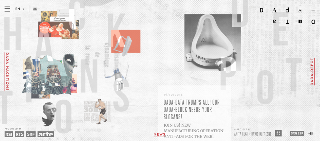
The website shown above has randomly-placed design elements and clicking on any one of them will take you to another page. The whole randomness and chaos of this website make it interesting and engaging.
2. Accessible Websites
With the growing awareness and understanding of the importance of making websites accessible for all, this will be a growing trend. More websites will try to comply with ADA guidelines and add accessibility features.
Web design agencies will leverage AI-based accessibility solutions like accessiBe to make ADA compliant websites that are accessible to all users. Powerful accessibility solutions like these will automatically detect any accessibility issues and make websites accessible within a matter of days.
In the screenshot shown above, the blue icon at the bottom-right corner opens an accessibility interface to make the website more user-friendly for the specially-abled. The AI completes the accessibility process by providing data to screen-readers with the ARIA set of attributes, and adjusting the website’s HTML to make it fully navigable by a keyboard.
3. Drawings and Sketches
As people strive to add more personality and character to their websites, more websites will add these elements. Hand drawings, doodles, sketches, etc. add charm and a human element to the website.
Websites containing these elements can stand out from the sea of websites out there, all trying to differentiate themselves. This trend has been present for some time now but is yet to reach its peak.
Enchanting Marketing
See how this website has used hand drawings to give a creative look and personality to their website. It also makes the design clean and minimal yet visually-appealing. Overall, it is a good tactic that any sort of creative business can use for their website.
4. Augmented Reality
This is a web design trend that is still in a nascent stage but it will grow stronger in 2020 and beyond. You can see this already on some beauty websites where you can upload your picture and try on makeup products. Going forward, this trend will also be adopted by other types of retail websites like apparel, home decor, etc.
As technology advances, it will become easier for web designers to add such AR elements to their websites and apps. There are several tools like Artivive that allow you to add AR design elements to your website without much hassle.
IKEA Place
IKEA Place is a brilliant example of augmented reality in use. This allows users to upload a picture of their room and see how the furniture will look in it before they make a purchase. This enables users to make better buying decisions and also drives engagement.
Web Design Trends Infographic - On The Time Machine Through the Years 2004-2015
Get into the time machine to start a captivating journey from past to future of web design. All you wanted to know about the history of trends, you’ll find in Web Design Trends Infographic, the complete guide that will give you a close look at all changes happened during 2004-2014 years and a foolproof 2015 prediction. Let’s start and dive deeply into the versatile world of web design and its run through years.
Today I dare say that TemplateMonster designers have built the time machine, and now it's possible to learn more about web trends and the way the best designs looked in the past. You can object that old times have gone with the wind of the past, and there is no need to return to them, but there is a side of the question that you can’t put out of account. Everything new is actually well-forgotten old, and to be well versed in today’s design tendencies, you have to know their origins, and possible prerequisits for their uprise. This understanding will also help you trim your sails to the wind and foresee the forthcoming tendencies in design. Whether you’re a web designer, a specialist of any web niche or the average user of Internet, this infographic will come in handy and give understanding of the main web trends. The infographic is fully responsive cause it was created catering the need of people who browse the Web from their smartphones.
Web Design Trends Infographic In Brief
This interactive infographic offers you to browse the major trends of the latest 12 years (from 2004 to 2015) in web design industry. The timeline page presents all of them in a vertical accordion slider, and you can browse each year by clicking the correspondent cell. Pop-up window with a short description will tell in brief the main idea of the trend and bright examples will nicely illustrate it. Thumbnails below the pop-up will indicate the other trends of the same year. To come back to the list of all years, just click “back to all years” button.
* * *
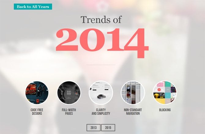
Being interactive, this infographic allows you intuitive browsing though all the data and thus a pleasant experience of working with it. To dip into what you'll get in the infographic, check out a list of trends presented in it.
- Large Hero Areas
- Micro Interactions
- Monochromatic Colors
- Material Design
- Code Free Designs
- Full-Width Pages
- Clarity and Simplicity
- Non-Standard Navigation
- Blocking
- Flat Design
- Video Backgrounds
- Metro Style
- Fixed Header
- Mixed Typography
- Responsive Web Design
- Vertical Narratives
- Skeuomorphism
- Interactivity (CSS3, jQuery & HTML5)
- Circular Design Elements
- Boards and Grids
- Full-Screen Photo Backgrounds
- Parallax Scrolling
- Diagonal Designs
- Ribbons and Stitches
- Minimalism
- Typography
- Based Designs
- Fixed Position Navigation Bar
- 3D Environments
- Infographic Driven Designs
- Oversize Everything
- Radical Transparency
- Magazine Look
- One Page Layouts
- Textured Backgrounds
- Glowing Rainbow Backgrounds
- Grunge Style
- Handmade Elements
- Vintage and Retro
- Watercolor
- Glossy Interfaces
- Grid Format
- Highly-Textured Design
- Swirls and Flourishes
- Vector Illustrations
- Huge Fonts
- Neutral Background Colors
- Reflective Surfaces
- Badges and Labels
- Color Gradient Fills
- Horizontal Navigation
- Subtle Earth Tones
- Script Fonts
- Distance from the "5-Piece Website"
- XHTML + CSS Layouts
- Cluttered Layout
- Restrained, Pale Color Schemes
- All-Flash Sites
- Starburst Effect
- Patterns and Textures
Please, check our web developer themes WordPress to grab more web design inspiration.
FAQ
Of course, you can create your own unique style but if you use outdated tools – your whole project will look outdated. Even if you don’t copy the modern trends you have to keep yourself informed about them.
The audience’s tastes change rapidly. Just take a look at the fashion industry. The situation with web design is the same.
Definitely, yes. Some things, connected to tech are not changing. For example, all project has to be mobile-friendly. That feature won’t change until some new way of communication will be invented.
Read Also
5 Enticing Ways to Improve Your Web Design Skills
Web Design Guide to get Higher Conversion for your E-commerce Store
Top Web Design & Development Companies
How to Find Your Web Design Niche & Why Should You At All
How To Apply Marketing Psychology To Web Design
15 Creative Web Design Agencies. Websites Examples
Don’t miss out these all-time favourites
- The best hosting for a WordPress website. Tap our link to get the best price on the market with 82% off. If HostPapa didn’t impress you check out other alternatives.
- Website Installation service - to get your template up and running within just 6 hours without hassle. No minute is wasted and the work is going.
- ONE Membership - to download unlimited number of WordPress themes, plugins, ppt and other products within one license. Since bigger is always better.
- Ready-to-Use Website service is the ultimate solution that includes full template installation & configuration, content integration, implementation of must-have plugins, security features and Extended on-page SEO optimization. A team of developers will do all the work for you.
- Must-Have WordPress Plugins - to get the most essential plugins for your website in one bundle. All plugins will be installed, activated and checked for proper functioning.
- Finest Stock Images for Websites - to create amazing visuals. You’ll get access to Depositphotos.com to choose 15 images with unlimited topic and size selection.
- SSL Certificate Creation service - to get the absolute trust of your website visitors. Comodo Certificate is the most reliable https protocol that ensures users data safety against cyber attacks.
- Website speed optimization service - to increase UX of your site and get a better Google PageSpeed score.

Experienced writer passionate about highlighting all the topics related to web, design, marketing, SEO, and more. Follow Helga on Quora.
Get more to your email
Subscribe to our newsletter and access exclusive content and offers available only to MonsterPost subscribers.
