It’s not a secret that about 70% of internet users worldwide browse the web via various mobile devices. Chances are, you are doing that right now!
With the rise of mobile technology and the rate the market of mobile devices is growing, it shouldn’t come as a surprise that modern websites are expected to be accommodating for the mobile users. Heck, Google has already banned websites that are not optimized for mobile from their mobile search results! Yet, the number of websites they are flawlessly performing on mobile devices is still rather low.
The reason for this mobile unfriendliness of the majority of online businesses is probably that most of the website owners consider the redesign to be an expensive, complex and scary thing to do.
Since you are reading this article, you probably understand that frustrating the majority of your website visitors with awful mobile experience is not the best business practice. So how do go about making your website mobile-friendly without too much effort and financial loss? The answer is the responsive design of course.
There are other ways of making a website mobile friendly, such as m-dot version, which is basically a second website for your business; and mobile app, which yet again is a separate entity. The beauty of responsive design is that it allows you to create just one website and it will flawlessly operate for all of your users, mobile and desktop alike.
What is Responsive Web Design?
Responsive web design (RWD) is an approach to web design aimed at allowing desktop web pages to be viewed in response to the size of the screen or web browser one is viewing with. A site designed with RWD adapts the layout to the viewing environment by using fluid, proportion-based grids, flexible images, and CSS3 media queries
Fluid grids, flexible images, and media queries are the very things that create the magic of responsive website design. Let’s understand what they are and how they work.
- The fluid grid is basically a content arrangement with no fixed width, it’s an area composed of vertical and horizontal lines that intersect. By adjusting the elements within these lines in the grid you arrange the content in a predictable and consistent way.
- Flexible images are images and any other media that can adjust to any screen size. These visual assets are placed within a grid and can not get bigger than the said grid they are put into, but can resize fluidly within it and not loose any aspect ratio.
- Media queries are a bit more complex to understand. This is a CSS3(Cascading Style Sheets) module that controls which styles are applied to a media attribute. The styles are applied based on the qualities specific to a device that is being used to view a page, such things as the width of the screen, it’s height and orientation etc.
How do you make your website responsive?
If by now you’ve started searching for coding lessons online or estimating how much it’ll cost to make a responsive design from scratch - stop! There’s a better, faster and cheaper option - website templates.
There’s a number of good providers on the market, and TemplateMonster is one of the best. Why? The designs are modern, easy to customize and there’s lifelong tech support. This last feature is rare when it comes to web templates.
How do you create a website from a template?
First of all, you need to create a plan, research the features you want to have on your improved website, check what your competitors have, ask your SEO and marketing teams how you should improve it to perform and convert better.
It’s a great idea to ask your audience if there’s anything, except responsiveness, they’d want to see changed. User experience is the cornerstone of the success.
When you have a list of features ready and have an estimated budget it’s high time to see the designs. If you use a popular CMS like WordPress the choice will be wider, but the customization is going to be a lot easier.
Here are a couple of examples of modern, stylish and fully responsive business themes to give you an idea of what you can get:
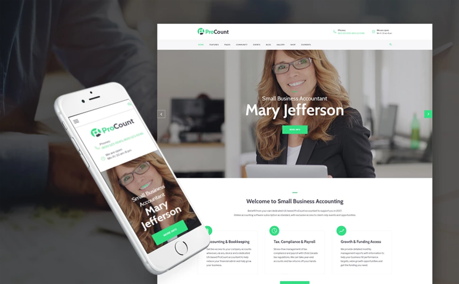
This theme is a perfect example of modern web design done right. An accountant’s website will be perfectly accommodated with this WP template. A business website does not have to be dull, don’t you think? This theme offers stylish looks along with brilliantly powerful functionality. I love the slider and appointment booking widget, I believe just these two small things are going to make a huge difference in your user experience and thus conversions.
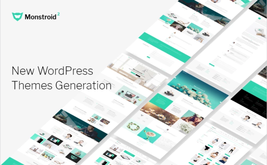
If you want more freedom and flexibility going for a multipurpose theme is the best decision you can make. This one is basically 9 pre-built websites for the price of one! I love how customizable it is, there is a wide choice of blog styles and header styles, there is even WooCommerce plugin pre-installed
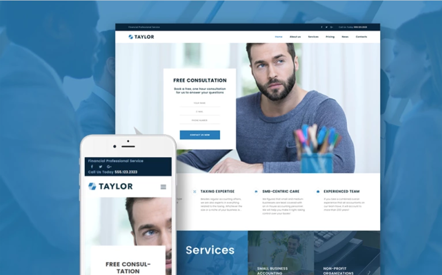
This here is another stylish design for an accountant firm online presence. The offered multiple layout options give you a chance to make your website look just the way it did before redesign, but better. I am quite impressed with the custom widgets and content modules this theme is packed with. You just need to see the demo!
After you’ve chosen your responsive template it needs to be filled with your content and you need to have it uploaded and launched on your hosting. You can hire a specialist separately or order customization and other services needed when you make the purchase.
And that’s it, you have your responsive website up and making you tons of conversions from your mobile visitors! See, it’s not that hard to do.


Hello, I'm Tracy, nice to meet you here, on MonsterPost blog. As a part of the big team of TM writers, I make articles on various themes, such as website creation tips, web design templates usage and so on.
Get more to your email
Subscribe to our newsletter and access exclusive content and offers available only to MonsterPost subscribers.

Leave a Reply
You must be logged in to post a comment.