Establishing The Visual Hierarchy
Have you ever thought of what helped us to evolve from the chaotic 90’s design to something we have now?
The answer is quite simple: we owe one to the visual hierarchy and it’s followers.
We have already discussed how to work with the typography on your website. We've highlighted the most important points on organizing the typographic hierarchy on your website. But visual hierarchy is about all the tools you have in your designer’s bag of knowledge: contrast, spacing, typography, color. All these things can help you structure your content in the most efficient and beautiful way.
What is the most important thing in the website design? That’s right, it’s crucial for the user to be guided through the website content. You should make it simple for him to navigate your website and find all the needed information in a blink of an eye.
Content reading patterns
We all know the traditional reading techniques for the books and newspapers. However, it’s a bit more complicated for the web pages. When a customer opens your website there are two possible options on how he’ll read it. These options are called patterns and I’ll tell you a little bit about each pattern and when it’s applicable.
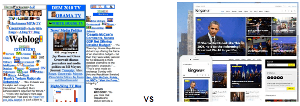
F-Patterns
These are usually applied to the blogs like ours. When you have a large feed of information on the left and a sidebar on the right, your website user will look through your page trying to find the most interesting headlines. Once he finds something interesting he starts reading it and moving to the right for additional information or moves to the sidebar to navigate additional features.
When you look at the statistics (like the screenshot above), you’ll notice that the hottest zones of user’s attention form a shape looking like an ‘F’ letter.
If you are trying to build a theme for the blog or website with lots of content, make sure you highlight your headlines by making them bold and locate them on the left side of your website.
Wanna see a website with the F-Pattern? You are reading an article on one right now! 🙂
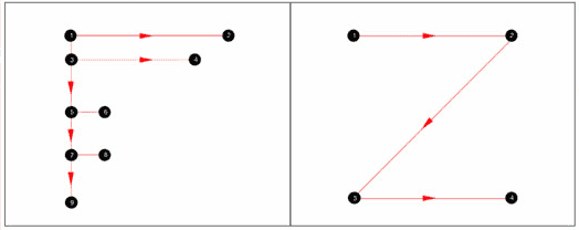
Z - patterns
For all other types of websites, you can apply the Z-pattern. When a user visits the website he looks attentively through the top panel to check all the important info like logo and menu. Then he moves to the opposite corner diagonally and does the same thing on the lower part of the page.
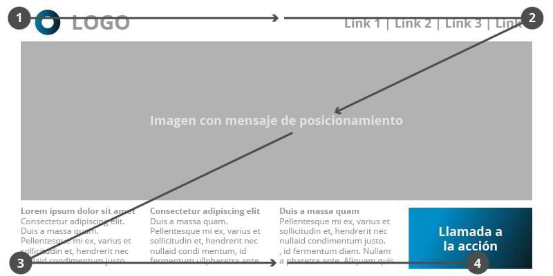
That is why many web designers strive to locate the most important and useful information on the top panel, bottom panel and across the diagonal.
Here is the example of the Z-pattern website.
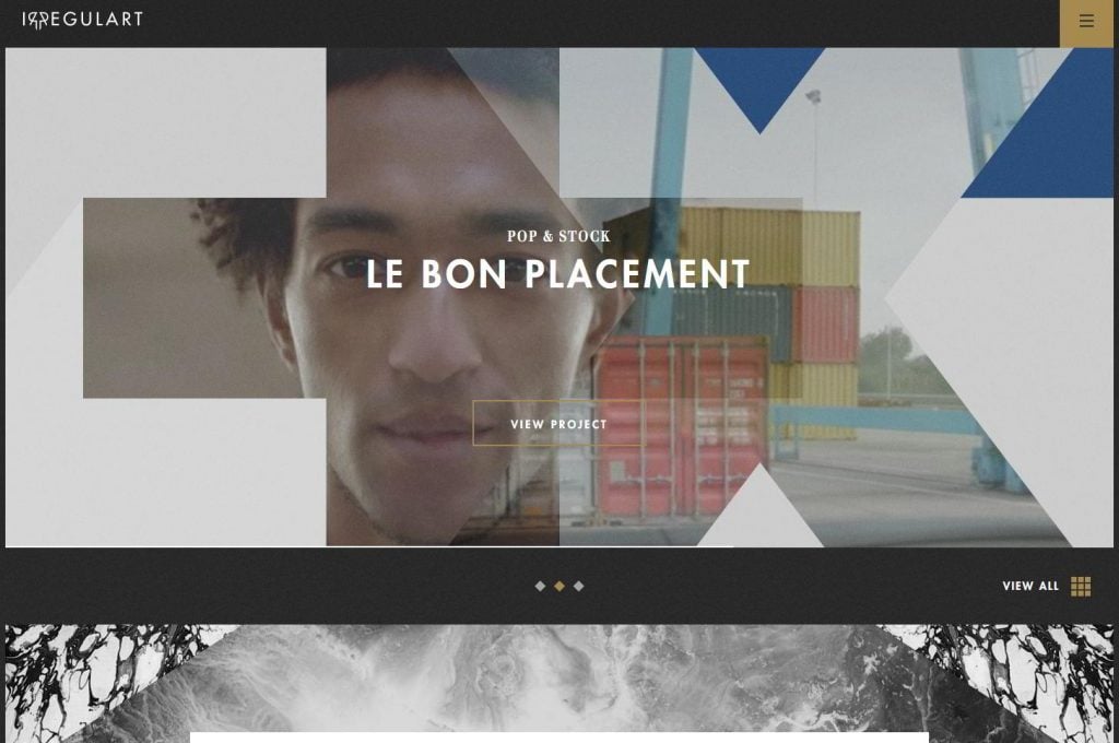
http://www.irregulart.com/
Ways to implement the visual hierarchy
As I’ve already mentioned, in order to structure your content in the most efficient way you should be able to utilize a certain number of design skills. Talking is always easy, but let’s face the ways of the visual hierarchy implementation. Our main goal here is learn something new and gain knowledge, right?
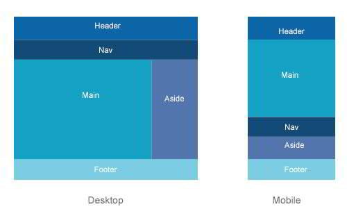
Layout and Sizing
Since we’ve discussed the content reading patterns, I believe it will be fair to talk about the website layouts first.
Looking for a direct way to affect and improve your visual hierarchy? Trust me, there is no more direct option than the website layout itself.
Feel free to use rows, columns to structure the information on your website and keep the chaos under control.
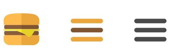
Using parallax effects, hamburger menus and other features will help you keep the users’ interaction with your website effective and convenient.

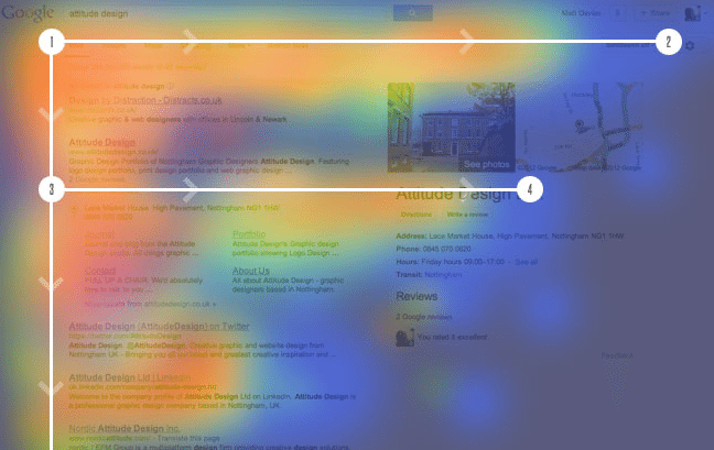
By the way, have you ever heard of the Fitt’s Law? It helps web designers (and not only us) predict the amount of time needed to move to the certain object of the interface.
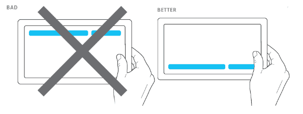
This law helps designers to position the important elements of the interface where the user will not have any problems reaching it.
You should aim for reducing the distance from one design element to another, but keep in mind that it’s also important to make the object big enough, so the client wouldn’t have to aim before clicking for a few minutes.
For example, good practice of positioning the interface elements may be seen on the image below. As you can see, the buttons a large enough, they are noticeable, it’s easy to reach them and operate with them.
So as you could have already understood, it takes the biggest amount of time for the user to reach the objects that are small. If they are located far away from each other, it will make it even longer.
Be the way, if you are interested in getting deeper into the Fitt's Law understanding, here is a great video for you.
Spacing
Spacing plays one of the leading roles in the visual hierarchy. There are plenty of websites that had some great layout ideas, but then they screwed everything up by not including enough white space in their website design.
Even if you are trying to provide your audience with the biggest amount of information on the market, you should present this information with a certain amount of spacing.
Yeah, I understand that it’s very tempting to use all the free space on your website and make use of it.
Clean website design includes active and passive white spacing. Mastering the micro and macro white space will definitely benefit your design, as well.
We have a separate article on spacing usage in the web-design, so if you want to dive a little bit deeper, feel free to check it out. You’ll see what is that and will be able to look through the examples to see how it works in real life.
Color
The colors you choose will service you as the tools to influence your website visual hierarchy.
If you just stop for a second and look through the websites you visit on a daily basis and the websites you truly love to use, you’ll notice how the contrast and the choice of color guides you through the website’s content.
For example, I really like how the guys from the Stanford d.school highlight the content with the bright colors while guiding you through their website. If you pay attention to the movement of your eyes, you’ll notice that first of all the headlines and the ‘Read more’ buttons catch your eyes and only then you take a look at the picture on the right.
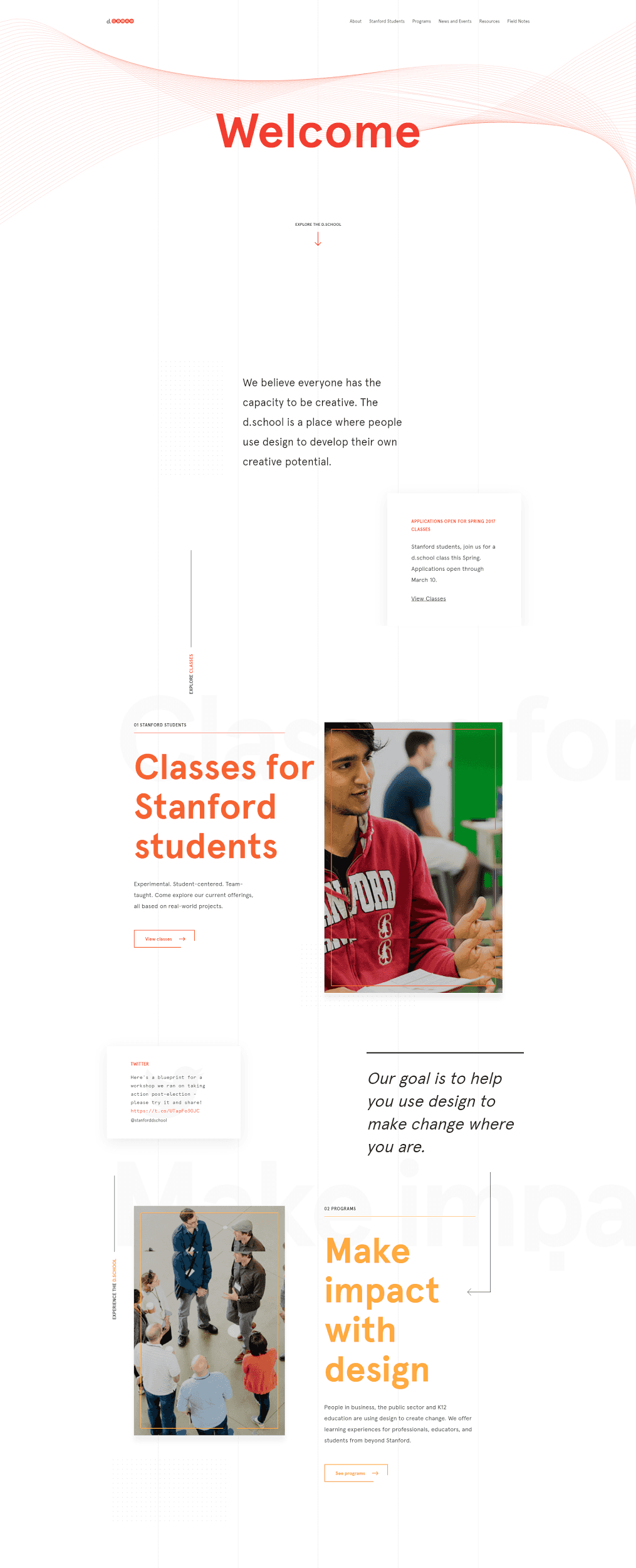
https://dschool.stanford.edu/
We've described all the ins and outs of the color theory in our previous article. Choose your color scheme and learn how to use the color wheel with us!
Typeface weight and sizing
This is pretty obvious that one of the important points in the visual hierarchy is the typographic hierarchy. It helps you structure your texts on the website in the way you want your user to consume the information.
In the most cases, web-designers have to present the texts in the way it reaches the audience and hits it like a storm. Nobody likes reading the monotonous texts without any visual difference throughout the whole block or article.
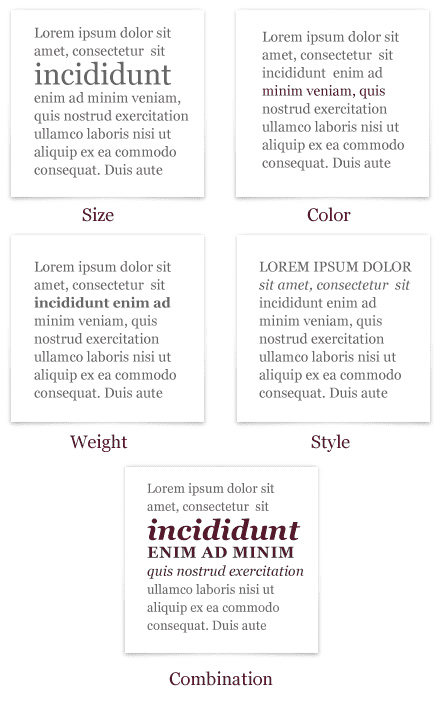
That’s where you should utilize the weight and sizing. Simply highlight the paragraphs or information blocks in the order you need the user pay attention to them and it will ease the overall user experience.
Don’t overuse the text styling on your website, there is no need to make the 60% of your text bold and italic or apply 10 fonts to the same article, but different paragraphs. Make it simple, yet eye-catching.
Make sure you read our typographic hierarchy guide and learn to understand how it works.
Summing things up
Keeping your visual hierarchy in order is the key to making your website user happy and satisfied with the overall website interaction.
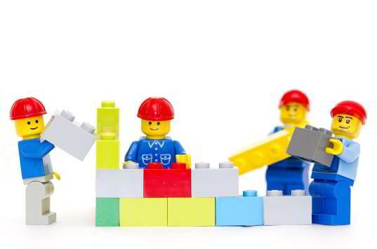
Have you ever assembled a big Lego pack without the instructions and guidelines? That’s pretty much the same stuff, but not under our watch! As you can see, we’ve compiled a bunch of articles that will help you structure your website the right way. Keep in mind all the aspects of the visual hierarchy and go for it, we will be glad to see your design masterpieces!

Creative writer passionate about WordPress and all that technical stuff. Meet Alex in person on LinkedIn.
Get more to your email
Subscribe to our newsletter and access exclusive content and offers available only to MonsterPost subscribers.

Leave a Reply
You must be logged in to post a comment.