The Forgotten Basics of Website Typography
Building a website can take time with everything from user experience, user interface, marketing plans, etc. But one forgotten thing is website typography . It’s something so simple, yet effective.
The things typography can do are communicate through words and colors, change the meaning of a group of words, and achieve a greater amount of graphic design appeal. Typography can also alter a message even with the same words applied to it.

When it comes to creating user interface with words, some things are so easy to forget that it can make a difference in converting a website visitor into a future customer.
Here are some basics that you can keep in mind when it comes to creating your business website .
Typeface
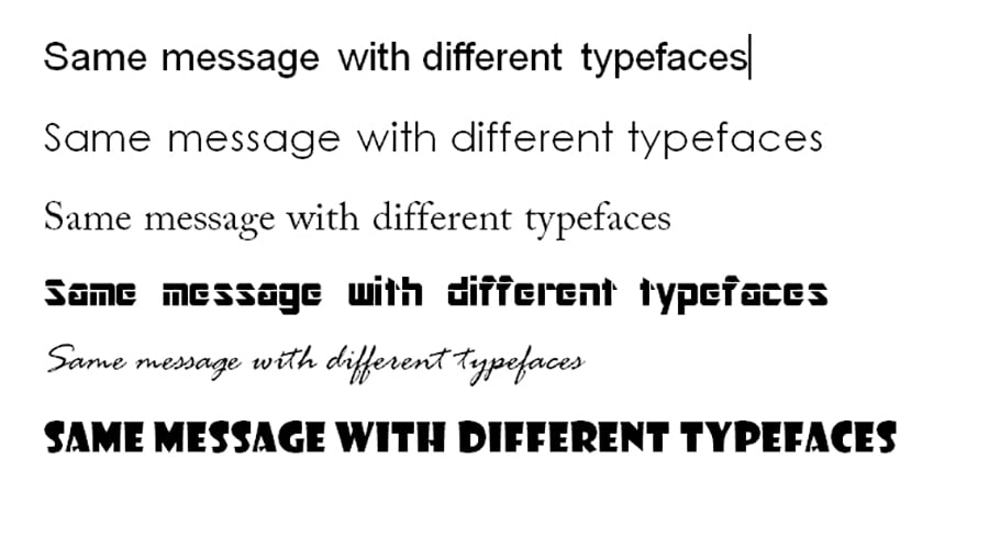
One of the common misconceptions of typeface is the confusion between the words typeface and fonts. Typeface is a family of fonts and font is the style within those typefaces. An example of typeface is Helvetica. Within the Helvetica typeface is Regular, Bold, Black, Italic, etc.
Typeface will give you weights (italic, bold) to choose from without compromising the typeface itself. With italics, it will slant it but you could still tell it’s the typeface Helvetica.
Below are multiple typefaces, more than the average person let alone the average designer can think of.
Font
As a subset of typeface, fonts create and change in a creative way that lets the creativity of the designer shine through.
Fonts are distinguished by their weight, so it’s important that they keep their same anatomy without discrediting the typeface itself.
In an educational and professional text, it’s often asked to use the basic professional type fonts such a Times New Roman, Tahoma, or Georgia. In web design, it’s more flexible with the use of other creative types such as Rissa , Pacha , or Kust .

Typeface classifications
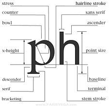
Those little stems attached on some letters make a difference in the typography of a website. As a standard rule, sans serif is best used for titles and headers while serif is good for paragraphs and bodies of text.
Serif : any of the short lines stemming from and at an angle to the upper and lower ends of the strokes of a letter
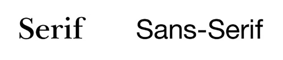
Sans serif : a letter or typeface with no serifs
Color
The lack of color might work for websites such as Craigslist, but color is one of the most important of typography. It invites visitors and can even affect how they buy .
Color choice should be well-rounded as well as learning about your common user. Balance is key when using multiple colors so the user doesn’t get lost in the look of your website. Most importantly, the user is there for your content however the look can deter the user away from your website as color is very strong.
Kerning
Kerning is the individual space between two individual characters. It can make or break a returning visit and even take away your credibility if no one can read any of the words.
Adjusting kerning can be tedious, but in the long run, it can bring great results especially when printing a web page.
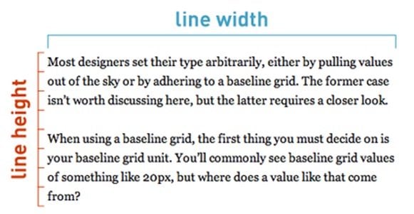
Leading
Leading is the amount of space between lines of text. Like kerning, space is important in leading. In CSS, it’s called line-height.
Readability is the crucial part of leading. Lines of text can look cramped. A leading measure of 22pt can look more cramped than a leading of 28pt.
Consider your typeface also as some have smaller kerning and it will look overcrowded.
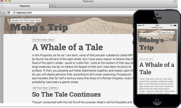
Line Height
On my very first website I ever created, my line height had more length than I needed. The words ran from edge to edge. Ask any web designer about their first website and they might tell you the same!
Line height makes a huge difference in making sure the reader reads your content and not skim it. The most important information is skipped over if it’s too long of a line or sentence to read. A common practice is 60-85 characters per line. It won’t matter how long your page is as long as the content is thoroughly read and the user leaves with something educational.
Whitespace
People look at the empty space on a website. Even though there’s nothing there, it’s still a needed space to give that person something to look at when they visit. They’re looking at your website as a whole and not just what is on the page.
A website visitor will see that white space and think if something is missing or not loaded yet. Making use of all space and not the middle part of the page is a common practice.
Fill your website up with useful content and not fluff. No matter your website, there’s a lot of information to fill whether it’s text, images, or advertising.
Weight
As a more creative aspect of typography, weight brings out text or a specific typeface font by bolding a word. Weights are used in the body, title, or images. It’s flexible in what it can do and provides a great deal of creativity to a web page.
Alignment
The four main alignments justified, left aligned, right-aligned, and centered. Text is usually read from left to right so left–aligned is the common and default alignment.
The rag, the ending of the right-hand side of a line of text, sometimes words are hyphenated and make a good balance between line length. Most of the time it’s not the same as letters and number of words are different on each line.
Centered alignment is common in titles or short lines of text. Some quoted words are commonly used as a center alignment.
In the end…
Many of the elements of web design typography are very flexible. You can start with some flexible website templates where you can add your special typography touch.
Significance of Typography in Design
Typography is a crucial aspect of a design anyday. Be it websites or business cards, written content, even if little, is fundamental to complete the whole picture. Typography puts words to the emotions and messages you want your visuals to convey. According to experts, typography helps to bring clarity to the unspoken visual elements lying around. It’s important because absence of words might at times provoke misleading understanding among viewers. Thoughtful use of typography eliminates such risks and enables the design to send a legible message to the viewers. More precisely, written words magnify the value of your design and make the whole content easy to read, understand & share.
Usage of typography also helps to beat visual fatigue. Plain visual arrangement can be monotonous for the viewer. Appropriate use and placement of written content bring variation in the picture and render meaning to the whole layout.
Research studies have shown, written words play a decisive role in influencing the audience. The stroke, arch, form and positioning of letters present a glimpse of your entire brand at a glance. No wonder, seasoned designers always stress on careful selection of typography in web design. Careful application of fonts helps to distinguish one theme from the other in a jiffy. And this is not limited to just web designs but applies to all forms of designs we can have. For example, typography is a major differentiation factor between warm inviting ceremonial invitation cards and sharp formal curt business cards.
Checklist-Typography Pdf [Free Ebook]</u+0421>
Interestingly, typography is a dynamic space where we see new typography trends with each passing. To start with, a responsive typeface is really the order of the day in the contemporary “smart” world. With 70% of the online users shifting to smartphones for web browsing, there is an increasing need for responsive websites. Responsive typefaces are designed to complement the responsive sites which grow & shrink according to the size of the browsing device. Mix & match typeface is also garnering a lot of attention of late. It’s excellent when you want to create a boho statement and would be cool for creative industries. Other recent trends in typography are geometric fonts and handwritten or hand-drawn styles.
Typography is powerful enough to make or break the unique aura of a design- be it for a website o a poster or a banner. Thus, designers have to be very particular regarding the selection of font style, size, line length as well as other related elements.
10 Powerful Web Typography Tools
Being one of the cornerstones of the web design aesthetics, web typography has moved forward and now any professional web designer can be armed with various online tools. We all know how important the striking typography is and how crucial it may be in terms of influence and the visual appearance of the website.
Now the designers can create their own fonts and easily embed them just by pasting some special code snippets or using the existing pieces of CSS code. So embedding awesome typography has definitely never been as easy as it is today.
In today's post we're proving just that - we'll present a list of tools that will help you easily improve your design's typographical aspect. These are real time savers for web professionals and we've tried to collect tools that cover various aspects of web typography creation and implementation. Well, let's start and of course feel free to share your favorite web typography tools that we may have missed.
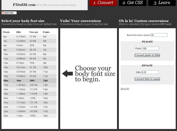
1. PXtoEM
Size always matters especially when you are going to choose appropriate font's size for your new design. PXtoEM calculates conversions based on your body font size, offers special calculator for your custom needs and delivers CSS file for the style you have chosen.
* * *
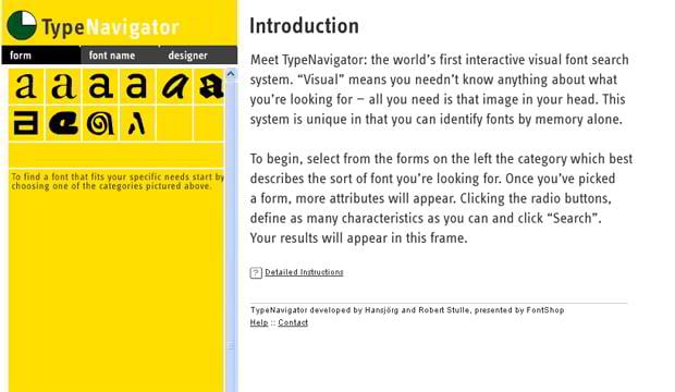
2. Type Navigator
This is a font visual search system which helps you to identify unknown fonts giving a proper information about font name and sometimes even about the designer who have created this font.
* * *
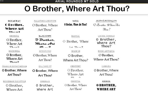
3. Flipping Typical
Flipping Typical is a very original tool that offers unique option to choose from different typography styles by looking at all of them at same time on one page. Just put the text in the box in a header and make a right choice.
* * *
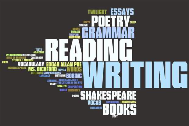
4. Wordle
Wordle typography tool is a great toy for creative folks that are going crazy about "word clouds". By using this service you can compose unique clouds by using various styles, fonts and colors. You can use the images that you've created in any way that you want - there are no any restrictions.
* * *
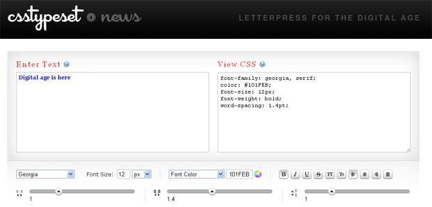
5. CSS Typeset
Just type any text into the box on the left and play with settings till you get a result that would satisfy you. The box on the right shows you a piece of CSS code that stands behind each variant of your settings.
* * *
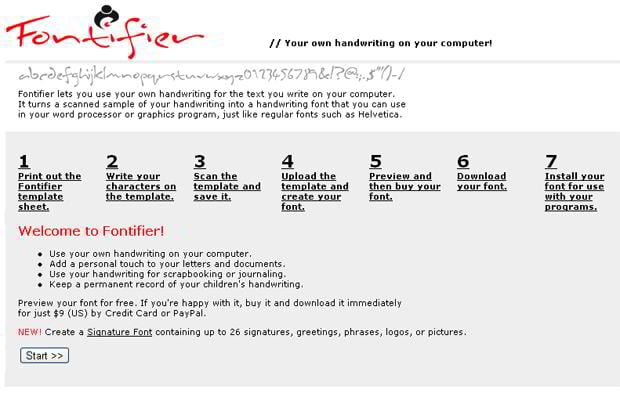
6. Fontifier
Fontifier will be a great solution for those who love handwritten fonts. Now you can import your own handwriting into the web fonts by using this handwritten font generator.
* * *
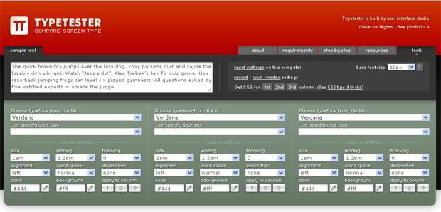
7. Typetester
Typetester offers unique opportunity to compare different fonts at one page. Also you can change such options as color, size, word space, alignment etc.
* * *
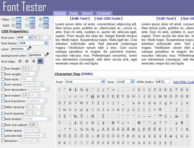
8. Font Tester
Here is another excellent online tool for web designers called Font Tester. You can preview and compare various fonts and apply different CSS properties to find the most suitable solution.
* * *
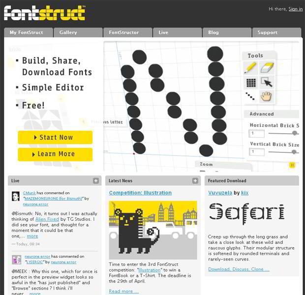
9. Fontstruct
This one here is a free online font-building tool which is based on the grid system. The final product will be delivered to you as True Type fonts that you will be able to use both on Mac and PC.
* * *
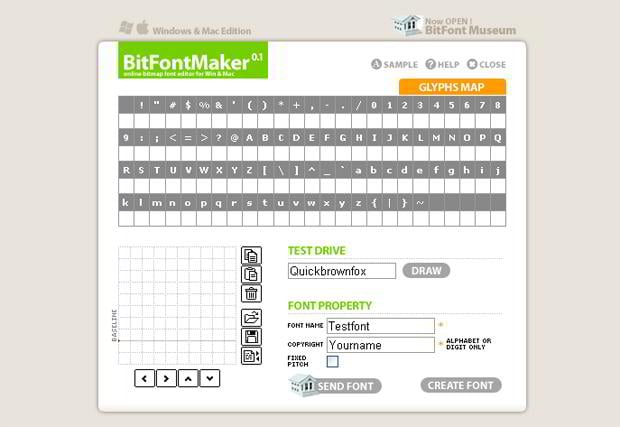
10. BitFontMaker
BitFontMaker is a very simple online service for creating fonts. You can edit the existing fonts, create your own from scratch and so on. This pixel font editor allows you to preview your work during the process seamlessly.
Typography as a Tool for Improving User Experience and Usability
As you may know enhancing your website usability can turn up a real headache, especially if you don't imagine where to start. Many web masters on the net claim that design begins with the proper typography. And today we are touching on the subject of typography as a tool for enhancing usability of web projects.
Whether you are a newbie or an experienced web design guru, there is always something new to discover about improving your websites to bring more regular visitors.
Below you will find some interesting facts about usability, legibility and readability as well as recommendations about selecting fonts, font sizes and other parameters in a proper way to make your pages more readable.
Components and Mission of Typography
According to the stats 95% of web information is written language which requires good shaping. Typography is actually all about shaping this information. Logically enough typography affects reading. Typography is known to affect legibility and readability of text. It defines the comfort and speed of reading and emphasizes the proper ideas.
You may select the type for its rhythm, style, mood and legibility which are being set by font type, size, spacing, kerning, orientation etc. The text features such as margins, line length, word choice and pictures placement into the text body can also affect reading.

You should also consider the flow of the eye movement through the body text. According to eye-tracking visualizations there is even specific F-Shaped pattern for reading web content. This means that users follow two horizontal stripes and a vertical stripe instinctively, so it's highly desirable to place all important information right in that area.
Legibility and Readability in Terms of Web Design Usability
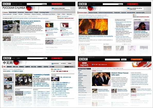
Recently we fell across an interesting material about BBC experience of playing with text in different languages. They conducted a research about what font would be the best one for various languages and made a conclusion that Nassim is that very font that meets the typographic hierarchy they need. They worked out the customized editions of Nassim (c) for Arabic and Persian versions of BBC website. The font has been created by Titus Nemeth in 2007. This search proves that each language requires specific typographical approach. You should work at the letterforms to make them look exquisite and recognizable by the audience. This can be achieved by creating the font to look anatomically and stylistically outstanding and at the same time readable. That is their recipe for improving user experience and usability.
Based on the analysis of typography and legibility made by Ellen Lupton, we came to the conclusion that people are quite tolerant for typographic variation and that typographic system is quite elastic. According to Ellen, “designers often distinguish “legibility” and “readability” as the objective and subjective sides of typographic experience”, while for scientists readability is often “objectively measured, as speed of reading + comprehension”.

Considering the abovementioned studies, we would like to clear up the definitions of legibility and readability in terms of web design usability.
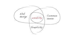
First and foremost, what is usability all about? In simple English that means a group of features which make the website efficient, visually consistent and easy to use. Not less important is meeting the needs of your potential audience.
Usability is associated with legibility and readability first of all. In case the website is not efficient and difficult to use, the number of visitors will fixedly decline. Not surprisingly, the visitors tend to return to the sites with perfect usability. The best way to achive maximum usability is to walk in user's shoes meaning look at the text from the user's point.
Legibility and readability
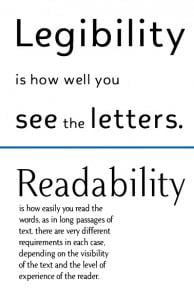
You may find it useful to discern the difference between “legibility” and “readability”. Ellen Lupton in her research explained the definitions in the following way: “legibility” concerns the ease with which a letter or word can be recognized (as in an eye exam), whereas “readability” describes the ease with which a text can be understood”. So legibility serves for visual perception and scanning of information, while readability means understanding and is more associated with typography.
The separation of legibility and readability is oft misunderstood. Robin Williams in his work “The Non-Designer's Web Book" states that readability means how "easy it is to read a lot of text, extended text, pages and pages of text". Kevin Connolly adds that readability is defined by reading rate and comprehension as well. It's obvious that both type font and line length are at the forefront of readability.
Psychology students at Wichita State University conducted a survey on the legibility of various font types and came to the conclusion that Courier, Verdana, Georgia, and Times are the most legible fonts.
So legibility serves for visual perception and scanning of information, while readability means understanding and is more associated with typography.
Despite these fonts have been recognized as the most legible ones, the case about typography is by no means closed: there are other essential visual factors that affect readability on the whole.
Major factors affecting readability
Type font choice. Choosing the best font for your website is not an easy task. The font has a variety of parameters like bold or regular, serif or san serif, different sizes. Robin Williams, an authoritative American educator, states that a long passage of text is easier to read with a serif typeface. Many sources recommend to use maximum two font types for your web page design. The optimal type size is considered to be 10-14 points for the online content.
The Times of London are using Times New Roman for the decades not occasionally. And professional webmasters often use Arial or Verdana fonts for body copy deliberately, considering typographical experience. Verdana, Arial, Times New Roman and Tahoma are recognized as the most readable fonts to use. Try to avoid extra usage of funky fonts damaging the clean and readable layout.
Line length. Over the decades there have been debates about the optimal line length.
E.g. Williams recommends to use shorter line lengths since human eyes can't grasp the text across the whole screen. Humanfactors.com have compiled results of several researches and made a conclusion that the perfect line length is four inches. The other studies show that the best width for a text line is 45- 75 characters including spaces. The ideal line is believed to contain 66 characters.
Word choice. The proper word choice impacts readability as well. Although it is closer to copyrighting than to typography, it affects typographical representation of ideas as well. Short slogans and headings require brief and precise wording. The number of syllables, the number of words, their meaning and addressing to audience plays important role in the content perception.
The following simple rules about the words usage will help you to improve the readability and, as consequence, the usability of your website content:
1) less syllables eases reading and understanding;
2) less words and short sentences improve readability;
3) wordings about people and addressed to the specific audience provoke more interest;
4) technical information should be presented with the traditional English words instead of Latin borrowings.
Hoping that using these simple rules and recommendations will make your texts friendly and memorable for the readers. Keep in mind that readability and usability are in the forefront of conversion and retention, and typography is the perfect instrument to improve the situation.
Let's cast back the basic keys of effective typography:
- specify the target audience so that you could offer more relevant information in a more efficient way;
- improve legibility of content;
- consider optimal type font, line length, word choice and other things affecting readability.
Just play with fonts and give your readers a more enjoyable experience of working with your website!
Manage Texts Like a Boss with jQuery Typography Plugins
Сhosing font face is one of the key steps in designing website or any other UI. One of the main disadvantages of typography is a relatively small number of font groups. Unfortunately there are only four of them Serif, Sans Serif, Script and Decorative. But each one of these four groups includes great amount of fonts that it makes pretty hard to pick the most appropriate one.
Eventually, when you picked a font for your design, the result may not seem to be satisfactory. In this case you can make use of various jQuery typography plugins that will certainly give you some super useful features and allow to manipulate web text like never beforeand perform this with a bang. Today's blog post rounds up 12 of the most unique typography plugins that allow you to fine tune your type as well as create some cool effects. Feel free to use them.
***
Type Butter

TypeButter allows you to set optical kerning for any font on your website. If you’re longing for beautifully laid out text that today’s browsers just don’t provide, this is the plugin for you! Also, don’t forget to check out delicious curved text using jQuery Bacon.
***
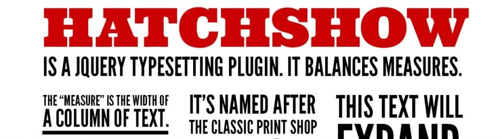
jQuery typesetting plugin balances the measures. Depending on the amount of text in columns they will be either contracted or expanded.
***
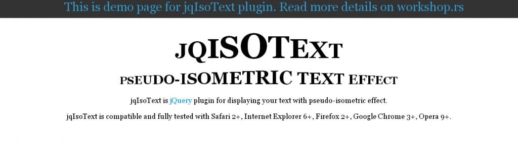
With this plugin we’re changing size of letters in text. It starts from one font size and increment or decrement to other font size. On that way we’re getting something similar to isometric projection. That can be done for whole block of text or for every word in some text.
***
A jQuery plugin that is able to generate ideal responsive measures.
***
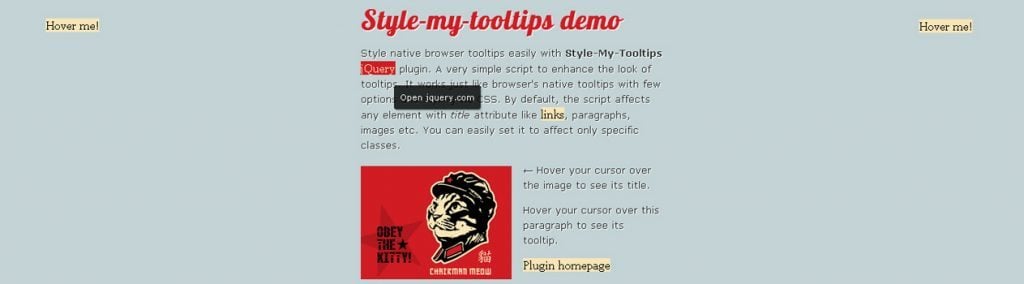
Style-my-tooltips jQuery Plugin
A simple, lightweight jQuery plugin to enhance the look of browser tooltips. Small in size (4kb unminified) script that works just like browser’s native tooltips with few options and styling via CSS.
***
Textillate.js combines some awesome libraries to provide an ease-to-use plugin for applying CSS3 animations to any text.

***
This jQuery plugin shuffles the text content of any DOM element – an interesting effect that can be used in headings, logos and slideshows.

***
#html_escape
    str.gsub!(/[&><]/) { |special| { '&' => '&', '>' => '>', '<' => '<' }[special] } if options[:escape_html]

    #apostrophe
    str.gsub!(/(\w)'(\w)/, '\1’\2')

    #russian quotes
    str.replace_quotes! '«', '»', '„', '“', 'а-яА-Я'

    #english quotes
    str.replace_quotes! '“', '”', '‘', '’', 'a-zA-Z'

    #mdash
    str.gsub!(/--/, '—')
    str.gsub!(/(\w|;|,)\s+(—|–|-)\s*(&#|\w)/, '\1 — \3')
    str.gsub!(/\s+—/, ' —')

    #nobr
    #around dash-separated words (что-то)
    str.gsub!(/(^|\s)((\w|0-9){1,3})-((\w|0-9){1,3})($|\s)/, '\1\2-\4\6')
    #1980-x почему-то
    str.gsub!(/(^|\s)((\w|0-9)+)-((\w|0-9){1,3})($|\s)/, '\1\2-\4\6')
Simple plugin to make text more readable by applying some typographic rules to string. It is intended to use for russian texts, but english typography rules are also supported.
***
Cubitoo Typography Plugin
(function($) {
  $.fn.fixTypography = function(selected_replacements) {

    // Replacements for bad web typography
    var replacements = {
      // Line rhythm
      bastards:      { invalid: /\ ([a-z]{1})\ /mgi, valid: " $1 " },
      em_dashes:     { invalid: /\ - \ /mgi, valid: " — "},
      en_dashes:     { invalid: /([a-zA-Z ]{1})(-)([a-zA-Z ]{1})/mgi, valid: "$1–$3"},
      double_spaces: { invalid: /[ ]{2,}/mgi, valid: " " },

      // Quoting
      single_quotes: { invalid: /\'([a-zA-Z0-9 ]+)\'/mgi, valid: "‘$1’" },
      double_quotes: { invalid: /\"([a-zA-Z0-9 ]+)\"/mgi, valid: "“$1”" },
      angle_quotes:  { invalid: /<<([a-zA-Z0-9 ]+)>>/mgi, valid: "«$1»" },
      apostrophes:   { invalid: /([a-zA-Z0-9]+)\'([a-zA-Z ]+)/mgi, valid: "$1’$2 " },

      // Replacing
      copyright:     { invalid: /\(c\)/mgi, valid: "©" },
      ellipsis:      { invalid: "...", valid: "…" },
    }
Does the default typography on your website suck? Worry no more! — Cubitoo Typography is a set of small fixes to remedy usual trouble with most common typography issues without breaking down your markup with over-optimised syntax, e.g.:
- a single letter at the end of line, whereas it should be moved to the next line using hard space,
- a hypen between two words (e.g. "user-centered") that should be unbreakable,
- dash (or hyphen if you fancy that too) between words (e.g. "I like it — that's what she said") that shouldn't be left at the end of the line or be the first element in the next line.
***
Line-In-Typography
(function($) {
	"use strict";
	// Create the control panel. This should only be fired once.
	$.fn.LineInTypography = function(options) {
		// Extend our default options with those provided.
		// Note that the first arg to extend is an empty object -
		// this is to keep from overriding our "defaults" object.
		var opts = $.extend({}, $.fn.LineInTypography.defaults, options);
		opts.selector = $(this).selector;
		opts.lineHeightContainerHeight = $(opts.lineHeightContainer).height();
		if ( opts.defaultLineHeight !== false ) {
			opts.lineHeight = parseInt( opts.defaultLineHeight );
		} else {
			opts.lineHeight = Math.round(
				parseFloat(
					$(opts.lineHeightContainer).css('line-height')
				)
			);

		}
This plugin allows display lines based on your theme's line height so that you can correctly set your vertical rhythm and line up all of your typography to a baseline grid like the titan of typography.
One should be aware that this is a plugin primarily promoted to pixel pushers and isn't for production use. You would do well to know quite a bit about CSS and you should know how your theme is laid out in the HTMLs before using this plugin.
***
jQuery(document).ready(function() {
  jQuery('body').typographyTroll();
});
Typography Troll provides an easy way to confuse readers who try to distinguish which of several similar fonts you're using (like Helvetica and Arial) by randomly assigning a font family to each character in the selected text.
***
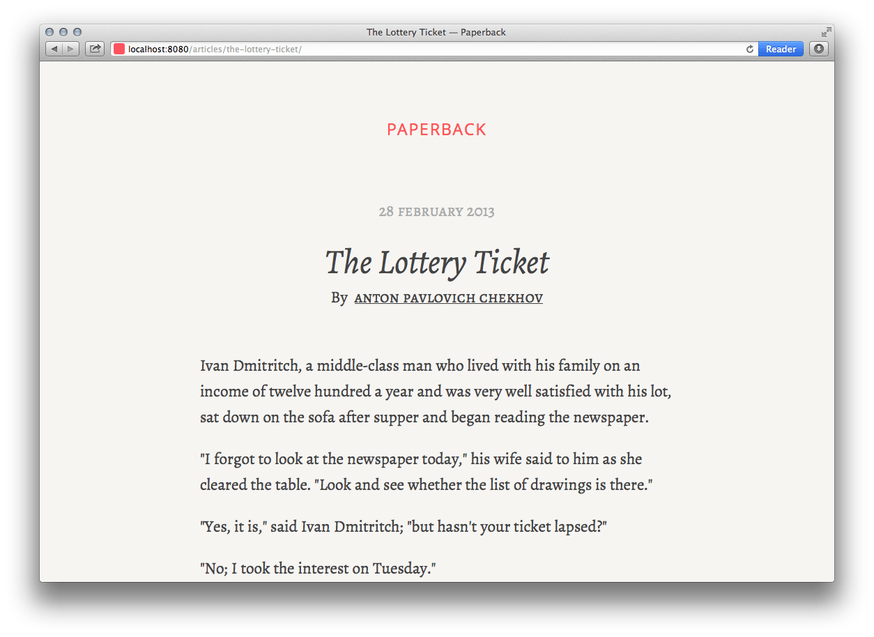
Paperback is a theme for Wintersmith inspired by the typography of printed novels and informed by blog posts about the digital reading experience written by Information Architects, among others.
Why Should We Optimize Mobile Website Typography
A lot has already been said about mobile web design; numerous battles took place considering the necessity of this type of websites. Still there is no clear answer if we need them or not. Those who got used to them still provide constant updates of their mobile web resources. Others consider them simply time killers, because we can all benefit from an amazing responsive website designs that nipped in the bud the necessity to build mobile websites.
Mobile SEO Tips
We can say that mobile websites simply evolved into apps. Nowadays all large websites have their own apps developed for specific mobile platforms. Simply downloading this app and logging in you get “almost full” access to your content preserving original fonts and their readability. Top 5 downloaded apps are the following:
- Google Earth
- Shazam
- Nettflix
Still, when designing a responsive website you need to be sure that your typography is responsive and will perfectly fit in smartphone layout remaining fully legible. Here web designers can benefit from some plugins and tools that will make texts fully responsive:
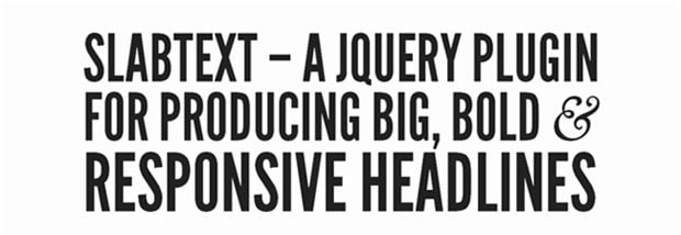
Simply adding this plugin into your website your headlines will become responsive.
***
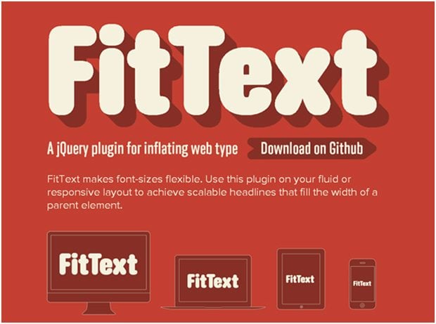
Fittext is a lightweight jQuery plugin that allows to turn website typography from static to responsive.
***
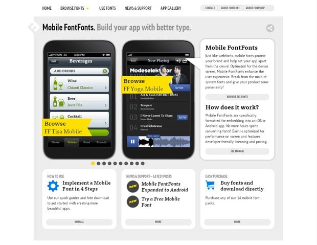
MobileFonts protect your brand and help set your app apart from the crowd.Optimized for the device screen, Mobile FontFonts enhance the user experience.
***
Mobile fonts optimization is not that hard as it is thought to be. There are few basic rules for mobile optimization that will help you make all fonts readable on any portable device with any screen resolution.
Basic rules for mobile fonts optimization
- Make sure that your website is readable on a small screen, pay attention to the font face and it's size
- Reduce load times to make sure that your website loads seamlessly even on slower mobile connections, get rid of hi-resolution images
- Apply automatic redirection to the mobile version of your website when a mobile user visits your web resource
With that amount of screen options, and pixel densities some fonts can become scrambled when the website layout shrinks to the smartphone size. When making fonts responsive keep in mind following tips:
- PC: System fonts look fine in most cases. Custom fonts turn into a nightmare if they’re not hinted.
- OSX: System fonts look good on low resolution screens (e.g. the old PowerBook G4 12 inch), they look too bold on high resolution screens (MacBook Air) and they look okay on Retina displays (next MacBook Pro). Lighter fonts look excellent on high resolution screens, but they are too light for Retina displays.
- iOS: System fonts look too bold on high resolution screens (iPhone 1-3, iPad 1-2) and they look perfectly fine on Retina Displays (iPad 3). For perfect HTML performance on Retina displays, you need a bolder font on portrait mode and a regular weight in landscape mode. For perfect performance on high resolution screens, you need a lighter typeface.
I bet this list have confused you, but let’s put it in simpler words. For optimal performance beyond low resolution, and outside of the PC world (where system fonts still perform adequately), you need three font grades:
- Lighter (for high resolution screens)
- Regular (for Retina landscape HTML mode)
- Bolder (for Retina portrait HTML mode)
You might ask "Why not just allow the user to choose the type size?" Well, adjusting type size is not a matter of taste, but a matter of reading distance. For example the same font that is read on the screen of an iPhone and iPad should vary in size. Font for iPad should be bigger than the one for iPhone it all depends from the distance you read the text on the screen. The text on the screen of an iPad should be fully legible because most users read from their knees. The font for an iPhone should be smaller because the distance from eyes to the screen is lesser than with iPad.
***
2012 is the year of raise of tablets. Let's have a brief statistics: for the last six months the number of activated Android devices increased from 600000 devices to 900000 devices daily! [Source: pcworld.com] Android took a great share of mobile user overestimating the popularity of Apple. Great part of these devices are the tablets with high-res displays offering up to 177ppi and even more. These screens allow to display even the tiniest fonts making them legible only when zooming. The tips mentioned above are also good for tablets, most of them are "finger-controlled" (no stylus or mouse' precise-clicking) that is why larger fonts will reduce the necessity of constant page zooming.
***
Just for a reference, recently there was provided a survey among web designers considering websites they build most often, and it showed following results:
Separate mobile websites 26.28% (522 votes)
Responsive websites 67.32% (1,337 votes)
Separate mobile apps 5.14% (102 votes)
Other: 1.26% (25 votes)
Total Votes: 1,986
According to these results it feels like mobile websites soon will turn into an extinct species.
***
To find out more about the responsive web design feel free to browse through the responsive wed design interactive guide.
***
Users don’t want to limit their access to just desktops and/or laptops. In today’s world people are on the go more and more and they want to have the web at their finger tips. A huge number of portable devices gives this possibility to their owners. Still not always it is possible to surf freely using a smartphone due to low connection speed or the functional capabilities of the device itself. That is why it is still essential to build mobile optimized websites. Couple years will pass and we will forget about mobile websites as they will become obsolete as it happened to IE6.
Designing Principles Behind Responsive Typography
Change is one of the constant factors when it comes to web design. It is mobile now and not static. This is the reason why responsive web design is the latest buzz. And related to responsive design there is one important aspect of the larger puzzle. It is the use of fonts or typography that adapt to different resolutions, so that they are viewable and the overall layout remain intact.
Instead of using a single font for different mobile site, why not use fonts that can stretch or shrink according to the screen’s requirements. All remaining readable and clean looking without any overlap or other readability issue.
Therefore, to get your typography aptly fit into the layout no matter what the device or screen width happens to be here are some of the important techniques for making typography go responsive.
Make the text flexible
Before resizing text on different screen size, make sure that the text is legible and flexible. And the best way to do is, by using contrast colours and readable font to prevent turning your page’s content into an eye soar. To emphasize the importance of font being readable , it is worth mentioning about W3C that introduced the media query concept called Luminosity media query that allow designers to adjust the style of document to ensure maximum readability of text. Consider the following factors to make your text legible and flexible.
* * *
Select a readable font
Fonts like artistic script fonts are great for small headlines, but when it comes to body type, choose a font that’s easily readable. Usually the choice falls between serif and sans serif. When it comes to screen typography, both these fonts can perform equally well, provided you choose a body text size above 12 pixels. Below 12 pixels serifed typefaces usually don’t render sharply enough. However, if you are using @Font-face, there are hundreds of free font kits available which contains all file types you require in your @Font-Face.
Remember, using too many font type in a page can create a confusing visual layout that makes reading difficult for the users especially users with reading disorders, learning disability or attention deficit disorders.
* * *
Select font colour correctly
Low-contrast font colours lead to text being unreadable. Text is much easier to read when there is adequate contrast between the text and the background. Odd colours and low contrast tend to appear garish and make reading difficult for the users. With contemporary high contrast screen, it is better to choose either a dark grey for text or a light grey for the background, instead of bold black on white. A recent experiment confirms that reading time is lower in case of high contrast between the text and the background.
* * *
Select real text and avoid text within graphics
Text can be transformed into sound with voice synthesizers or can be enlarged with magnification software without compromising on the quality. There is a primary reason as why content in text format is important. Text within graphics cannot be enlarged without some loss of quality.
* * *
Maintain optimum line lengths
Maintaining a proper line length across different devices is tricky. After much of research and development, it seems that somewhere between 50 and 75 characters per line is ideal for line length. To achieve the desired results, look at different screen sizes and figure out what size font you should use to get 50 characters on a line. For a small screen, go below 50 characters per line to maintain a readable font size, but aim for 50 characters. Also set maximum widths for text content area. Determine the width of the content container when there is 75 characters per line. This is possible when you are using monospace font.
With smaller screen you may want to leave the container width out and let the typeface spread across the entire width of the screen. And with larger screens, split your content into multiple columns. Multi-column specifications makes it easy to split your text into multiple column without the need to change the entire layout. Combine this with media queries and make content layout splits into two to three columns for larger screens. This help you to maintain highly legible type size and readable line length.
Make sure that the space between the lines is also resized and stays proportional to any new font size on every resize.It is better to use CSS reset to define styles for your fonts, because different browsers have predefined margins for paragraphs and headings that may interfere with the space you want to define between your lines. The common value for line heights which is easily readable and easy on eyes is a value of 1.4em for body text and 1.2em for headings. A better and convenient way to set line height is by using Unitless values.
* * *
Make body text responsive
To make body text responsive you need to preserve vertical rhythm with optimized line height. The text should scale well on high resolution screens, so that it can be easily resized by the users. These points can be achieved by using proportional and relative sizing units to size your fonts and define the line height. Using em and percentage value is highly beneficial to size text. Using em allow the users to increase the size of the font on a page if they want to. And the percentage value allow you to set the font size for your page’s body and define content size proportional to its value. If you set your body’s font size in percentages, you are actually providing a flexible baseline through which you can size the text up and down.
A good practice is to use a baseline value 62.5% on the body instead of 100%. This is because setting font size on the body to 100% will only set the text size to the browser’s default font size which is 16 pixel. However, Richard Rutter, the author of The Original 62.5% Technique recommended 100% baseline, as it ensures more consistent cross-browser results. To resize the font for smaller screens using media queries, you need to simply resize the body’s font size. As the page’s text is sized proportional to it, the total text will be resized by changing one line of CSS.
CSS viewport unit is also used to resize body text as this method make text become 100% fluid and does not have to depend on a set of media queries to resize. CSS viewport unit resize text and make it fit within the container no matter how or when the width changes.
* * *
Make use of alternate typeface
Designers often overlook a fact that different typefaces may not work well with different screen sizes. But that does not mean that you should avoid using fonts in your responsive design. Instead, you may choose different fonts for various elements in larger or smaller layouts. For instance, designing for desktop computers, you may use font like League Script for the headers, but for smaller display like iPhone, you need to make it so large that it will inevitably dominates the content, or else it will be hard to reset.
To avoid such situation, here you can use League Script for larger displays like iPad and switch to larger version of the body font for smaller displays like iPhone or Smartphones.
Besides every important responsive designing principles, maintaining readability of your text content is a crucial component to create an optimal user experience for your users.
How to Use Typography in Web Design?
When you are running a business these days, it’s almost imperative to create an online presence. In recent times, more number of people purchases stuff online than ever before. According to the report on e-retail sales index by IMRG Capgemini:
- Online retail sales increased by 18% year-on-year in December 2013
- Growth of the online retail market touched 16%
This is continuing in 2014 as well. According to Forrester Research, as much as $248.7 billion is expected to be spent for online shopping in the US during the year.This trend is expected to rise going forward as well. Hence, it’s also imperative for the businesses to have a website. If designed properly, this website can turn out to be one of the best places for you to sell your products and services.
Designing a website isn’t an easy task. It becomes even more difficult when you are planning to use the platform for online marketing. In the very first place, you need to attract the customers to your website. And you need to keep them glued to it as well. Only then you can expect them to make purchases from your site.
You will have to take a number of things into account while designing a website. These include, among others:
- The appearance of the website
- Usability and navigation
- Quality of content shared
And in recent times, there has been an increasing stress on the typography of websites. The fonts that are used on the sites are also of utmost importance. New trends in typography emerge. And they help to make the customer attracted to the website even more and purchase from there.
[related_posts]So, when you are planning to design your website, you have to focus on fonts too. The typography is sure to play a major role in helping your website communicate in a better way to the customers.
Here are a few tips to help you choose the perfect fonts for your website.
What are You Writing About?
Well, this needs to be the first question that you should ask before choosing the fonts. Is the topic somber? Or, is it a casual one? The selection of the font is going to depend on it significantly. And the most important thing is - who are you writing for? The choice of the fonts depend a lot on who your target audience is. For example, you can choose fonts, such as Comic Sans MS for a website planned primarily for the children. While fonts, such as Avenir, Futura, Roboto, and others go perfectly with business websites.
Best Font for Website Content - Web Fonts
Let me share a story with you: I knew a designer who would never use fonts that have been used by a few other websites. “These fonts have already been used. Why should I use them again when there are so many fonts available online”, he would say. So, what he would do is choose some of the most uncommon fonts on the web.
This, no doubt, had a positive aspect. The websites looked unique at times. But in many cases, the fonts that he used were not perfectly matched for the subject or the audience. So, the impact was primarily negative. Remember, most of the overused fonts have been utilized time and again, only because they have a positive impact on the web audience. So, utilize them properly to have the best results.
Use Fonts that are Readable
When you are using the web fonts, the primary objective needs to be constant. You have to make the content readable for your website visitors. So, decide what kind of font you need. The Sans Serif fonts are usually plain and simple, which can be the perfect choice for any website. But, if you are looking for a bit of creative touch, you can find fonts of that type as well. They can act as ornaments to your web page. But make sure they don’t hamper the viewing experience even a bit.
WhatFont Styles are You Using?
You can vary the same font in different parts of your write up. For example, the normal font needs to be used in most of the places of the content. But for the headlines and subheads, change it. Maybe you can use a bolder font for these.
But why don’t you vary it at other places?
It’s really one of the best ways to add variety to your webpage. You can use different fonts in separate places of your web page. Well, it’s not appearing professional enough? Change it then. Use the same font throughout. But still you can add some variety. Change the size of the fonts at different places. You can use the larger size of the same font in the headline, or can even vary the typography a bit to get the best results.
Content still is the king in the world of websites. But without the right choice for typography, even a good content might fail miserably. Hence, it is extremely important to choose the right fonts for your website. And using these fonts prudently can even make your website more effective.
***
SPEAK UP! Don't forget that we are extremely glad to hear from you. Don't forget to drop us a line at the bottom.

I'm a professional writer and my articles clearly show the sphere of my interests - marketing, content management and website audience growing. Besides that, I like reading tech magazines and traveling.
Get more to your email
Subscribe to our newsletter and access exclusive content and offers available only to MonsterPost subscribers.

Leave a Reply
You must be logged in to post a comment.