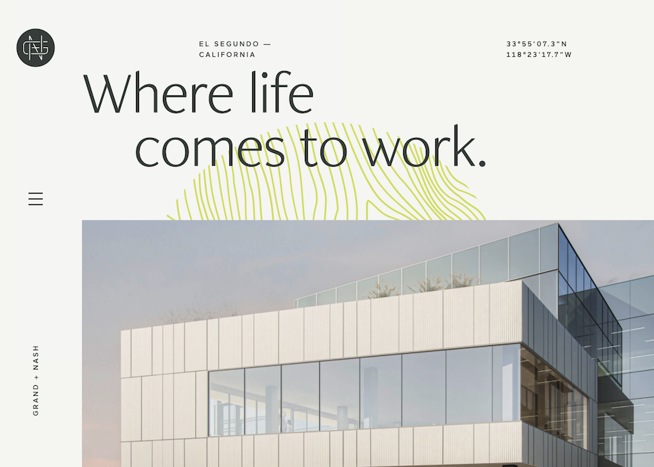
Pastel Color Scheme for a Refined Website Design
Pastel color scheme can win Oscar for the most "elegant role" among other palettes used in web design. Sites taking minimal approach by using washed out color scheme, call a feeling of sophistication and purity. These days, when uncluttered designs like Scandinavian (extremely clean with cold colors), flat and minimal rock the web, websites in muted colors are in a great favor.
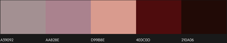
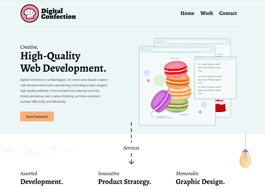
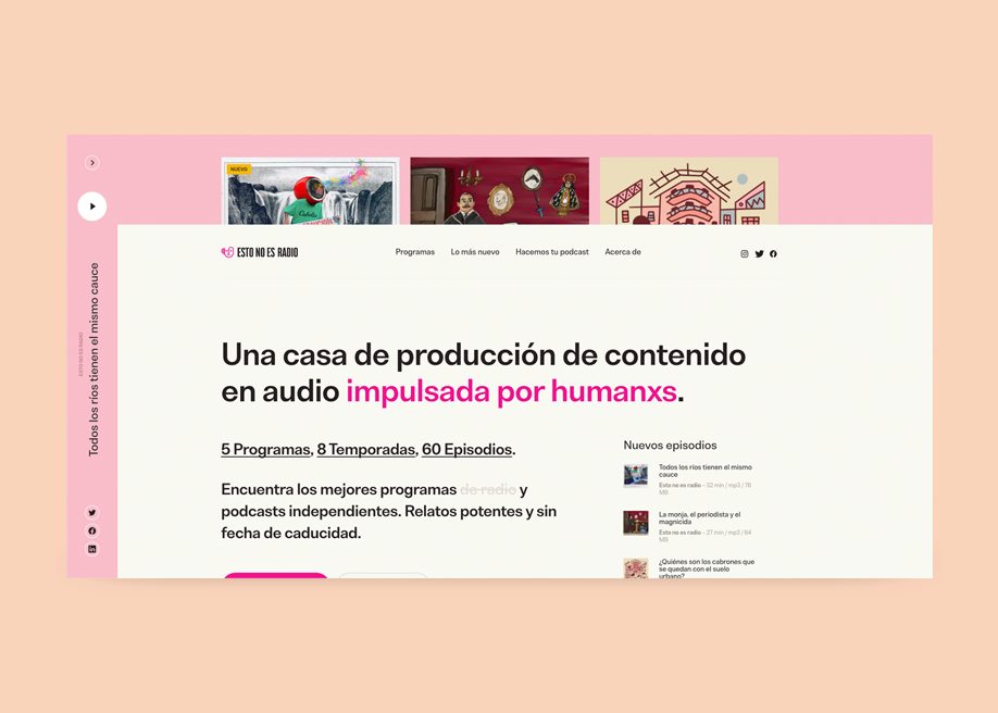
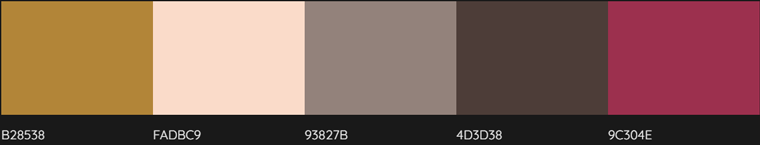
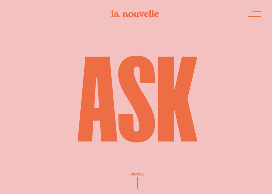
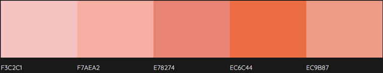
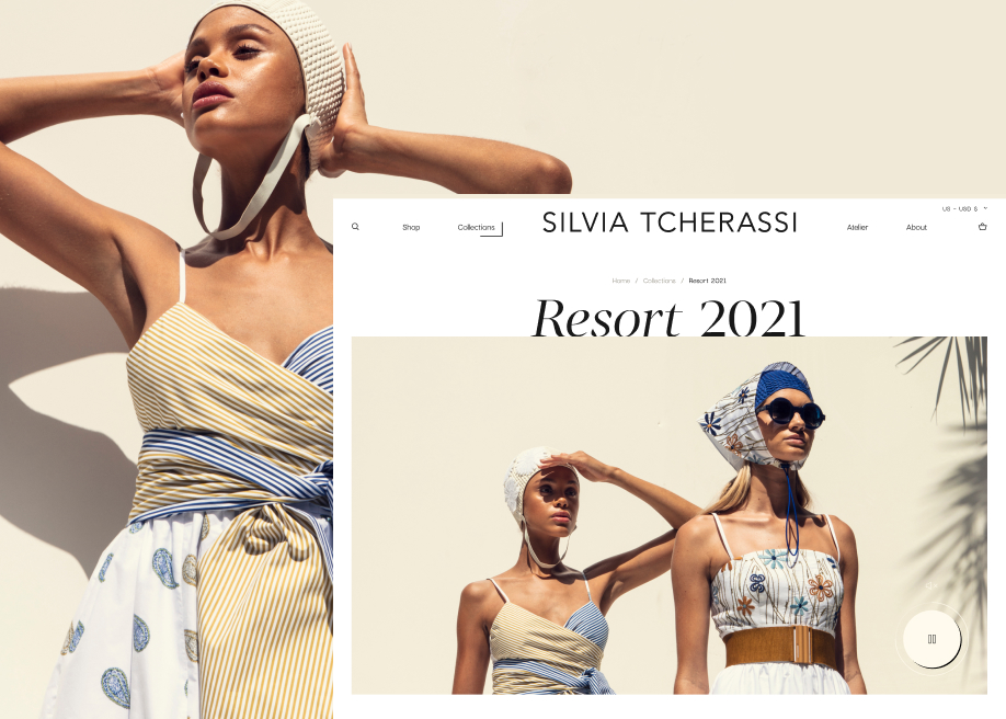
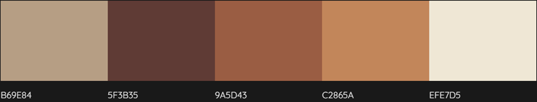
If you look at most sites, you'll notice how clean they are. The lightness of their designs reminds the one of the feather. A lot of negative space, light color schemes – nothing annoying is used there. Among such designs there is a great variety of the examples using pastel color scheme, and I’m going to inspect them in this blog post. To make your journey around it quite interesting, I'll not bug you with long descriptions and endless examples, just several paragraphs illustrated with sites and their pastel color schemes. Each scheme goes with HEXes, so it may be not only inspirational, but also a useful compilation showing successful variants of color combinations used in design.
What's a Pastel Color Scheme?
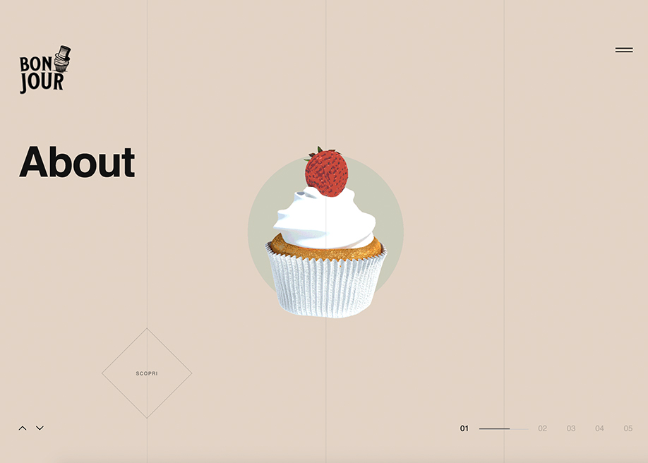
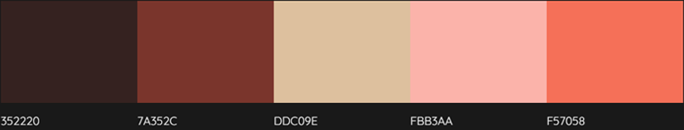
They have low/medium saturation, a soft, subdued shade and lack strong chromatic content. They are called soft, neutral, soothing, milky, hazy, washed out, desaturated, etc. They are never bold, they look soft and they're easy on the eye.

What are They For?
There are several ideas behind the usage of a certain color scheme in design: supporting brand identity colors, creating certain tone of a web presence, calling the desired emotions of the viewers. Pastel colors communicate soft and friendly atmosphere of a website, thus evoking calm feelings. There is not a wide range of hues in pastel color scheme, that’s why designs implementing it never look oversaturated. To sum up, muted colors are all about softness and sophistication, giving lighter and more refined look to the site.

Where to Apply?
The most popular places of implementation are the following: background (textures and images), logos, icons, fonts, frames. Of course, it doesn’t matter where you have applied several muted colors. The main point is the result you have achieved – elegant and polished look of the site. Most vintage and flat designs like a pastel color scheme, ‘cause they perfectly work for creating the desired retro or clean and precise atmosphere.

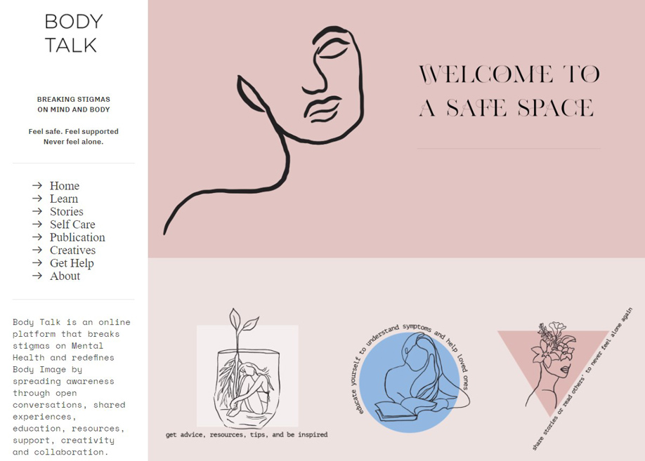
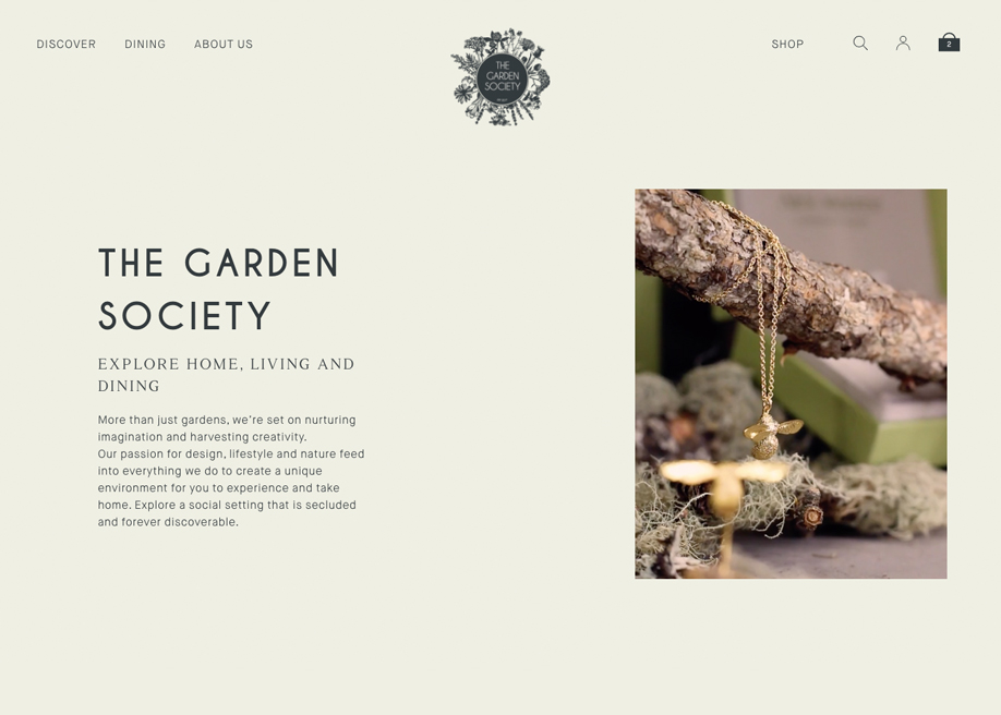
Too Feminine?
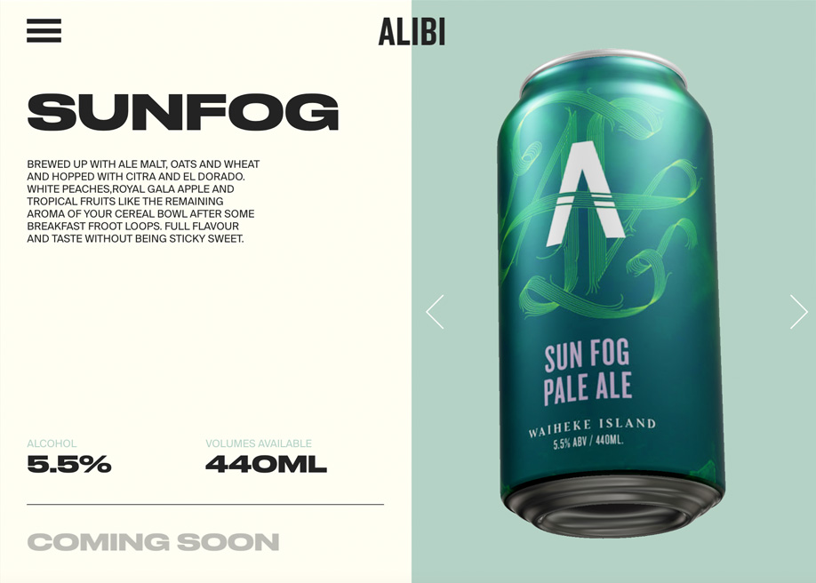
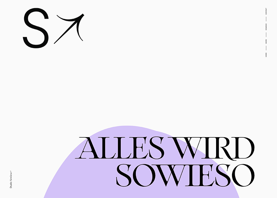
Adding a light tone to the design, pastel color schemes are considered to be feminine sometimes, but it’s partially true. Of course, creamy colors of a site hint at its non-masculine nature. Lightness, softness are undoubtedly feminine characteristics that perfectly work for websites with women as a target audience. It doesn’t mean that serious web presences (business, design agencies, personal pages) don’t make use of these well-balanced colors. Such schemes look a bit colder, but still underline sophistication of masculine designs.
"masculine" designs


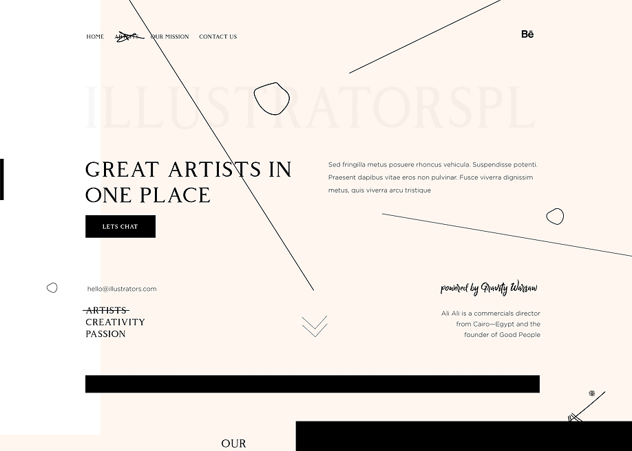
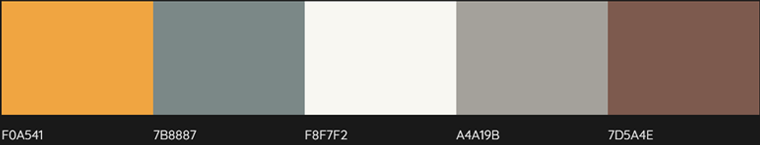
Contrasting Pastel
Pastel color schemes can also be visually-contrasting due to the mix of one or two washed out colors with a strong one (dark grey, for example). They still behave as pastel, but create more contrasting effect.
The way a certain site impacts its visitors depends on colors used in its design. They are really a powerful tool that can draw attention, guide viewers through the page and stir emotions. Today’s web chooses simple and minimal approach to designs, and pastel color schemes are in favor. Looking appealing to the viewers, they add a sophisticated tone to the site design and call pleasant emotions. Sites with muted color palette look extremely clean and modern.
A trend or fad? That’s not a question about pastel colors in design, that’s a choice of designers who strive to create visually appealing works. Every year brings new trends, but design classics like pastel color palettes still holds its positions.
Role of Colors in Making Websites Conversion-Friendly
Web design "an 8-second influencing factor" has to perform several tasks. From stunning looks, appealing colors, smooth navigation, effective call to action, rendering help in moving down the conversion funnel, there is a lot to do. Everything has its own significance for the final, user-friendly image of a website. Colors, the web designers’ tool, need to be used appropriately, as per business type and considering the target audience.
According to Neil Patel, top influencer and online marketer, “color is 85% of the reason you purchase a specific product.” It means clearly that colors affect the final conversions of a website. Website design experts focus using colors while understanding their psychology and picking the most suitable ones to make the site highly conversion-friendly.
In this post, you will come across different aspects that could influence the use of colors at a web design and what do different colors mean. Know and implement in your web designing venture.
Colors Affect Human Behavior
It is quite true that colors affect human behavior, as mentioned above the purchasing decision is greatly based on product colors. From health to healing, from shopping to entertainment, colors have their meanings. For a website, right use of colors helps grabbing the attention of the target audience and arouses them for the desired response. It is the job of web designers to consider all the aspects that could influence picking up the best suitable colors for a website.
Picking The Most Appropriate Colors For Website Design
While picking the best suitable colors for website design, know what the website is dealing in and who the target users are. If the website is dealing in kids’ sports items, then black might not be a suitable color; instead, bright colors, like red, green, yellow, will enhance the acceptance level.
For a website dealing in women items, brown or orange are not good options; instead, black, purple, and white will go good. While picking the best colors for a website design, do consider the right way, products, target audience, and the purpose.
- Women prefer purple, green, and blue; do not like brown, orange, and grey.
- Men prefer black, green, and blue; do not like orange, brown, and purple.
Understanding Colors With Meanings
Blue Is The Color Of Trust
Blue is often considered as a color of peace, tranquility, trust, and loyalty. It is the color of corporate America, revealing a sign of confidence. It invokes trustworthiness, as used at PayPal, an international mode of fund transfer. Most of the banks around the globe use this color in their website design.
Apart from being trustworthiness, blue color should not be used at food websites. Evolutionary theory links blue color with poison, so should be avoided at websites dealing in foodstuff.
Yellow Warns
You might have seen traffic signals and other warning signs in yellow. From business perspective, yellow is considered as a color of fun and friendliness. It might be due to the excitement yellow brings to human mind. Better to use yellow color in small doses to avoid heightened anxiety level and to make users go for the desired action.
Green Depicts Nature
Green is the color of outdoor environment, nature, and peace. It also enhances creativity. This color should be used at websites dealing with nature, environment, outdoors, and organic stuff. It is also good to be used along with “isolation effect” for call to actions. Isolation effect means things stand apart from the crowd if they are in some particular color, that has not been used anywhere on the page. The best example is DELL that has all the conversion elements in green.
Green color also shows how aware a company is about environment, hence improving the website repute among environment-conscious people.
Orange Means Active
Orange color helps arousing the physical activity, shows competition, and reveals confidence. That is the reason orange color is used at websites dealing in sports or kids’ products. Amazon has used orange color at its banner of limited offer, showing urgency and making the message noticeable.
Black Stands For Luxury
Darker tones stand for luxury. Black shows timeless classic sense, glamour, and sophistication. Lamborghini’s website reflects the magic of black color. For websites dealing in luxurious and high-class items, black is the color to go for.
White Can’t Be Ignored
Google, the top search engine, is a white-colored web design. Some people do not include it into colors’ list, but Google’s stance depicts its significance. Allowing more white space at a website means spaciousness, freedom, and causing users to breathe.
Bright Colors Are More Converting Than Lighter Ones
For call to action statements or buttons, bright primary colors like yellow, orange, red, and green are used. Darker tones like black, purple, brown, grey, all are less supporting for high conversion rate.
While picking colors for your web design, do not stick to the traditional approaches; do test. Go for what is best appealing for your audience and the conversion rate. Do not leave the whole task of color selection onto your web designer, give your input, and share your opinion. Mutual understanding can work well for the outcome. Avoid overloading your website with too many colors; it would make the design just fun.
Colors can create a specific impression about a website. A wrong impression can add to poor site experience, resulting in high bounce rate. Wrong selection of colors reveals unprofessionalism of the site owner and the web designer. Web designers and site owners should know the psychology of colors and their relevance for a specific business while picking some and avoiding others. It is all about creating a business image; can you compromise over that? Share your thoughts below in the comments section.
Don’t miss out these all-time favourites
- The best hosting for a WordPress website. Tap our link to get the best price on the market with 82% off. If HostPapa didn’t impress you check out other alternatives.
- Website Installation service - to get your template up and running within just 6 hours without hassle. No minute is wasted and the work is going.
- ONE Membership - to download unlimited number of WordPress themes, plugins, ppt and other products within one license. Since bigger is always better.
- Ready-to-Use Website service is the ultimate solution that includes full template installation & configuration, content integration, implementation of must-have plugins, security features and Extended on-page SEO optimization. A team of developers will do all the work for you.
- Must-Have WordPress Plugins - to get the most essential plugins for your website in one bundle. All plugins will be installed, activated and checked for proper functioning.
- Finest Stock Images for Websites - to create amazing visuals. You’ll get access to Depositphotos.com to choose 15 images with unlimited topic and size selection.
- SSL Certificate Creation service - to get the absolute trust of your website visitors. Comodo Certificate is the most reliable https protocol that ensures users data safety against cyber attacks.
- Website speed optimization service - to increase UX of your site and get a better Google PageSpeed score.

Posting contributed articles about the major web design highlights and novelties. Come across a handful of useful tutorials and guides shared by experts in the web design and online marketing fields.
Get more to your email
Subscribe to our newsletter and access exclusive content and offers available only to MonsterPost subscribers.

Leave a Reply
You must be logged in to post a comment.