Intro: how to make a graph on google slides
How to make a graph on google slides? The target audience of your presentation or report is potential investors, management, and just people who are expecting the formulated conclusions or clearly highlighted key points. There is a need to draw the listeners’ attention to factors and circumstances, to show plans and strategy.
Graphical display of information helps to convey the right idea, to sustain a conclusion, or to stress the most important topics. Graphs simplify our lives, help us to see the overall picture and make conclusions. A graphical dashboard is much better perceived by a user than long boring text reports.
A well-chosen chart can radically change the perception of the information: if you just show how the company's income grew during the year, it would not be as impressive as if the dynamics of your competitor's losses is shown next to it.
A line graph displays information in the form of lines which connect data points in the chart. Line charts are useful for displaying changes or trends. It is easy to create different charts in Google Presentations. One of the simplest ones is Google line graph.
Do you want to learn how to do more in Google Slides? See our ultimate guide.
Tutorial on How to Make a Line Graph in Google Slides
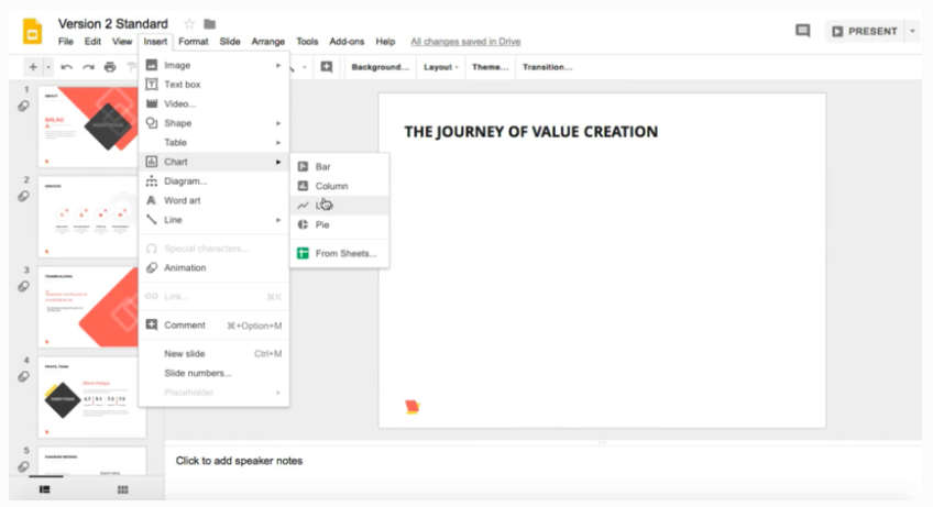
- Locate the slide you want to add the graph to and navigate to the Insert menu.
- Choose Chart. Your graph will be visible on the slide.

- Now you can play with the size of the chart if you need any size/location adjustments. To do this, just grab the corner of the chart to try various size options.

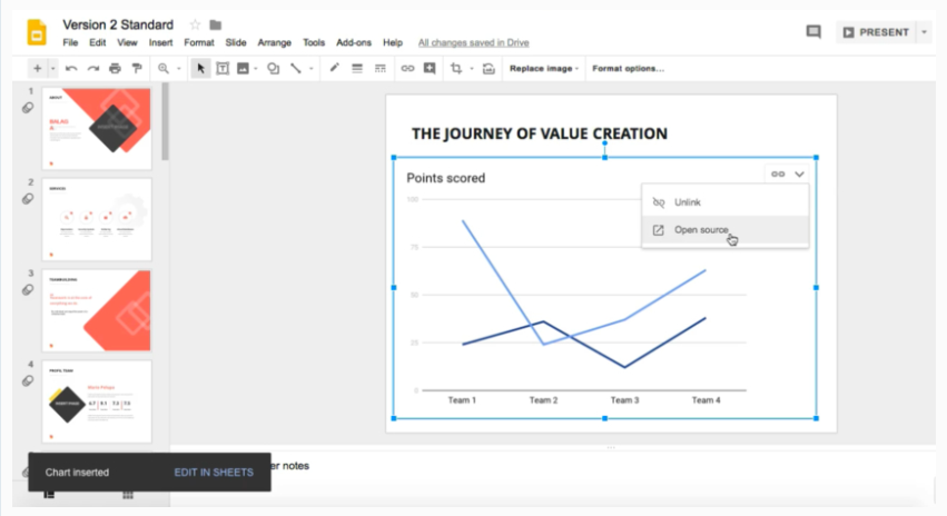
- Once Google Presentation shows your graph, it is time to replace the default data with your own information. Click on the icon in the top right corner of the chart. ‘Linked chart’ options will appear.
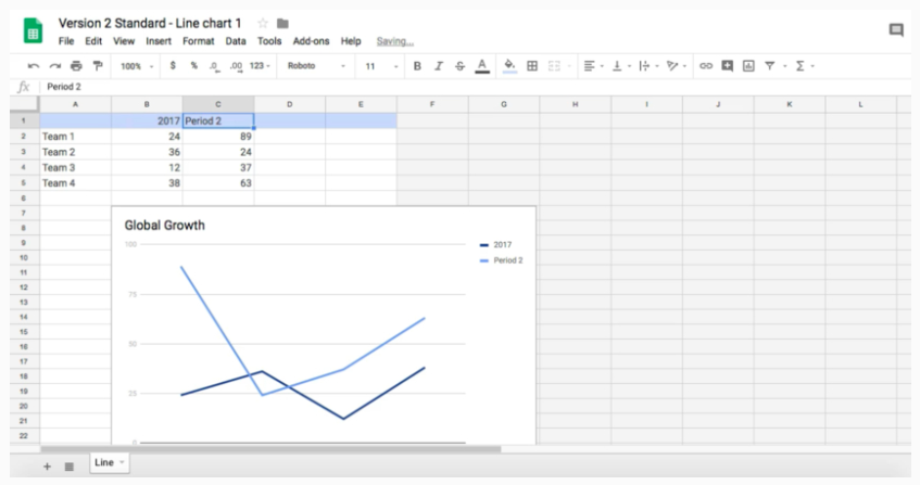
- Choose ‘Open source’. The Google Sheets tab will show up.
- Customize your data the way you want to adjust the graph to your needs. To do this, simply add your new information over the old and the chart will be refreshed immediately.

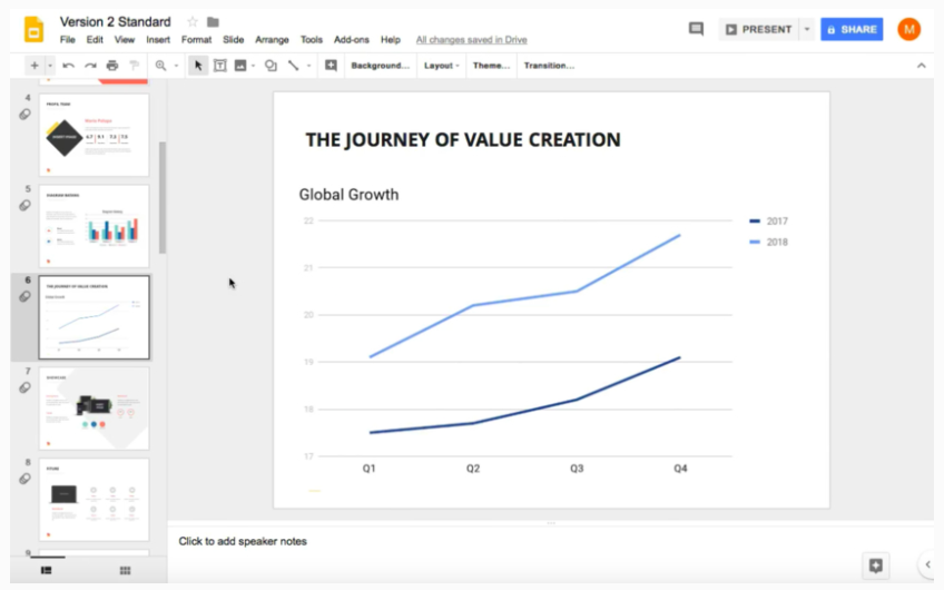
- Get back to your Google Slides presentation after you have added your data. Rest assured, all the changes will be saved.

- Open your presentation and see the chart fully customized to your needs. If you decide to make any edits, you will need to use ‘Open source’ command again.

Conclusion
We live in a period of struggle for attention, both in life and during the presentation. Visual information is better perceived and allows you to quickly and effectively convey your thoughts and ideas to the viewer. Instead of just giving the numbers on the slide, try showing them. There are many data visualization tools in presentations that you can use to build graphs and tables. Creating a line graph in Google sheets is as easy as 1-2-3.
How to Make a Graph on Google Slides FAQ
Generally it is quite simple to do, especially if this is not the first time you are working with Google Slides. All you need to do is insert the default graph on any slide. You can easily resize this graph with a couple of mouse clicks. And the last step is to add the data to your graph in Google Sheets.

Creating a chart is similar to creating a graph in Google Slides. You can easily add a chart by creating it outside of Google Slides. And this way, you can just add a chart image. If you want to create a diagram in Google Slides, then select Insert - Chart (select chart type). And then go to Google Sheets and edit the chart completely.
You can create 4 types of charts in Google Slides:
Line chart, bar chart, graph, pie chart. The type of data displayed will affect the type of chart you use, as different charts serve different purposes. Remember that pie charts do not recommend using statistics as the data is hardly readable.
Read Also
Google Slide Tutorial: How to Craft a Splendid Presentation
PowerPoint vs. Keynote vs. Google Slides: What Presentation Software to Choose?
Google Slides Timeline: Step-by-step with a Template
100 Best Business Presentation Templates. Cool! Great! Awesome!

A freelance copywriter, who has a great interest in writing, content-related stuff, traveling, and photography. She is always mastering her writing skills to synthesize the essence of any business ideology in an easy-to-use nugget of words to get people to feel, think, or respond. Instagram.
Get more to your email
Subscribe to our newsletter and access exclusive content and offers available only to MonsterPost subscribers.

Leave a Reply
You must be logged in to post a comment.