Drupal Documentation
Content management
In this section we will overview how the website content is created, and also how to manage any content type, if you've installed your template with sample data.
Menu management
The following menu types can be used in Druapl template:
- Main menu contains the links to the main website pages;
- User menu contains the links related to the user's account, such as "Register", "Login", etc.;
- Footer menu duplicates the main menu.
Let's overview each of them in details.
Main menu
To edit main menu items, follow the steps below:
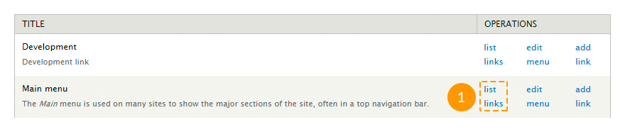
In the admin panel navigate to Structure > Menus menu or in a browser's address bar type http://www.example.com/?q=admin/structure/menu, where www.example.com is your website URL.
Click List links next to this menu.
To add a link, click Add link at the top left corner of the page.
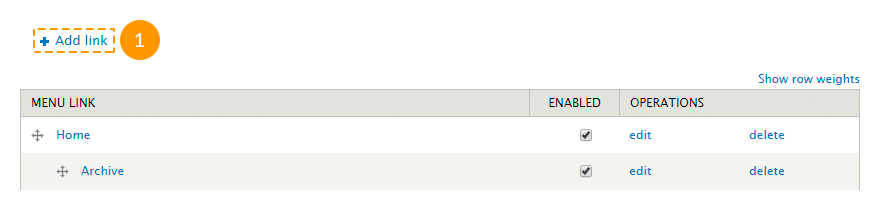
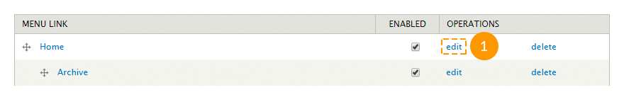
To edit a link, click Edit.
To remove a link, click Delete.
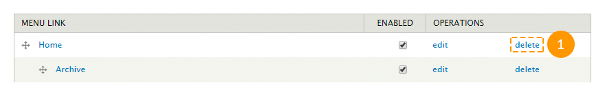
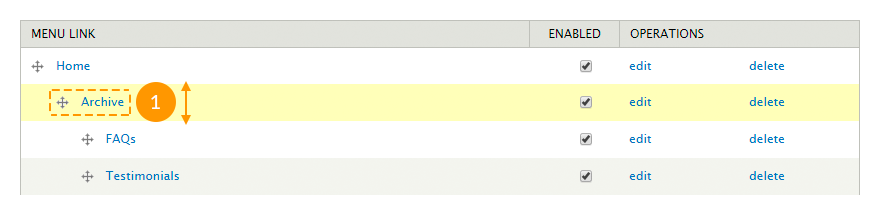
To change the items order, use the drag-and-drop method to place the item, then click Save configuration button.
To set up a drop-down menu, follow the steps below:
- In the admin panel navigate to Structure > Blocks menu or in a browser's address bar type http://www.example.com/?q=admin/structure/block, where www.example.com is your website URL.
- Find the block with this menu title.
- Click Configure link next to the block.
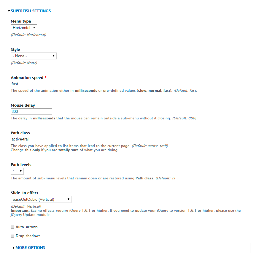
-
Make changes in the Superfish settings section.
- Press Save block button.
To change the menu location, follow the steps below:
- In the admin panel navigate to Structure > Blocks menu or in a browser's address bar type http://www.example.com/?q=admin/structure/block, where www.example.com is your website URL.
- Find the block with this menu title.
- Move the block to the needed region, the same way as a regular block.
- Press Save blocks button.
User menu
Users menu is a standard Drupal menu. It does not include any drop-down menus. To edit this menu or change its location, you can use the same instructions provided for the main menu.
Footer menu
Footer menu duplicates the main menu. To set up this menu, follow the steps below:
- In the admin panel navigate to Structure > Blocks menu or in a browser's address bar type http://www.example.com/?q=admin/structure/block, where www.example.com is your website URL.
- Find the block with this menu title.
- Click Configure link next to the block.
-
On the appeared page besides the standard fields fill in the following ones:
- Menu - the name of the menu that needs to be duplicated;
- Starting level - block visibility on a page. Blocks that start from the first level will always be visible. Blocks that start from the second level or deeper will be visible only on the pages, where these menu items are active.
- Maximum depth - the number of the visible menu levels. Set 1 value to disable all sub-menus.
-
Press Save block button.

Feel free to check the following instructions:
Content type management
Drupal templates include the following main content types:
-
- Banner
- represents company name, logo and additional information. It can be used in blocks like "Our partners", "Our clients", etc.
-
- Employee
- consists of an employee’s photo and a summary regarding the employee. It can be used in blocks like "Our team", "Our staff", etc.
-
- FAQ
- represents content in question-answer form. Such content type is being used on FAQ pages.
-
- Portfolio item
- consists of a title, an image and some information. Such content type is being used on pages like "Portfolio", "Gallery", etc.
-
- Service
- consists of a title, an image and and some information. It can be used in blocks like "Services", etc.
-
- Slide
- consists of a title, an image and some information. It is being used in the slider on the Home page.
-
- Testimonial
- consists of a short feedback and some information about its author. Can be used in "Testimonials", "What people say about us" blocks, etc.
- Other content types.
Any changes made in these content types (adding, editing, deleting) instantly appear in the blocks or on the pages where they are used.
Some of the modules contain their own content types. For example, the Panels module adds Panel content type.
You can also create custom content types.
To edit, delete or manage a content type, follow the instructions below:
- To check the full list of the existing content types, in the admin panel navigate to Content menu or in a browser's address bar type http://www.example.com/?q=admin/content, where www.example.com is your website URL.
-
To create a new node, click Add content link.

-
On the appeared page select a content type.

- Fill in the required fields and click Save button.
-
To edit an existing node, on the Content page in the Show only items where field select a content type and click Filter button.

-
To edit a node of the content type, click Edit link next to the node title.

-
To remove a node, click Delete link next to the node title.

Feel free to check the following instructions:
Page management
All template pages are created using the Panels module.
To manage pages, follow the instructions below:
To check the list of all existing pages, in the admin panel navigate to Structure > Pages menu or in a browser's address bar type http://www.example.com/?q=admin/structure/pages, where www.example.com is your website URL.
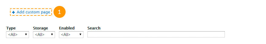
To create a new page, click Add custom page link.
Follow the instructions on the screen, fill in all required fields, save the changes.
To edit an existing page, click Edit link next to the page title.
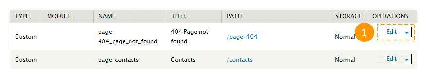
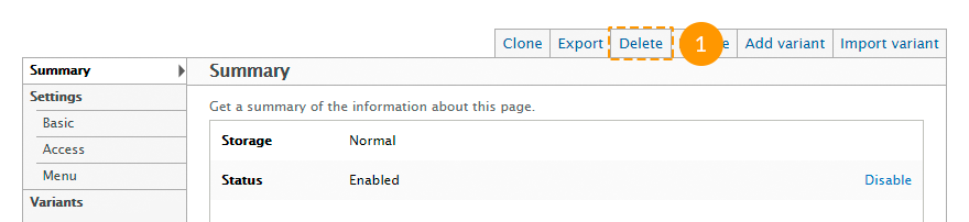
To remove a page, in the editing mode click Delete tab at the top of the page.
Feel free to check the following instructions:
View management
Most Drupal templates content is made using views, such as:
-
- Archive
- takes the content type "Blog entry", arranges them by months and displays them in the block or page mode.
-
- Banners
- takes the content type "Banner" and displays them in the block mode.
-
- Categories
- takes taxonomy terms from the "Blog categories" vocabulary and displays them in the block mode.
-
- FAQs
- takes the content type "FAQs" and displays them in the page mode.
-
- Portfolio
- takes the content type "Portfolio Item" and displays them in the Portfolio (Gallery, Services) page mode in two, three or four columns.
-
- Portfolio filter
- creates a portfolio filter block that can be used in the "Portfolio" view.
-
- Recent comments
- takes comments and displays them in the block or page mode.
-
- Recent posts
- takes the content type "Blog entry" and displays them in the block mode.
-
- Slider
- takes the content type "Slide" and displays them in the slider block mode.
-
- Team
- takes the content type "Employee" and displays them in the block mode.
-
- Testimonials
- takes the content type "Testimonial" and displays them in the block or page mode.
- And other views.
To manage views, follow the instructions below:
- To check the full list of all existing views, in the admin panel navigate to Structure > Views menu or in a browser's address bar type http://www.example.com/?q=admin/structure/views, where www.example.com is your website URL.
-
To create a new view, click Add new view link.

- On the appeared page specify a view title, content type, ordering type and display mode.
-
To set additional parameters, press Continue & edit button. To complete, press Save & exit button.

-
To edit an existing view, select Edit option from the drop-down list next to the view title.

Do not make changes to an existing view, if you are not sure what you are doing.
-
To remove an existing view, select Delete option from the drop-down list next to the view title.

-
Views displayed in the block mode can be managed the same way as the regular blocks. You can also open a view block's settings page directly from your site front-end. To do it, mouse over the needed block, click the gear wheel icon at the top right corner of the block and choose the Configure block option:

-
Views displayed in the pages mode can be set up the same way. Mouse over the needed block, click the gear wheel icon at the top right corner of the block and choose the Edit view option:

Feel free to check the following instructions:
Media management
Media module controls the uploading of images and videos.
To manage media, follow the instructions below:
- To check the full list of all existing media files, in the admin panel open Content menu and navigate to Media tab or in a browser's address bar type http://www.example.com/?q=admin/content/media, where www.example.com is your website URL.
-
To remove existing images or videos, check them, in the Operations field choose Delete option and click Submit button.

-
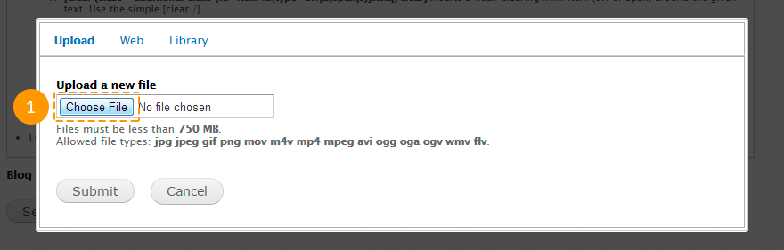
To add a media file to a node, click Select media button in the node editing mode.

-
On the appeared page:
- in the Upload tab you can upload an image from your computer;
- in the Web tab you can specify an image URL or a YouTube or Vimeo video URL;
- in the Library tab you can select an image or video from the Drupal Media library.
After you select the media file, press Submit button.
Please, note, that you can add a video only to the Blog entry content type nodes.
Feel free to check the following instructions:
Shortcodes
Shortcode is a little bit of code that contains 1-2 words. Shortcodes are used instead of writing a large program codes (dozens of lines) to perform some functions.
To use shortcodes the Shortcode, TM Shortcodes modules should be enabled.
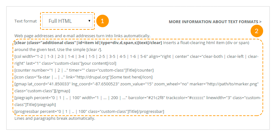
The full list of all available shortcodes you can check in the Text format section while creating a node.
You can use the following shortcodes:
[clear][/clear] - clears floated blocks. The shortcode contains the following attributes:
-
- class
- an additional class;
-
- id
- an element indicator (id);
-
- type
- an element type: block (div, d) or in-line (span, s).
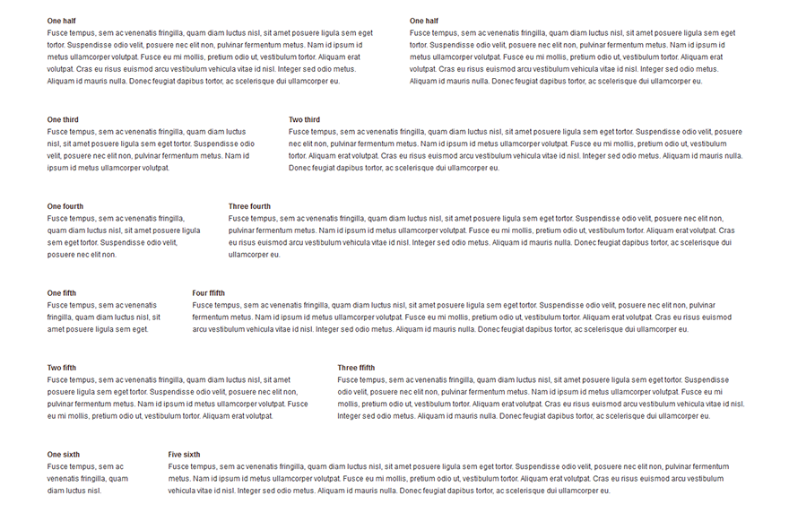
[col][/col] - displays content in columns. The shortcode contains the following attributes:
-
- align
- columns alignment: right - a column will appear at the right side of the external block, center - a column will appear at the center of the external block;
-
- class
- an additional element class;
-
- clear
- clears floated blocks: clear-both - on both sides, clear-left - on the left side only, clear-right - on the left right only;
-
- last
- should has "1" value for the last column.
-
- width
- column width: 1-2 - a half, 1-3 - a third, 2-3 - two thirds, 1-4 - a fourth, 3-4 - three fourths, 1-5 - a fifth, 2-5 - two fifth, 3-5 - three fifth, 4-5 - four fifth, 1-6 - a sixth or 5-6 - five sixths external blocks.
It is recommended to use this shortcode inside [clear][/clear] shortcode.
For example:
[clear type="div"]
[col width="1-3"]column content[/col]
[col width="1-3"]column content[/col]
[col width="1-3" last="1"]column content[/col]
[/clear]
Possible use cases:
[counter][/counter] - displays animated counters. The shortcode contains the following attributes:
-
- class
- an additional element class;
-
- number
- any integer number;
-
- timer
- count speed from 0 to the specified date in milliseconds.
The shortcode content serves as a title.
For example:
[counter number="300" timer="30" class="custom-class"]Title[/counter]Possible use cases:

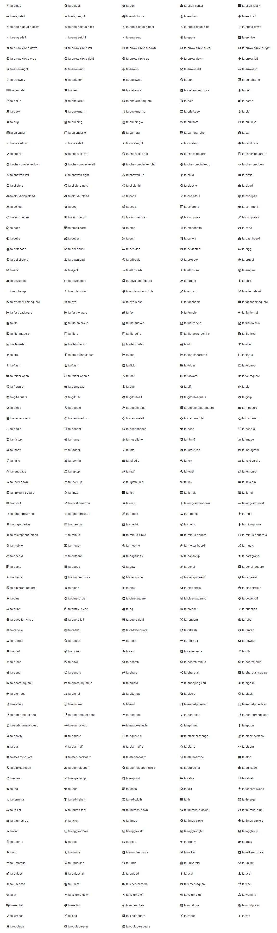
[icon][/icon] - displays FontAwesome icons. The framework uses FontAwesome 4.1.0 version. The shortcode contains the following attributes:
-
- class
- FontAwesome icon class;
-
- link
- URL-address, if you want to add a link to the icon.
For example:
[icon class="fa-star"]Текст[/icon]Possible use cases:
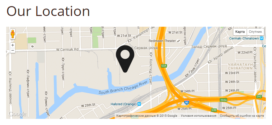
[gmap][/gmap] - inserts a Google map. The shortcode contains the following attributes:
-
- class
- additional element class;
-
- lat_coord
- latitude coordinate;
-
- lng_coord
- longitude coordinate;
-
- zoom_value
- initial zoom level of the map. Use values from 1 to 20;
-
- zoom_wheel
- adds a scroll wheel to the map. Use "yes" or "no" value.
For example:
[gmap lat_coord="41.850033" lng_coord="-87.6500523" zoom_value="15" zoom_wheel="no" class="custom-class"][/gmap]Possible use cases:
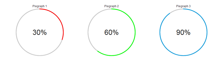
[piegraph][/piegraph] - displays a cycle progress indicator. The shortcode contains the following attributes:
-
- barcolor
- a color of the bar line;
-
- class
- an additional element class;
-
- linewidth
- the line width, any integer number;
-
- percent
- a progress in percents (0-100);
-
- trackcolor
- a color of the track line (progress line);
-
- width
- diameter of the progress bar, any integer number.
The shortcode content serves as a title.
For example:
[piegraph percent="60" width="200" barcolor="#21c2f8" trackcolor="#cccccc" linewidth="3"]Title[/piegraph]Possible use cases:
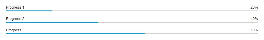
[progressbar][/progressbar] - displays a progress bar. The shortcode contains the following attributes:
-
- class
- an additional element class;
-
- percent
- a progress in percents (0-100);
The shortcode content serves as a title.
For example:
[progressbar percent="30"]Title[/progressbar]Possible use cases: