Digging into Duotone: How to Create & Use Colorized Images in Web Design
Images play an integral part in modern web design, and if in the beginning of the ‘wild wild web’ you could get by without using them at all, right now every design depends on them. Photography and typography are blended into a single rough mix of visuals which you, as a designer, are privileged to orchestrate.
The major purpose of such a mixture is to bring forward a brand personality and create an identity that can be instantly recognized. But the creation process becomes more versatile and fun when you have an adequate number of weapons in your design arsenal. Today I want to introduce to you one of these weapons, a .44 Magnum in the world of design techniques - and that is the duotone effect.
I’ll tell you about the theory behind duotone images, provide some examples and, most importantly, share with you some techniques on how you can create duotone images in Photoshop.
A little bit of history
The classic definition of a duotone is a halftone image that is printed using two colors, or two shades of one color. In the old days of print, duotone was a cheaper alternative to color print, since the former required only two types of ink.
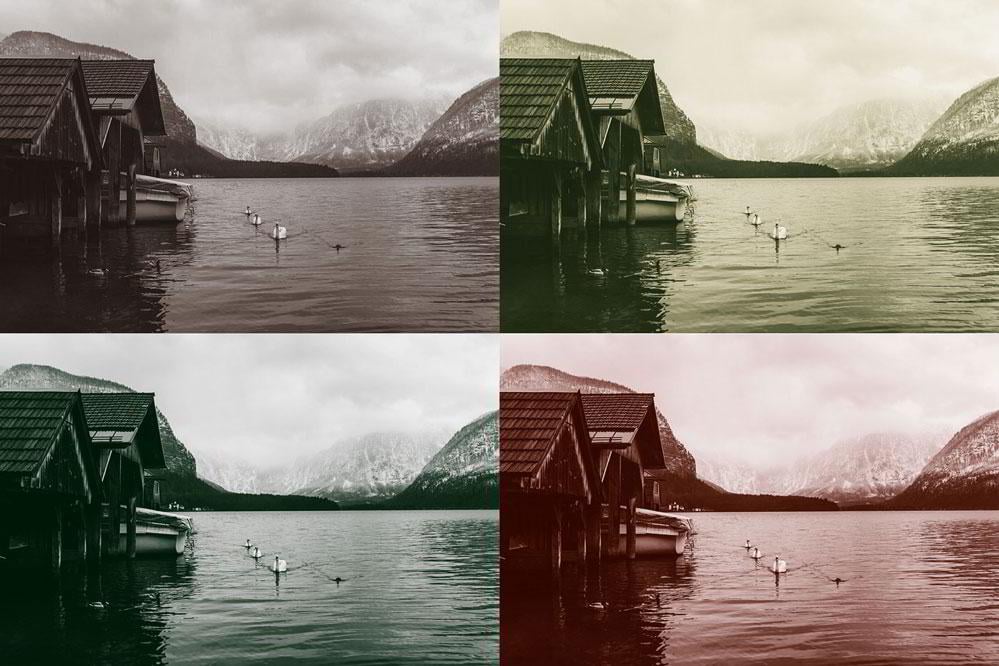
Examples of duotone images similar to what were used in print
Besides a cheaper cost, there’s also an aesthetic component to duotone images that can easily change the mood of your design composition. Graphic designers have been using duotone in print for quite a while now, however there hasn’t been too much of it on the web. Until now.
Duotone and its modern application on the web
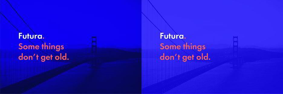
Although colorized imagery has been known to designers for a long time, the trend started to take off right after a major Spotify redesign.
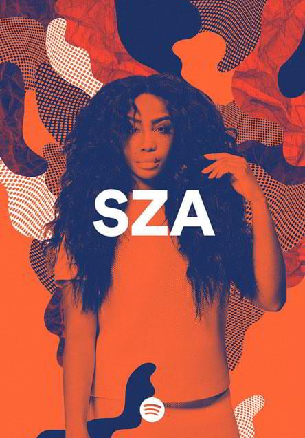
Brian Collins and his team managed to create a bold and inspiring identity that encouraged many designers to experiment in that direction.
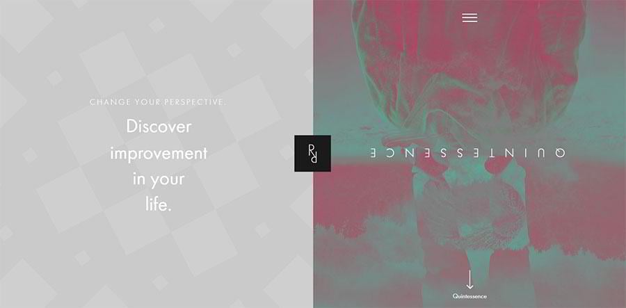
Take a look at some of the examples of how the duotone effect is used around the web.
Holm Marcher & Co.

Marshall WordPress Theme

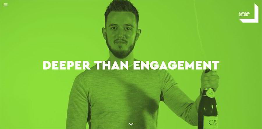
Social Chain
Home Inspector

Adison Partners

Renate Rechner
Carent

What’s the magic behind it?
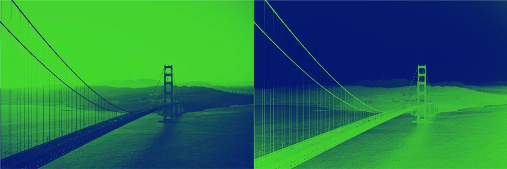
The effect is created by replacing the original image colors with two colors of choice based on the lightness and darkness of the image. The darker parts of the image are colorized with the first color, and the lighter part is painted with the second color.
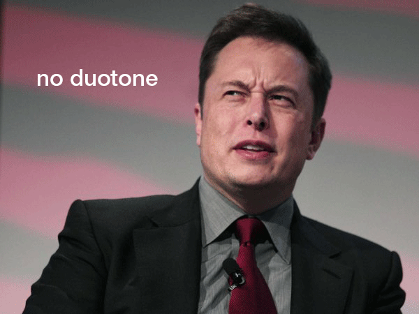
The effect is similar to black-and-white photography, except you are not limited to black and white and can combine any other colors you want.
How to create a duotone effect in Photoshop
There are three ways to achieve this effect in Photoshop. The first technique is the most common one, but in this article we’re also going to explore two alternative options.
METHOD 1. GRADIENT MAP TOOL
That’s the easiest and go-to way to colorize your image with a duotone effect.
Gradient Map is an adjustment layer in Photoshop that applies a gradient to an image based on its brightness values. If your image has a lot of darks in it, the first color will be prevalent, the same goes with the lights and the second color.
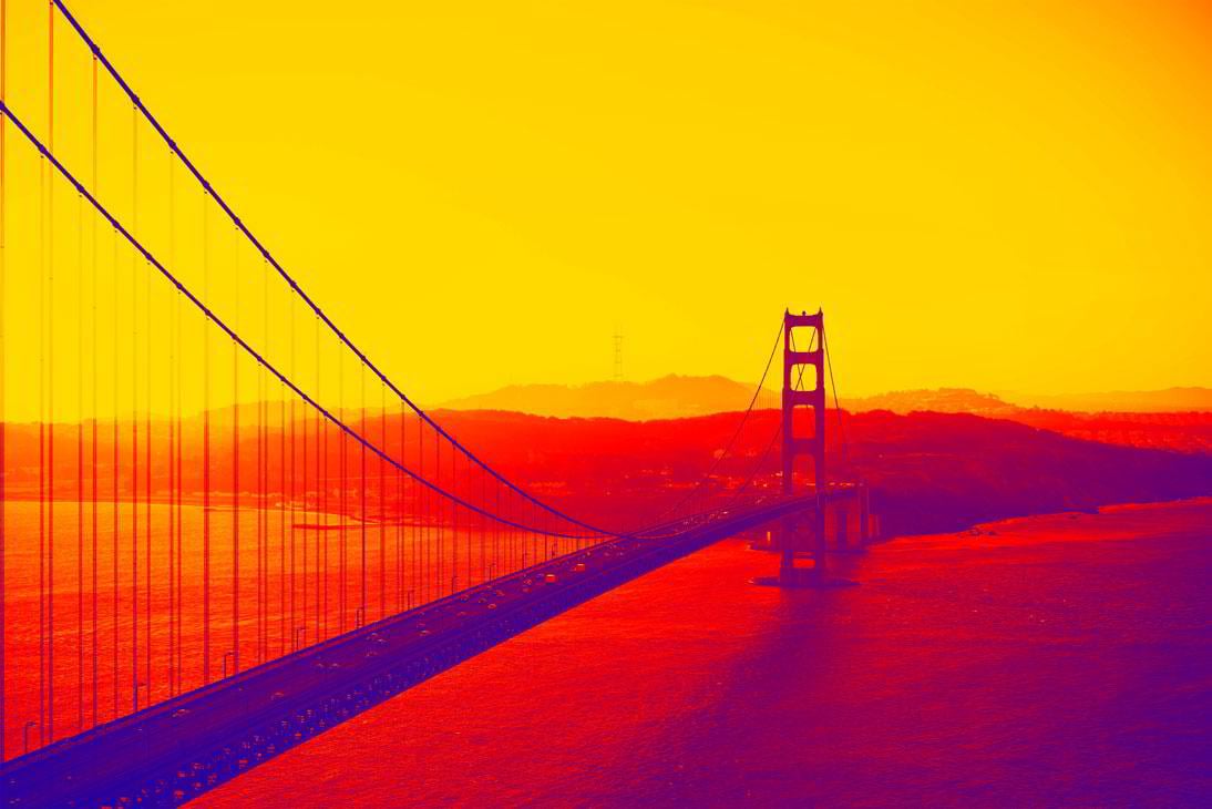
First, choose an image with which you’re going to be working, and open it up in Photoshop. In my example I’ll be using a photo from Unsplash. You can see that a large portion of the image is taken up by a bright sky, so whatever color I choose as second, when applying the duotone effect, it would be dominant in the composition.

In order to add a new adjustment layer go to the Layer menu, hover over New Adjustment Layer, and click on Gradient Map.
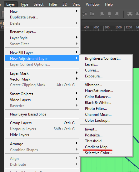
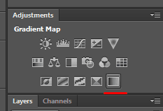
Alternatively you can select a Gradient Map icon in your Adjustments window.
A new layer will appear in your Layers panel. If your default foreground and background colors are set to black and white, you’ll see a black and white image.
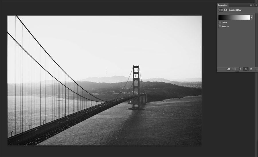
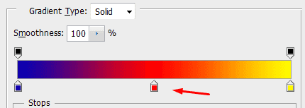
Click on the gradient picker in the Properties window and try out different color combinations.
Picking a Duotone Color Palette
The basic rule of thumb in choosing colors for a duotone image is to pick a darker color first, and a lighter second, otherwise your image would look inverted (of course, if it’s not the effect you’re looking for).
A duotone effect with an inverted color scheme
It’s also not a good idea to pick two bright colors, although in some cases you might want to do this in order to create a unique style for your image.
Some of the best combinations include either contrasting colors, or a hue of one color combined with white or a shade of black.
When Two Is Not Enough
Sometimes we want more than two colors. Luckily, the Gradient Map tool can help us with that. Just add another Color Stop and pick the third color you want to add to your palette.
Here’s an approximate example of what a tritone image would look like if we were preparing a post about Instagram.
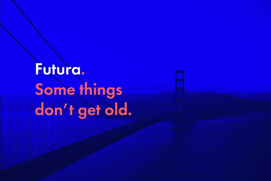
Adding Just a Little Bit of Type
Very often duotone images can be successfully used in the background. Since their color scheme would consist of only two colors, it would be much easier to pick the right color and weight for the type in order to make it readable and stand out.
Gradient Map vs Color Overlay
A gradient map can also be a great alternative to a color overlay. With a duotone you have more control over your visuals, since you are given two colors instead of one to manipulate.
Here on the second image below you can see how an overlay of the same color would look like with 80% opacity:
Duotone vs Color overlay
The first image makes a much stronger impact thanks to the contrast and saturation, and there’s no way for us to achieve the same level of saturation in the second example because of the overlay opacity.
As you can see, Gradient Map is a very easy tool to work with. It can be turned on or off when needed without affecting the original image. However it’s not the only technique for creating duotone. Let’s explore the other two.
METHOD 2. COLOR FILL LAYERS
The second method is a bit complex, but it helps you understand better how the duotone effect can be created, so let’s explore that as well.
Here’s the original image I’ll be working with:
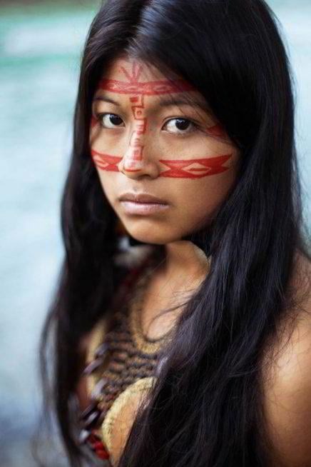
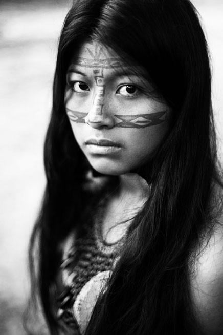
Open up your image of choice in Photoshop and click on Layer > New Adjustment Layer > Black & White in order to make your image monochromatic. This would take out all the hues from the image and let us deal only with shades of black.

It seems that the image needs more contrast, so I’ll add a Brightness/Contrast layer by clicking the corresponding icon in the Adjustments window. I’ll increase the contrast value up to a 100, and add the brightness value of 7.
Here comes the most interesting part. We need to add two color fill layers to our photograph. Click on Layer > New Fill Layer > Solid Color to add the first one, and choose the color value of #0d3edf. Your image should be filled with a solid highly saturated blue color.
Blending Modes
Now let’s pause here for a minute and remember about blending modes in Photoshop. They allow us to mix layers and change their hue, saturation, brightness and tone based on mathematical formulae. The two most popular modes are Screen and Multiply, and they’re exactly what we need to create a duotone effect.
To put it simply, the Screen mode makes all the dark pixels of an image disappear. In our case the darkest region of our image is the girl’s hair, so you can see how the blue color fills in all the darks, and instead of black and white, the picture becomes blue and white.
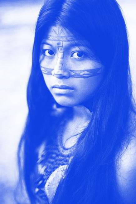
In order to achieve this effect, select the blue fill layer in your Layers window, click on the blending mode drop down list, and choose Screen.
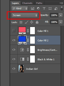
Changing a blend mode of a layer in Photoshop
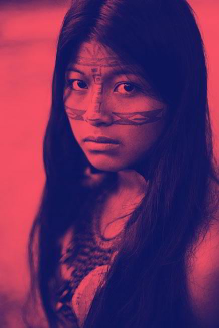
Adding the second color
Now add another color fill layer, this time we’re going to make it red, with a value of #fa5265.
Instead of selecting Screen mode, choose Multiply, which would leave all the darker parts of the image untouched, but would colorize the whites instead.
At the moment, your image should become a mixture of blue and red, where the blues substitute the shadow parts of the photograph and the reds fill out the highlights. As a result we get this duotone effect:
Feel free to play around with the colors and position of the layers to achieve the result you want. Pay attention to the order in which layers are placed (in this case the blue layer is below the red one), because this may result in some unwanted changes.
METHOD 3. DUOTONE MODE
The third method may seem verbose and mostly applies to print rather than to the Web, but it can also come in handy, in part due to a large collection of duotone presets.
Open your image in Photoshop, and convert it to Grayscale Mode by clicking Image > Mode > Grayscale.
Now that it’s black and white, you can convert it to the Duotone Mode. Go to Image > Mode and select Duotone.
You can play around with some of the presets and see how this affects the image.
Notice that the effect is different from the ones we created previously, because the colors are blended in, and we don’t see a colorized, contrasting effect. In order to make it similar to the previous examples, do the following:
- Select Duotone in the Type drop-down list. This would enable you to select two colors instead of one.
- Select the second ink color, I chose
#f11b1b. - Click on the Overprint Colors button below, click on the first square, and select the color with which you want to overprint the image (I went with
#091cae). - Click on the curve icon on the left side of the second color box.
 In the very first input field enter 100. This would turn the diagonal line into a horizontal one and put it to the top.
 - Click OK and close the window. Go to the Image > Mode and select RBG Color to convert your image back to the standard color mode.
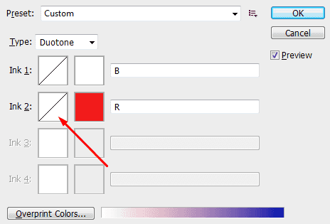 In the very first input field enter 100. This would turn the diagonal line into a horizontal one and put it to the top.
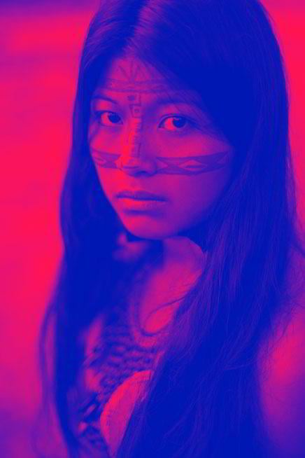
Here’s the result you should get.
This method requires a few extra steps, but the result is worth it. It’s also helpful to know that you can achieve this trendy colorized effect in the Duotone mode as well.
Comparing Gradient Map, Color Fill, and Duotone Mode
We’ve explored three ways to create a duotone effect, and the result in each of them is a little bit different.
For comparison’s sake I colorized the previous image with duotone using the first two techniques described in the article, and here’s what I’ve got. The colors that were used for the effect are #f11b1b and #091cae.
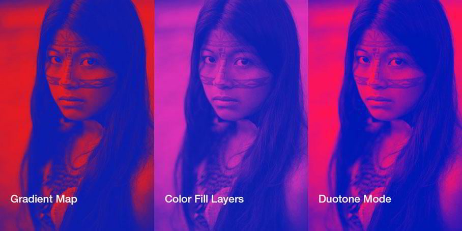
An image colorized with the same colors using different duotone techniques
The above result doesn’t mean, that you cannot adjust the values such as contrast, hue or saturation when using each of the techniques, but that’s the result we get if we apply the same colors with default settings. Also note that I didn’t use the brightness adjustment layer in the color fill example and applied a black and white layer only.
Summing It All Up
A duotone effect is an awesome way to bring boldness to your design, as well as make your images fit into the overall color scheme of your website. Duotone images can also be used to increase readability of the content, and simplify the color palette of your project. The effect can be applied in many places, e.g. in the hero section of your front page, as a background, or as a hover effect.
Duotone is fun to experiment with and explore, coming up with new color combinations, and rediscovering the ones you already know. If you need to make a strong impression on your visitors and make your design catchy and modern, duotone is a great technique to achieve this.
Don’t miss out these all-time favourites
- The best hosting for a WordPress website. Tap our link to get the best price on the market with 82% off. If HostPapa didn’t impress you check out other alternatives.
- Website Installation service - to get your template up and running within just 6 hours without hassle. No minute is wasted and the work is going.
- ONE Membership - to download unlimited number of WordPress themes, plugins, ppt and other products within one license. Since bigger is always better.
- Ready-to-Use Website service is the ultimate solution that includes full template installation & configuration, content integration, implementation of must-have plugins, security features and Extended on-page SEO optimization. A team of developers will do all the work for you.
- Must-Have WordPress Plugins - to get the most essential plugins for your website in one bundle. All plugins will be installed, activated and checked for proper functioning.
- Finest Stock Images for Websites - to create amazing visuals. You’ll get access to Depositphotos.com to choose 15 images with unlimited topic and size selection.
- SSL Certificate Creation service - to get the absolute trust of your website visitors. Comodo Certificate is the most reliable https protocol that ensures users data safety against cyber attacks.
- Website speed optimization service - to increase UX of your site and get a better Google PageSpeed score.

I like to create websites from the ground up, coding them carefully with HTML and CSS. Sometimes even the best and professionally created templates need some coding tricks. And here is my Quora account.
Get more to your email
Subscribe to our newsletter and access exclusive content and offers available only to MonsterPost subscribers.

Leave a Reply
You must be logged in to post a comment.