 EN
EN ES
ES RU
RU DE
DE PL
PL IT
IT TR
TR FR
FR BR
BR NL
NL CZ
CZ UA
UA HU
HU SE
SE 无限下载
无限下载 
 Sale
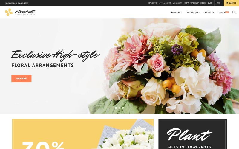
Sale FloraFest-花店响应式Magento主题
 对于一个产品,您将从作者获得6个月的支持。要了解更多相关内容,请阅读支持政策。
 减价出售:
减价出售:
MonsterONE - 无限制下载 $14.10/月
License permits using this item to create unlimited digital end products for sale during the active period of your subscription.
|
Support
加入后可下载此产品 免费 


模板怪物市场
TemplateMonster 是一个市场,您作为设计师或开发人员可以在这里出售您的网页设计软件、网站模板、设计元素、插件和扩展。成为数字产品供应商,每笔销售可赚取高达 70% 的佣金。
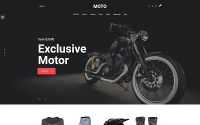
这是带有示例数据安装程序的 Plants Store Magento 模板
它是什么?
它是一个在线组件,有助于设置保存实时演示内容的大量数据文件。
为什么它好?
示例数据安装程序只需单击几下即可导入和启用示例数据。
在此处查看更多示例数据安装程序 Magento 模板
这个 Flower Shop Magento 设计是 Retina Ready
它是什么?
Retina Ready WordPress 主题是能够适应 Retina 显示屏的模板,并且看起来仍然清晰而充满活力。
为什么它好?
Retina Ready 布局使所有视觉效果和内容显得更清晰、更明亮、更生动。
最新的Retina Ready Magento 设计模板在这里
这个花店 Magento 设计是搜索引擎友好的
它是什么?
搜索引擎友好的模板根据现代 SEO 要求进行了优化。以下内容增加了它们在网络上被查看的可能性,从而提高了您的网站在谷歌搜索结果中的排名位置。
为什么它好?
SEO 有助于到达 Google 搜索结果的顶部并符合最流行的搜索引擎所需的排名因素。因此,您的网站在网络上可见。
新鲜的搜索引擎友好的 Magento 模板在这里
这个假期 Magento 模板是响应式的
它是什么?
响应式设计意味着互联网页面可以调整其大小和形状以匹配几乎任何屏幕,从最小的手机到最宽的笔记本电脑或电脑屏幕。对于每种设备,网页元素都会增大或减小以看起来更理想。
为什么它好?
响应式网站设计可让您丰富用户体验,并提供从任何设备对网站信息的完整访问。
这里有新鲜的响应式 Magento 设计模板
0 Reviews for this product
0 Comments for this product
Customer Support
This rating is based on feedback from customers who have received support from the author of this product.
This value represents the average response time to a client's inquiry or request.
Features:
Language support:
Magento Extensions:
Magento Compatibility:
Magento Engine:
Web Forms:
对软件和托管的要求:
 Adobe Photoshop CC+