 EN
EN ES
ES RU
RU DE
DE PL
PL IT
IT TR
TR FR
FR BR
BR NL
NL CN
CN CZ
CZ UA
UA HU
HU Obegränsade nedladdningar
 Sale
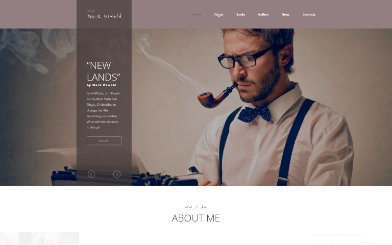
Sale Mark Oswald - Writer Responsive Minimal HTML5 webbplatsmall
6 months of support
![]() Med en produkt får du 6 månaders support från skaparen. Mer information om vad som ingår finns i supportpolicyn.
Med en produkt får du 6 månaders support från skaparen. Mer information om vad som ingår finns i supportpolicyn.
 Med en produkt får du 6 månaders support från skaparen. Mer information om vad som ingår finns i supportpolicyn.
 Försäljning:
MonsterONE - Obegränsad nedladdning för 13.25$/mån
License permits using this item to create unlimited digital end products for sale during the active period of your subscription.
|
Support
Gå med för att Ladda ned denna artikel kostnadsfritt 


Ändringsloggen
Mark Oswald Version 1.1 (April 24, 2019) Additions
8 Reviews for this product
I like the fact that this template is clear and concise, and has a nice open format. I expect to garner favorable results from implementing this as our sales website template.
This template was very easy to navigate around and to customize. I used Dreamweaver, and it was fluent and easy to work with if you have a basic to medium level skills in Dreamweaver and Photoshop (or any equivalent software that can do what Dreamweaver and Photoshop can do).
For example, changing the image assets to my own was as simple as opening the image in Photoshop and blanking out the whole background and then just overlaying it with my own image, and then saving the image in its original file name. Then, like magic, the template image changes to my own image, guaranteeing the dimensions of my new image are correct (because it mirrored the original template image), and best of all…no further html coding involved for replacing the images, because I didn't change the file name. Too easy! For the extra images that were not needed, I simply deleted them either in Dreamweaver’s graphic mode, or sometimes you might have to delete something in the html code mode if they’re not going away in graphic mode deletion.
Also, it was easy to add more items into the gallery image area (to exceed the amount the template came with), by simply copying & pasting the html code involved in that area. Dreamweaver allows you to edit in either graphics mode or just viewing the raw html code. I just highlight the section I want to duplicate while in graphics mode, and then I change over to the html code mode and instantly see the entire code of the section I highlighted while I was in graphics mode. From there, it’s just a simple matter of using the copy & paste command. Mistakes are un-avoidable, but that’s what the undo button is for, and also mistakes is how we learn and improve our skills.
I loved how the template automatically adjusts itself in regards to the device being used to view it. For example, if I view my website from my desktop PC with my large 28” monitor, it looks very nice. Then when I view the same website on my iphone (with the same URL my desktop used), I automatically get everything adjusted to suit my smaller iphone screen, and even some of the navigation elements are automatically optimized for better use with mobile device controls. I don’t know how this happens by itself because I am only editing the template once. Whoever made this template obviously used some technology that automatically re-adjusts the website design to suit the device viewing it (PC, iphone, tablet, etc.). I might not know how it automatically happens, but I’m glad it does happen because it makes me look good, and it saves me a lot of time and hassle by not having to make 2 different versions of my website (one for desktop, and another for mobile devices).
Thank you RockThemes for making this beautiful template, and for making me look professional with a website that looks like I paid someone 2000 dollars to make for me.
The Mark Oswald Writer responsive HTML5 website template has a modern, attractive design. I offer for those who have essential HTML editor skill and can upload the template manually for the web server. The manual updating seems to be a disadvantage, but if you need rarely edit the text on the homepage, in my opinion, a better solution than a CMS website, what for sometimes needs webmaster due to the hardly editable menu systems. Not to say about the CMS homepage often an aim to hackers. At this template no such a problem. The only issue aroused when I want to switch out the slider, which was impossible up to this moment. The text and the images are easily editable and changeable.
This is exactly what I was looking for...a fresh, responsive site to replace my previous one. I found it easy to work with and tweak for my own needs, and the support team was quick to respond with the fix for the single JS glitch I encountered.
Great and complete product with great extra plugins and support.
0 Comments for this product
Customer Support
Support rating ()
![]() This rating is based on feedback from customers who have received support from the author of this product.
This rating is based on feedback from customers who have received support from the author of this product.
This rating is based on feedback from customers who have received support from the author of this product.
Response Time:
Normal
![]() This value represents the average response time to a client's inquiry or request.
This value represents the average response time to a client's inquiry or request.
This value represents the average response time to a client's inquiry or request.