Crazyshop is a cutting-edge Shopify 2.0 responsive theme designed to meet the diverse needs of modern eCommerce businesses with its intuitive design, robust customization capabilities.
Sales:
18
Updated
Support: 4.7/5

KarDone is a ready-made solution for diverse types of online stores. his Shopify multipurpose design theme offers unlimited opportunities for promoting your goods.
Sales:
289
Support: 4.3/5
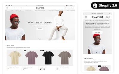
Champion theme is best suitable theme for clothing for men, women and kids.Theme is made with shopify default dawn version so its help you for support all third party apps etc.
SALE
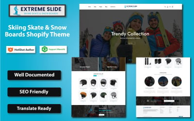
Introducing the Skiing Skate & Snow Boards Shopify Theme, a dynamic and responsive theme designed specifically for extreme sport enthusiasts.
Sales:
1
Support: 5/5
 $
$
FREE INSTALLATION
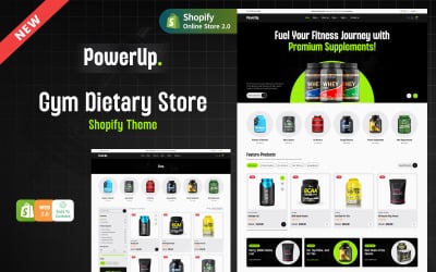
Powerup - Gym & Fitness Supplements Shopify Theme offers a dynamic and responsive design tailored to showcase and sell fitness products effortlessly.
Sales:
19
Updated
Support: 4.5/5
$
FREE INSTALLATION
Gadgetize - Computer Gadgets & Accessories UI Shopify Theme: Sleek, responsive, and feature-rich, perfect for tech stores to boost sales effortlessly.
Sales:
11
Support: 4.5/5
$
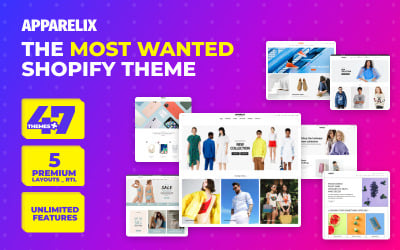
Apparelix clean multipurpose Shopify theme is the all-in-one solution to create stunning and minimal apparel websites whether you have a large or single product inventory.
Sales:
336
Support: 4.3/5
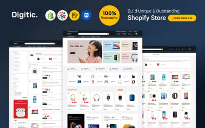
Digitic - Electronics, Gadgets, and Computers are the top Shopify responsive theme for online electronics and electrics companies.
Sales:
147
Support: 4.6/5
$
SALE
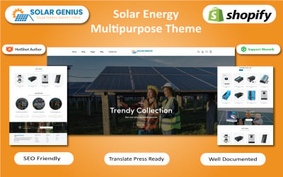
Solar Genius - Solar Energy Shopify Theme is a professional and modern theme designed for solar and wind energy businesses, as well as renewable energy companies.
Sales:
4
Updated
Support: 5/5
$
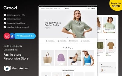
Groovi is a sleek, responsive OpenCart theme ideal for Women’s Fashion, Kids’ Fashion, and Blogs. Packed with customizable layouts, SEO-ready design, and seamless functionality!
Sales:
7
Updated
Support: 4.6/5
$
FREE INSTALLATION
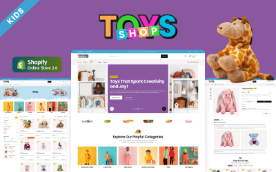
Toys Shop - Toys Shop Shopify Theme: A vibrant, playful theme designed to showcase and sell toys with ease, offering fun layouts and customizable features.
Sales:
13
Updated
Support: 4.5/5
$
FREE INSTALLATION
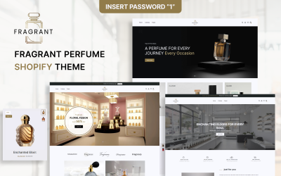
Discover Fragrant: Where elegance meets scent in a seamless Shopify theme. Elevate your fragrance store today!
Sales:
29
Updated
Support: 4.5/5
$
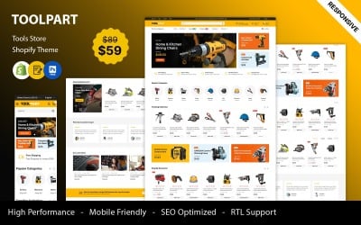
ToolPart is the perfect choice for entrepreneurs looking to establish a powerful online presence in the tools and equipment industry.
Sales:
33
Support: 4.6/5
$
FREE INSTALLATION
Game Rush UI - A dynamic Shopify theme for gaming gear & accessories, offering sleek design, seamless navigation, and gamer-centric features.
Sales:
6
Support: 4.5/5
$
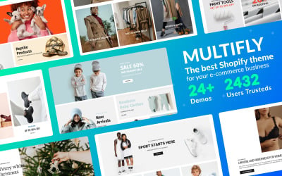
Multifly Multipurpose Shopify Theme is a perfect example of universality and a quality design mixed together to help you sell various products.
Sales:
205
Support: 4.3/5
FREE INSTALLATION
Gearhub Auto - Auto Parts & Car Accessories Shopify Theme: Streamline your online store with a sleek, responsive design for auto enthusiasts and sellers.
Sales:
10
Support: 4.5/5
$
Beautify is a sleek, responsive theme perfect for beauty salons, cosmetics, spas, and fashion stores. It offers stunning design, easy customization, fast performance, and powerful features.
Sales:
5
Updated
Support: 4.6/5
$
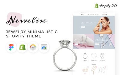
Rapid development of a jewelry store website with excellent functionality. The jewelry minimalistic Shopify theme will help you launch your website in the shortest possible time
Flex Fusion UI – A powerful Shopify 2.0 theme for sports clothing & fitness supplements. Fully responsive, SEO optimized, and designed for conversions!
Sales:
3
Support: 4.5/5
$
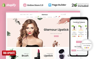
Glamour Cosmetics Shopify Theme perfectly fits for stores selling Beauty apparels and Cosmetics. Theme is responsive and user-friendly as all the customization settings are provided in the admin.
Sales:
255
Updated
Support: 4.3/5
FREE INSTALLATION
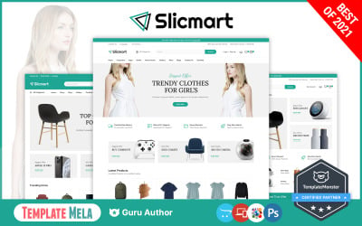
Slickmart is a modern OpenCart theme with a sleek design and a robust backend. It has three layouts in total, all of which are very appealing and eye-catching.
Sales:
6
Updated
Support: 4.5/5
$
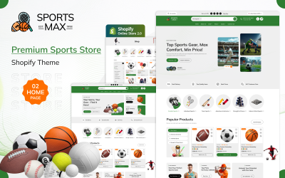
Sports Max - Sports & Fitness Equipment Store Shopify 2.0 Responsive Theme is a modern, high-converting theme designed to showcase sports gear, gym accessories, and activewear with style and ease.
New Product
Support: 4.5/5
$
FREE INSTALLATION
Lexicon is professional minimalist Responsive Opencart Theme built to create modern powerful e-Commerce website.
Sales:
51
Updated
Support: 4.5/5
$
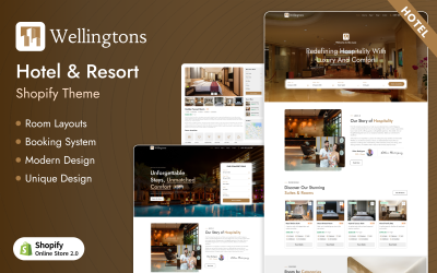
Wellingtons is a luxury hotel and resort booking Shopify theme designed for premium stays. Elegant layout, seamless booking, and modern design crafted for unforgettable guest experiences.
Sales:
1
New Product
Support: 4.5/5
$
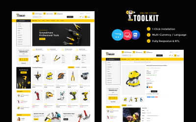
Toolkit is specially designed for products like HandTools, Hardware, Equipment, Accessories, Auto, Sparepart, Automobile, Bike, Car, Mechanic, Art, Ceramic, Furniture etc.
Sales:
18
Updated
Support: 4.6/5
$
Huntic Store is a modern Shopify theme for fishing gear, tackle, and outdoor supplies. Perfect for anglers and outdoor brands looking to launch a sleek, high-converting online store.
New Product
Support: 4.5/5
$
FREE INSTALLATION
Print Hive UI - A vibrant Shopify theme for designing, painting, and printing stores, featuring sleek layouts, SEO optimization, and secure checkout.
Sales:
4
Support: 4.5/5
$
FREE INSTALLATION
Fashion Buds - A trendy Shopify theme crafted for fashion and clothing stores, featuring sleek design, easy navigation, and powerful shopping tools.
Sales:
1
Support: 4.5/5
$
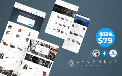
Are you in need of a ready-made template to create website where you can sell auto parts and accessories? - Eveprest Spare Parts theme is quite the thing. With this theme, you get plenty of...
FREE INSTALLATION
Soccer Club - Soccer & Football Sports Club Shopify Theme offers a sleek, responsive design for showcasing teams, merchandise, and engaging sports fans.
Sales:
10
Support: 4.5/5
$
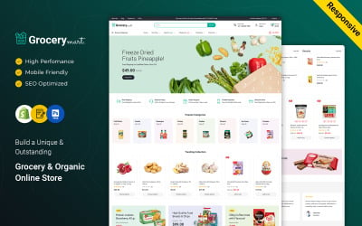
Grocery Mart, the ultimate Shopify theme for grocery stores, vegetable markets, and organic food retailers.
Sales:
16
Support: 4.6/5
$
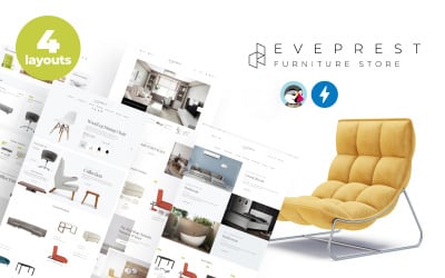
Good furniture is determined by its design and functionality. Eveprest Furniture theme was developed to create the needed conditions to give a good showing to your products. This theme was built to...
FREE INSTALLATION
Artify - Furniture & Home Decor Shopify Theme: A modern, elegant design for showcasing furniture & decor, featuring seamless navigation and customization.
Sales:
4
Support: 4.5/5
$
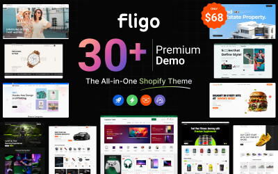
SALE
Fligo is a clean, modern, and versatile Shopify 2.0 theme designed for multipurpose stores. With sleek layouts and responsive design, it's perfect for any eCommerce business.
Support: 4.5/5
$
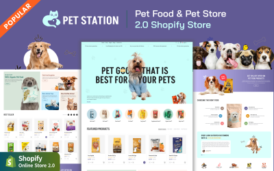
Pet Station - A charming Shopify theme tailored for pet lovers, offering a seamless shopping experience for pet supplies and animal products.
Sales:
2
Support: 4.5/5
$
Need a dynamic website to sell activewear, sports clothing, and gear? - Multipurpose Extreme Sports Template - Nextprest is straight from the hood.The theme includes 1.6 and 1.7 versions and is...
Sales:
403
Support: 4.1/5
E-commerce Website Templates
Looking for a way to establish a money making online store? Don’t know what to start with? We have this covered for you, providing professional eCommerce themes created for many e-commerce engines such as Magento, PrestaShop, VirtueMart, Zen Cart, OpenCart, etc.
Every template combines the best appearance and functionality! You will enjoy the look and feel of each item for sleek and thought-out color schemes, as well as high-quality premium stock photos available for lifetime use. Shopping cart design variations, user-friendly navigation, site-wide search options & filters, informative product description pages, and other functions surely make our online commerce themes stand out among the competitors.
Keeping in mind our clients' business needs, we have made all themes cross-browser compatible and search engine friendly. Furthermore, people will always find your resource in all major search engines and contact you without additional effort!
One more reason to choose the offered pre-made online store designs is the free 24/7 lifetime support provided with them! Qualified technical support specialists work twenty-four hours a day, seven days a week, to promptly address any problems!
Select professional eCommerce templates today to boost sales and make your online store a blast on the web!
Browse by eCommerce categories and functionality:
WordPress Ecommerce Themes
MotoCMS Ecommerce Themes
Elementor Ecommerce Templates.
Magento Templates are designs produced for use with the Magento eCommerce platform – a highly efficient open-source eCommerce engine.
View all Magento Themes
Running your shop online has never been that easy as with PrestaShop Templates you get from TemplateMonster. We provide PrestaShop online store designs that will let you create an eCommerce environment everyone’s going to like. Just add your product range, and you are ready to start accepting orders!
View all PrestaShop Themes
Many online merchants have yet to take steps to improve their eCommerce business in any aspect, much more one that addresses the visual appearance of their web stores. We are here to help you with a professional website overhaul. Build a steady online business with simple and intuitive OpenCart Templates!
View all OpenCart Templates
WooCommerce themes are snazzy designs for your future WordPress-based web store. These themes internally use the WooCommerce plugin, which is simple to manage and easy to start with. See the selection of WooCommerce templates available now, and the choice can be filtered for what you want. Then pick a design and add the pizzazz to your eShop.
View all WooCommerce Themes
MotoCMS 3 E-commerce Templates
If you want to build an eStore on your own, you won’t find an easier solution because MotoCMS 3 eCommerce templates are equipped with a simple drag-and-drop editor. You can experiment with the design and add the functionality you need. You may integrate Yotpo reviews into your store to boost your business credibility; you can easily manage the orders and customers and get all the statistics. In addition, MotoCMS allows you to save your hard drive space so far as it requires only 64 M to install your website.
View all MotoCMS 3 E-commerce Templates
If you want an out-of-the-box eCommerce solution for your business, Shopify Themes are a much better option to think about. You get a hosted web store with any Shopify Template right after installation with Shopify. This is built to make it very simple to create and customize every aspect of your website design.
View all Shopify Themes
Template Monster is pleased to present to you our newly updated product line of Zen Cart Templates. We have added newly designed Zen Templates to meet the improved abilities and standards of the new Zen version just released.
View all ZenCart Templates
VirtueMart Templates are design themes produced for VirtueMart – an extremely popular Joomla-based eCommerce engine.
View all Virtuemart templates
Top features every eCommerce website template should offer
When choosing templates for your eCommerce website, you need to make sure they present some important functionalities. The presence or not of these will determine the success or unsuccess of your business. This affirmation lets you imagine how crucial they are.
This is the reason that explains why we listed the top features your eCommerce shouldn’t miss.
Optimized for mobile
As you may already know, the number of users that access the web from their mobile devices is snowballing. The mobile responsiveness allows the users to see and interact with your content clearly and smoothly. If not so, they could get annoyed and leave it almost immediately.
This feature is also extremely important for Google, as it is one of its ranking factors. This means it prioritizes those websites that are responsive, conferring more exposure and relevance.
Easy to navigate
Regardless of the amount of content, a website should be easy to navigate. Thus, your website needs to have all the options (e.g., menu) that allow the users to explore and discover any spot. In other words, users should be able to access the content they want quickly and easily.
In-site search
One of the most important features that shouldn’t miss on an eCommerce website is the in-site search option. Users should make their product research straight to the point and get only the results they may be interested in. If not available, they would be forced to scroll through all the products before getting to what they’re looking for, which is annoying and can make them leave.
Payment gateway integrations
A good eCommerce website should offer a wide range of payment options and let you pay with your favorite one. This is a vital feature since it can ultimately decide whether or not a user proceeds with the purchase of the product. Thus, make sure to include at least the most popular payment methods.
Security
An eCommerce deals with transactions during which there is an exchange of personal and financial information. You have to invest in a secure eCommerce platform equipped with advanced and modern security features in such a case.
Benefits of using an eCommerce template
Some benefits drive people to buy eCommerce templates rather than creating the website from scratch. The benefits are related to the functionalities, economic, and appearance aspects.
Below we listed some of the most relevant advantages you’ll get from buying a template.
Launch for online shop quickly
Developing a website from scratch generally requires much more time than implementing a template. This is why, if you need to launch your online business as quickly as possible, the latter will be the best solution for you.
Money-saving
As you may already imagine, hiring a developer can be more expensive than buying and integrating a template. This is particularly advantageous for small businesses with a small and limited budget, which can’t afford such a cost. Instead, most of the eCommerce templates are available at lower than 100$.
Free support
Most of the website templates you’ll encounter across the web offer, in addition, free support. This means there is a team ready to answer and help you with any issue you may encounter during the implementation or use of their product. This way, you’ll save time that you’d otherwise spend figuring out the problem by yourself.
Mobile optimized and fully responsive
Most of the available online templates are already optimized for mobiles and are fully responsive. Thus, you won’t need to do it manually, which may require technical knowledge and experience. Having a fully responsive website will allow you to improve and offer a better user experience to your visitors, that will be more willing to spend more time interacting with your online shop. And the more time they spend on your website, the more relevance it’ll gain.
Design flexibility and customization
Ready-to-use templates enable you to get a professional design and a fully working online store with no development skills required. However, you may decide to edit some elements or details. In such a case, you can easily do it by using drag-and-drop tools, which are purposefully designed for beginners or people with no coding experience.
3rd app integrations
The majority of the ready-made templates you'll find online are accompanied by 3rd app integrations or are compatible with them. These apps will allow you to improve the functionalities and services of your business. Whether you want to track website visitors, add social media buttons, integrate an email marketing system, add contact forms, pop-ups, customer surveys, and much more.
Ecommerce Website Templates Unlimited Download with MonsterONE
If you need more than a single template, a subscription to the MonsterONE plan might be a better solution for you and your business. It will allow you to access and download unlimited eCommerce website templates and many other digital graphics designed by experts from all around the world.
Ecommerce website templates FAQ
Which is better: Shopify or PrestaShop?
If you’re a beginner with no technical experience at all, Shopify might be the better solution for you. Instead, if you’d like to have a platform that offers the most customization, PrestaShop will be a more suitable choice.
Is WooCommerce free?
WooCommerce itself is free. However, you may need to sustain additional costs for a theme, plugins, extensions, and developer fees.
Is WordPress good for eCommerce websites?
Despite the fact that WordPress isn’t eCommerce-focused, it features plugins that help you build and run an online shop correctly and successfully.
How to upload an external template to Shopify?
If you’d like to upload an external template to Shopify, you should follow these steps:
- go to the Theme library section;
- click on Upload theme;
- select the file that you want to upload;
- upload the file.
How do I move my WooCommerce site to Shopify?
To move your WooCommerce site to Shopify, do the following:
- go to your Shopify admin, then click Apps, and then Store Importer;
- on the import your data into Shopify page, choose WooCommerce;
- click add file and select your exported files;
- select the WooCommerce XML file;
- click Continue import, and then Import.
 ES
ES RU
RU DE
DE PL
PL IT
IT TR
TR FR
FR BR
BR NL
NL CN
CN CZ
CZ UA
UA HU
HU SE
SE Unlimited Downloads
  Sale
Sale 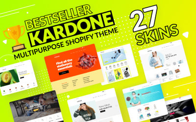