- Web templates
- E-commerce Templates
- CMS & Blog Templates
- Facebook Templates
- Website Builders
HTML/CSS. How to create vertical and horizontal menu
March 13, 2020
This tutorial will show you how to create a vertical and horizontal menus in HTML using CSS styles. Before you proceed please make sure you are familiar with unordered list HTML tags. Also please check the tutorial on how to create a menu in HTML.
Ok, first of all create an HTML menu using the unordered list:
<ul>
<li><a href="#">Home</a></li>
<li><a href="#">About</a></li>
<li><a href="#">Services</a></li>
<li><a href="#">Partners</a></li>
<li><a href="#">Contacts</a></li>
</ul>
Then you need to create new CSS file and attach it to the HTML page:
<link href="style.css" rel="stylesheet" type="text/css" />
Make sure you put the CSS attachement code into the <head> tag of your html page.
You can also use the inline styles.
	<style type="text/css">
		...here goes your CSS styles...
	</style>
As a result you shou have the following HTMl code:
<!DOCTYPE html PUBLIC "-//W3C//DTD XHTML 1.0 Transitional//EN" "http://www.w3.org/TR/xhtml1/DTD/xhtml1-transitional.dtd">
<html xmlns="http://www.w3.org/1999/xhtml">

<head>
	<link href="style.css" rel="stylesheet" type="text/css" />
</head>

<body>

<ul>
	<li><a href="#">Home</a></li>
	<li><a href="#">About</a></li>
	<li><a href="#">Services</a></li>
	<li><a href="#">Partners</a></li>
	<li><a href="#">Contacts</a></li>
</ul>

</body>
</html>
The unordered list has it’s own styles so without any additional changes you have a vertical menu.
As for the horizontal menu you need to perform some changes in HTML and CSS.
First of all add new class to the list, replace <ul> with <ul class="horizontal">
Now in the CSS file let’s make the menu horizontal. The unordered list has margin and padding values assigned by default. we need to clear them:
ul.horizontal{
margin:0;
padding:0;
}
Then make your list items display horizontally:
ul.horizontal li{
display:block;
float:left;
padding:0 10px;
}
We added the horizontal padding value to the list items to make then not stick to each other. Now your menu is ready, assign links, add some fancy colors and background and your are good to go.
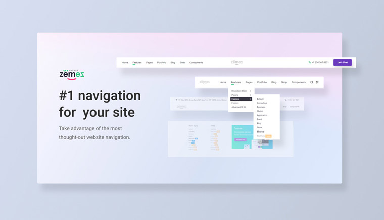
Zemez Responsive Navbar JavaScript

The average user has neither time nor patience to surf your website in search of the required information. Difficult-to-use navigation makes the user feel awkward and may leave the site anytime. Choose Zemez responsive Navbar JavaScript to avoid these mistakes and boost the functionality of your web resource.
This Navbar JavaScript is a beautiful solution for those who want to add more power to a web resource. The package comes with 8 unique layouts, multi-level dropdowns and megamenus, available in light and dark color schemes. Moreover, it is cross-browser compatible as it supports Edge 15+, Firefox 54+, Chrome 51+, Safari 10+. Click the demo link to view a demonstration of this script work.
More features:
- SASS
- Sticky navbar
- Fixed and fullwidth layouts
- Flexbox based
- Round-the-clock support


