 ES
ES RU
RU DE
DE PL
PL IT
IT TR
TR FR
FR BR
BR NL
NL CN
CN CZ
CZ UA
UA HU
HU SE
SE Unlimited Downloads
  Sale
Sale 



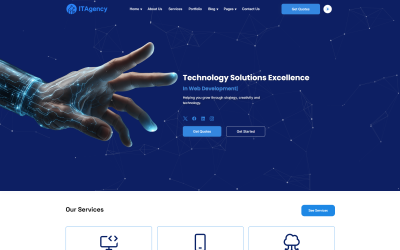


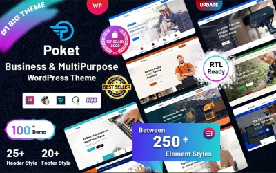
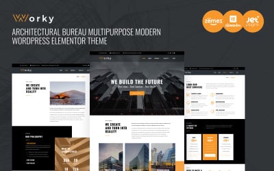
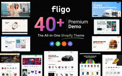
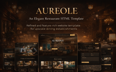

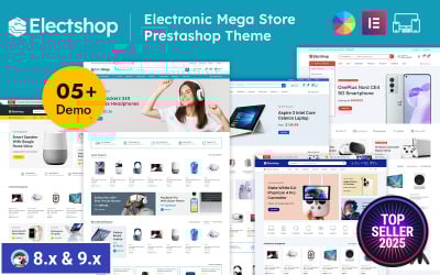
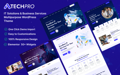
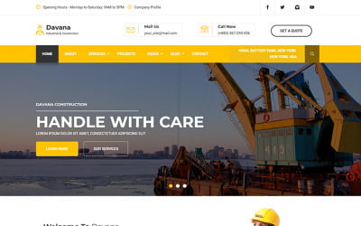


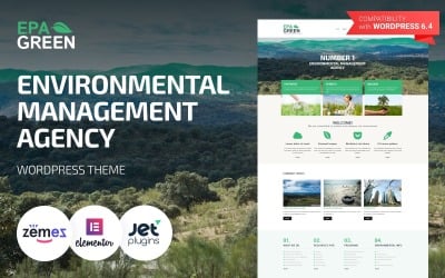

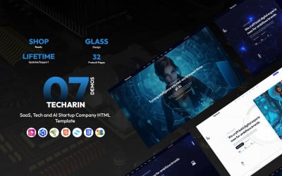

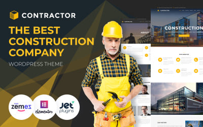

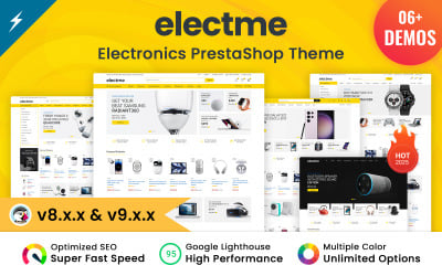
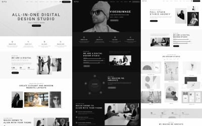
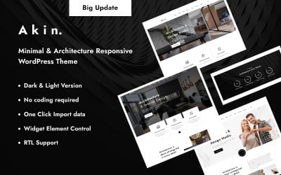

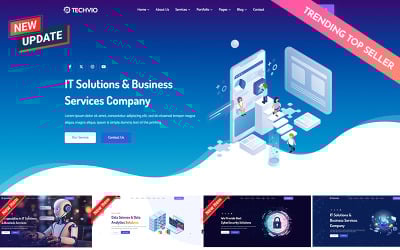



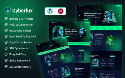
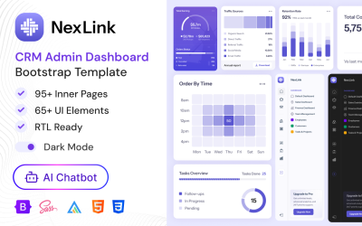


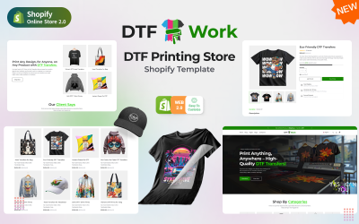


5 Best Responsive Website Templates 2026
10 Best Responsive Website Templates
| Template Name | Key Features | Number of Downloads | Cost |
| BeClinic - Multipurpose Medical WordPress Theme |
Multiple pre-built skins Various page templates Built with Elementor Fully animated revolution slider A huge number of pre-installed plugins |
2805 | 59 |
| Monstroid - Best WordPress Template |
55+ powerfully designed template sets Optimized source code Sample data installer Visual editor Long-term support |
7788 | 61 |
| Intense Multipurpose Website Template |
Trendy and clean design Novi visual page builder Intense UI kit Smooth parallax scrolling Dedicated support |
4352 | 29 |
| Imperion - Multipurpose Corporate WordPress Theme |
Build with Elementor SEO-friendly WPML-ready Bonus images pack Lifetime support |
1237 | 59 |
| Hazel - Clean Minimalist Multi-Purpose WordPress Theme |
Tons of pre-built beautiful pages Sticky navigation Revolution slider included Retina ready Unlimited colors and styles |
4065 | 89 |
| Tripster - Travel Agency Modern Elementor WordPress Theme | Built with Elementor Jet plugins included Install in one click Bonus high-quality images pack Well documented | 128 | 59 |
| Eveprest - Multipurpose Website Template |
Multipurpose solution Multiple layouts for each topic PrestaShop privilege 30+ exclusive JX modules Informative documentation |
1126 | 71 |
| House - Modern And Minimalistic Construction Project Website WordPress Theme |
Minimalistic layout Sample data installer SEO-friendly code WPML-ready Long-term support |
149 | 59 |
| Innomerce - Business Multipurpose Minimal Elementor WordPress Theme |
Eye-catching pages for all occasions Google fonts integrated WordPress Live Customizer Valid and clean HTML code Bonus images |
700 | 59 |
| BuildWall - Construction Company Multipurpose WordPress Theme |
Perfect solution for construction businesses 11 amazing demos Jet plugins included 30 custom pages 3 blog layouts |
1945 | 59 |
How to Make Your Website Responsive With Elementor Page Builder
If you ever asked “How do I make my website responsive with Elementor?” then this tutorial is for you. Visit Elementor Marketplace to get amazing themes, templates, and add-ons: https://www.templatemonster.com/elementor-marketplace/ How To Make Your Website Responsive For Elementor Builder? After watching this easy-to-follow tutorial you will be able to make your website responsive. Visitors will always get the best user experience possible. This tutorial is completely dedicated to the challenge of responsive for Elementor builder. It’s focused on the Elementor responsive problem. How To Make Website Responsive? A responsive website means that it can adapt its content (images) to match various screen or browser window sizes. Therefore, a visitor will always see the correct content. Images won’t be clipped where they are not supposed to be and the text will stay at the same spot. This tutorial shows how to create a responsive WordPress website with Elementor and what problems you may have to deal with. Elementor is a flexible WordPress page builder and it can help you make your website look modern. The Elementor-made responsive website will be rendered properly on various screen sizes. The key points of this video tutorial are: How to adjust the properties of widgets and text elements for mobile devices. How to move and resize columns. How to hide widgets, columns, or sections for certain devices. How to deal with the overcome position. How inline width can help you create a flexible mobile layout There are many challenges when you create a responsive website. It’s important to understand the importance of responsive design. You need to know how to solve various responsive design-related challenges. Nowadays, people use different devices to access websites and you have to be sure that your website looks correctly no matter what your visitors use. It affects the usability of your website.
Responsive Web Design Template FAQ
What is a responsive website template?
A responsive website design (template) is a design of web pages that gives the correct display of your website on any device - computers, tablets, phones, etc., and adapts to any screen resolution automatically. 100% responsive template fully optimizes your site and it automatically changes depending on the device that you browse the website from. The site changes all the sizes of images, modules, menu items, etc.
Is a responsive design must-have today? Is it so important?
Google gives preference to websites optimized for mobile devices if the user enters queries from a phone or tablet. This means that the user will be given first of all sites with a fully responsive design because they are much more convenient. The majority of visitors are young and middle-aged people who have tablets and phones from which they surf the web. Responsive design is a must-have today if you wish to increase your traffic and grow your business.
What are the three main components of responsive design?
Responsive website design consists of the following three main components:
- The site must be built with a flexible grid foundation.
- Images that are incorporated into the design must be flexible themselves.
- Different views must be enabled in different contexts via media queries.
Is there any difference between a responsive design and an adaptive one?
Responsive sites and adaptive sites are the same in that they both change appearance based on the browser environment and device they are being viewed on. Where responsive design relies on changing the design pattern to fit the real estate available to it, adaptive design has multiple fixed layout sizes. When the site detects the available space, it selects the layout most appropriate for the screen. Responsive design is still the “traditional” option and remains the more popular approach to date.