


- Web templates
- E-commerce Templates
- CMS & Blog Templates
- Facebook Templates
- Website Builders
FAQs
General Tutorials
Featured templates
MonsterONE Subscrioption


Our Support team is ready to present you a new tutorial that shows how to change sidebars width in Monstroid themes.
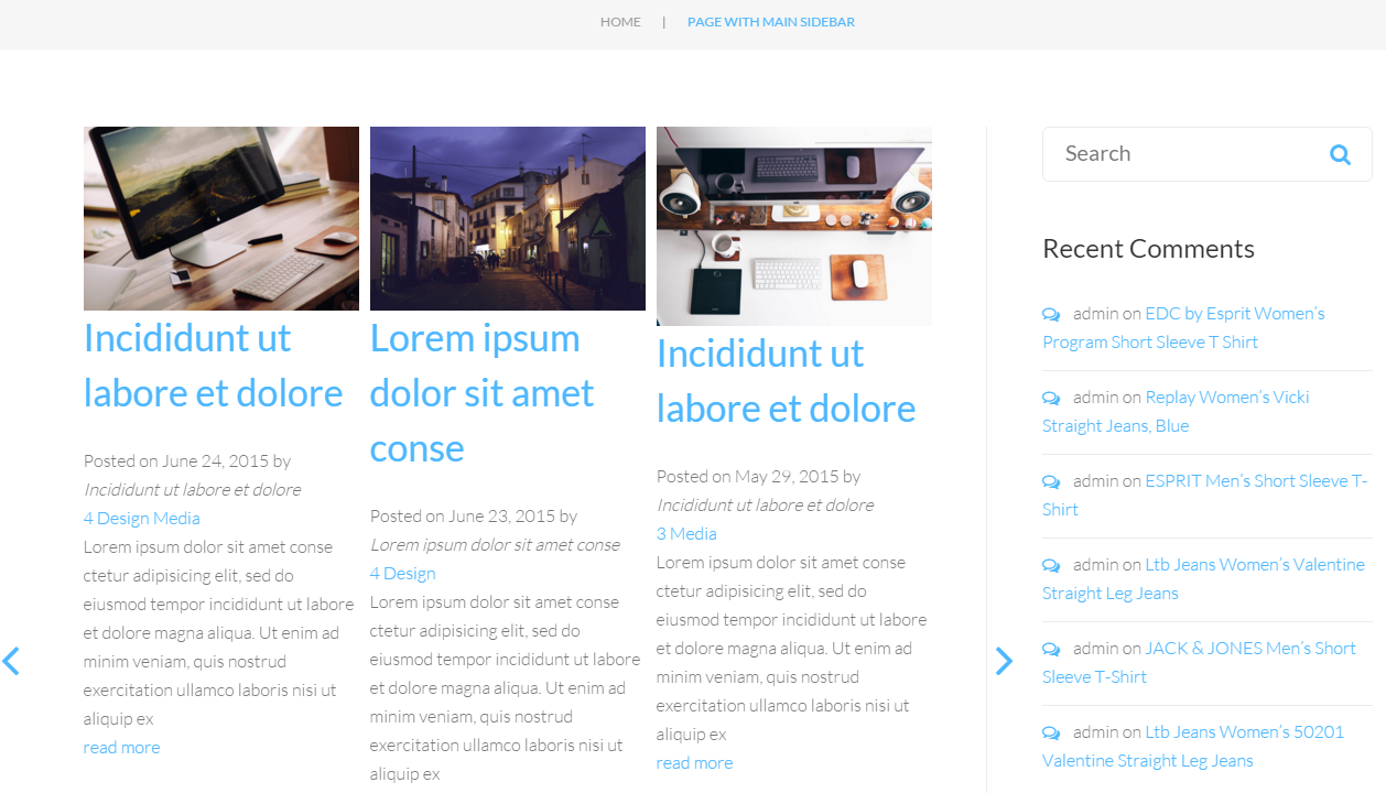
There are 3 sidebars that are usually used for pages with the sidebar: Main Sidebar , Secondary Sidebar and Custom sidebar:

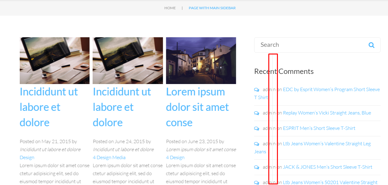
Inspect the sidebar with the developer tools to locate the css rule for sidebar width:

Copy the code to Cherry > User Css section and change the width value, save changes:

Then you will need to change the width of the content section in same way, make sure content and sidebar can fit in one row:

After changing the sidebar and content width, you will also need to change the location of divider:
Inspect the element with the developer tool and change the css rule to move the divider to correct location:

Since the sidebar is displayed under content on devices with width less than 992px, you will also need to change the sidebar width to 100% for such devices. Use the same sidebar css code with a media query and change the width to 100%. Your code should look like the following:
@media (max-width:992px){
.sidebar-content-wrapper .cherry-sidebar-main.widget-area, .content-sidebar-wrapper .cherry-sidebar-main.widget-area {
width: 100%;
}
}
Save your custom css codes in Cherry > User CSS section and check the result on your website:


You will need to locate and modify the width for the secondary sidebar with the help of developer tools if you need separate styles for it. Content width, location of divider and sidebar width on mobile devices are defined in the same way for all sidebars.
Your code for secondary sidebar width will look like the following:
.cherry-sidebar-main.sidebar-secondary.widget-area {
width: 25% ;
}

You will need to locate and modify the width for the custom sidebar with the help of developer tools if you need separate styles for it. Content width, location of divider and sidebar width on mobile devices are defined in the same way for all sidebars.
Your code for custom sidebar width will look like the following:
.cherry-sidebar-main.cherry-sidebar-manager-0.widget-area {
width: 20%;
}
Feel free to check the detailed video tutorial below:
Monstroid. How to change sidebar width