ES
ES RU
RU DE
DE PL
PL IT
IT TR
TR FR
FR BR
BR NL
NL CN
CN CZ
CZ UA
UA HU
HU SE
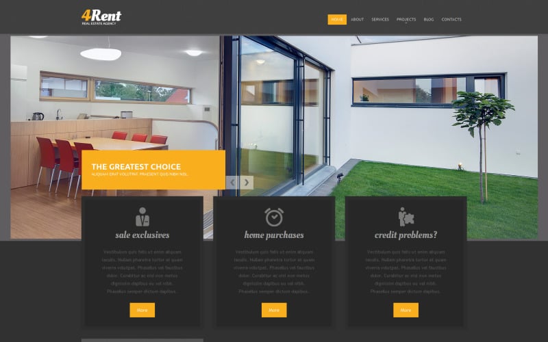
SEReal Estate Agency Responsive Drupal Template
This product is no longer available
Customer Support
Support rating ()
![]() This rating is based on feedback from customers who have received support from the author of this product.
This rating is based on feedback from customers who have received support from the author of this product.
 This rating is based on feedback from customers who have received support from the author of this product.
Created: Nov 17, 2014
Updated: Nov 17, 2014
ID: 52158