— Innovix HTML Email Templates — Ultimate eCommerce html Features — eCommerce design user experience Template

Create stunning email campaigns with Dsign. Our versatile bundle includes welcome, newsletter, and promotional templates. Fully customizable, optimized for engagement and conversions.
Sales:
4
Updated
Support: 4.7/5
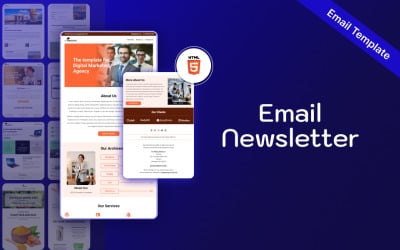
— Mailex HTML Email Templates — Ultimate eCommerce html Features — eCommerce design user experience Template
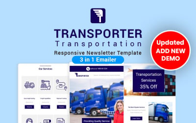
Transporter is a high-quality email template designed for transport businesses, which works to convey a clean and beautiful image to the read
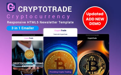
CryptoTrade Crypto Currency Responsive Newsletter Template is an excellent and high-quality email template built for today's digital currency
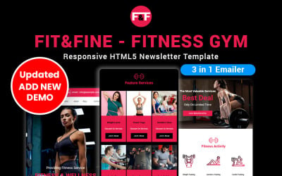
Now we have come up with a great unique design-related fitness newsletter template in which you will find all the necessary elements to present all those and the best points to your customers
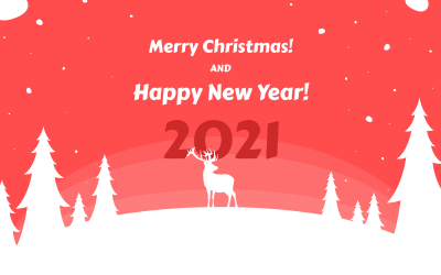
Minimalist Christmas and New Year Greetings Email TemplateThis design template is perfect to wish your clients a Merry Christmas and Happy New Year!The template is great for notifying your regular...
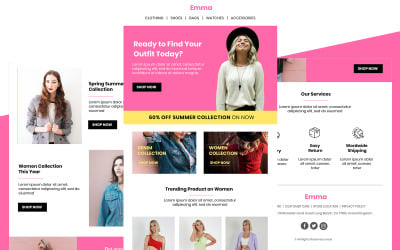
Emma is an email marketing template that allows you to promote the fashion studio or fashion e-commerce store to promote your items
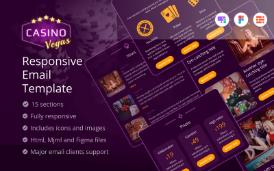
The Casino Vegas template helps you to present your service effectively. Customize it more easily using MJML and Figma files to align with your brand identity.
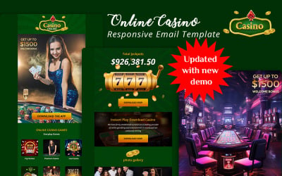
This newsletter is a one-of-a-kind design tailored to the needs of today's online casino game providers. With the help of which top premium segment emails are used
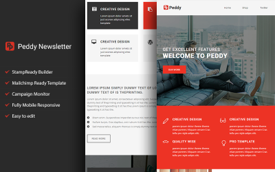
Peddy - Responsive Email template with Stampready builder. Fully Responsive and Major email client Supported.You can easily make changes through MailChimp, campaign monitor or Drag & Drop in...
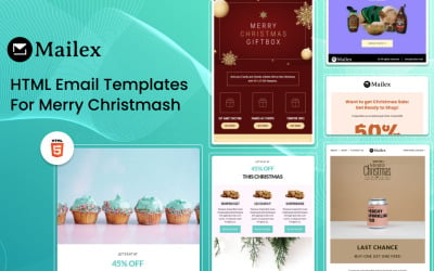
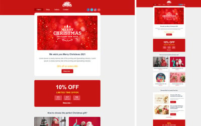
Christmas email newsletter is an HTML web template for designing your Products and gift newsletter for this Christmas festival or any other Festival send this to your customer beautiful Email...
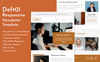
Deft01 - Responsive Email template with Stampready builder. Fully Responsive and Major email client Supported.You can easily make changes through MailChimp, campaign monitor or Drag & Drop in...
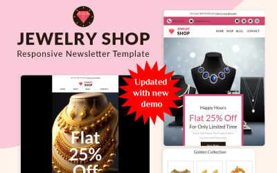
This is an email newsletter template designed to keep your jewelry store business in mind. Through this, you can make your jewelry store products easily available to your trusted
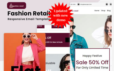
We have brought you the template of an email newsletter related to fashion retail, through which you can promote the products of your fashion store in an effortless way.
Enhance Your Email Marketing with Mobile-Friendly Newsletter Templates
Want to launch an e-mail campaign using the latest technology but don’t know where to begin? The best place to start is by using well-made mobile-friendly newsletter templates. The following will assist you to remain updated in the dynamic digital environment. Personalize any layout that matches your business look and see your user engagement increase at no cost for resources and tools! Now view yourself as your subscribers and witness how these exclusive designs will maintain their enthusiasm with less money and effort.
What are the Benefits of Mobile Email Newsletter Templates?
The following are some benefits of smartphone-friendly e-newsletter layouts:
- Boost ROI: Mobile-friendly mailings provide higher click-through rates and conversions than non-optimized e-mails.
- Maximize Reach: You will deliver content to prospective customers anywhere, anytime, and via any device by making electronic mail compatible with smartphones. This makes it easier for you to be effective in communication.
- Improved User Experience: Responsive e-mail themes provide easy reading as they adjust to fit the screen size.
- Improve Brand Recognition: When there is one identity for the company and it remains constant in all the communication channels, it helps stay consistent. This in turn builds customer loyalty and increases credibility. These enhance a company's image and long-term relationships with customers.
- Cost-Saving Solutions: Everything is pre-designed, hence it reduces design and maintenance costs.
Who Benefits From Mockups for Static Mailing Lists?
- E-commerce businesses: E-commerce companies can increase the number of their interactions with mobile customers, boost online sales, and grow ROI by sending out mobile-friendly e-mails.
- Influencers: Influencers can share promotional materials directly with their fans in real time on Instagram, Twitter, etc.
- Journalists and bloggers: Social media has changed how authors share stories, but creating interesting letters that look well on PCs and smartphones is still essential. Why not use responsive designs intended for this?
- B2B companies/professionals: You can keep your customers up-to-date on corporate news, new products, and services.
HTML Newsletter Mobile Template Features
Company marketing requires modern, feature-rich e-newsletters. They enable organizations to quickly and efficiently communicate with their target customers without compromising their message style. This feature list shows why your digital marketing campaign should rely on mobile-friendly newsletter templates:
- Responsive Design – Responsive layouts alter content based on the recipient's device. They work dynamically depending on the screens of users, saving space.
- Customization – Consumers feel connected when marketers send personalized messages. Such a strategy indicates individual care and a connection between a consumer and a company. This, by the way, increases click-through rates and engagement.
- Visual Content Support – Modern technology allows graphics, GIFs, and videos to create drama. That is, you help readers respond quicker than reading text alone! This offers visual excitement, attracts client attention, and perhaps increases open rates.
- Compliance with Popular E-Mail Marketing Platforms – These samples are compatible with MailChimp, CampaignMonitor, and StampReady.
- Image Inclusion – Demo pictures are already included to help you visualize how your content will look.
- Documentation & 24/7 Support – You have access to detailed documentation from a vendor and round-the-clock assistance during the first six months.
How to Choose a Mobile-Compatible Newsletter Template: Step-by-Step
Communicating professionally with clientele and prospects requires finding a proper mobile-friendly design. The right layout could even attract clients with appealing images that push them into action. Choose a current, professional theme with these easy steps:
- Determine Your Objectives – Before viewing designs, choose what type of data to incorporate into your message (text and images or mixed with video). This way, you can be informed ahead of time and decide which is worth writing about for your weekly or monthly content.
- Choose Theme – Ensure that the theme you choose is compatible with the major e-mail systems for purposes of compatibility across e-mail systems. For example, Hotmail, Yahoo, AOL, Gmail App, and so on.
- Investigate – Decide on a theme for your industry and maintain your company's image throughout. Think about whether colors look good, whether they fit into your existing branding regulations, and what kinds of messages include CTA buttons.
- Search – Browse TemplateMonster products and select ones based on topics, styles, or even special features.
- Live Demo – You should test a sample before purchasing and raise any questions about the layout. Does it work? How are links shown? Does each part have adequate text blocks? Etcetera.
Best Practices for Mailchimp HTML Mobile Newsletter Templates
Every professional marketer should follow these best practices to optimize open rates and click-throughs.
- Begin by thinking about the way readers view it on their portable devices. Maintain a basic and concise style while transmitting critical information on small screens.
- A/B testing is a way to test different versions and preview them before submitting each campaign. Data analysis, such as click-through rates and subscriber engagement, may highlight the positive or negative consequences of changes, resulting in better results than before!
- Also, while sending messages tailored to particular users' interests may enhance conversions, keep in mind why most people joined up in the first place. Consumers of today are skeptical by nature. Thus, their confidence level increases when effective and regular mailings happen once a week or month.
- The content strategy should be revised periodically to be able to cope with new consumer needs. For instance, surveys and feedback forms attract people, build community, and result in high conversion rates.
Tips by Expert for Using a Mobile Responsive Newsletter Template
Experienced marketers usually take into account the following factors when customizing these demos. Since the evolution of Internet marketing, it has become more important to make sure that all people can see your information. So, follow these guidelines to create the finest mobile-friendly e-newsletter possible:
- The fact that your content may be viewed on screens of varying dimensions and with different font sizes will determine how fast people read it. Remember this as you create.
- Small screen sizes limit space. However, in desktop versions, there are bigger boundaries and more options for features. So, try to reduce text portions, headers, and so on while retaining crucial information.
- To help users easily interact with your site, use large, bright buttons or links rather than little ones that need more clicks. This allows readers to click the recommended link/button.
How to Handle Mobile-Friendly E-Mails in MailChimp Editor
Learn how to use the MailChimp Editor to generate visually appealing emails for your projects. Get the latest ideas, tactics, and strategies for dealing with themes!
Frequently Asked Questions About Mobile-Friendly Newsletter Templates
Is it straightforward to utilize mobile-friendly newsletter templates?
There are files for multiple platforms in the download archives, like Stampready, Mailchimp, and CampaignMonitor. They all have easy-to-use interfaces that make it simple for anyone, no matter how much experience they have, to change the themes for each campaign.
Are there any rules about using mobile-friendly newsletter templates?
TemplateMonster offers personal and commercial licenses to match your needs. The former lets you personalize one project, while the latter lets you customize five and transfer or sell the end goods.
Are there free newsletter templates for email and mobile-friendly designs available?
Yes! Check out our partner, MonsterONE. This digital platform offers free and paid tools for modernizing and optimizing online businesses.
What does 'mobile responsive' mean when referring to e-newsletters?
Responsiveness means e-mails automatically adjust to the reader's device. Along with that, they maintain a consistent appearance (fonts, colors, images) on desktop computers, tablets, smartphones, ibooks/ebooks, etc.
 ES
ES RU
RU DE
DE PL
PL IT
IT TR
TR FR
FR BR
BR NL
NL CN
CN CZ
CZ UA
UA HU
HU SE
SE Unlimited Downloads
  Sale
Sale 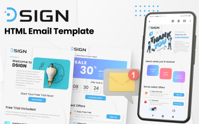