ES
ES RU
RU DE
DE PL
PL IT
IT TR
TR FR
FR BR
BR NL
NL CN
CN CZ
CZ UA
UA HU
HU SE
SE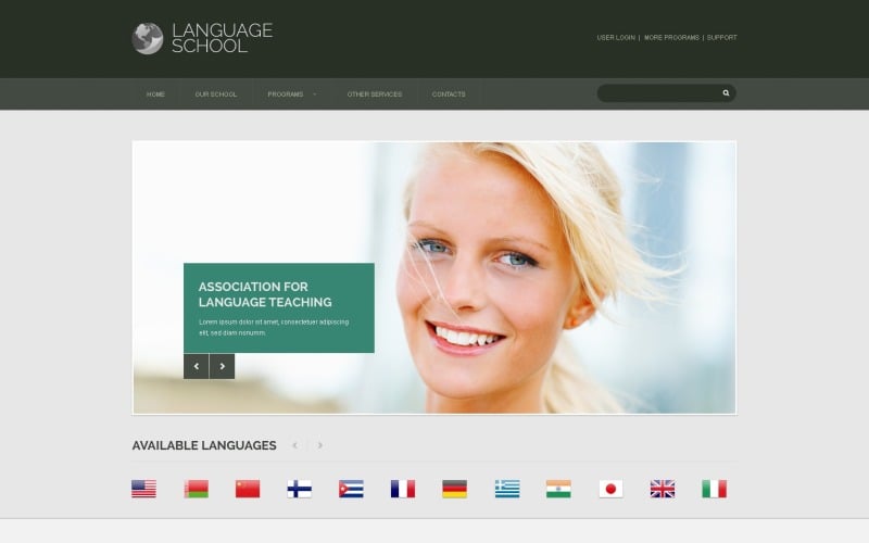
Добрый день!
Мы очень долго выбирали шаблоны, ну очень долго, где-то месяц. Выбрали сначала с десяток, потом начали их сравнивать и у нас осталось 2 дилера. В конце-концов остановились на этом шаблоне и не ошиблись!
Шаблон хорошо сверстан, хорошо и удобно прописаны стили. Приступили к автоматизации на ModX и надеемся наш сайт будет не хуже сайтов конкурентов)
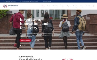
Шаблон рекомендуем использовать образовательным компаниям, у которых есть программы обучения по разным странам.
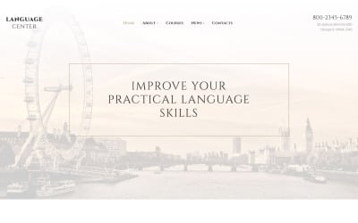
Language School Responsive Website Template
6 months of support
![]() With a product you will get 6 months of support from the author. To know more about what is included, please read the support policy.
With a product you will get 6 months of support from the author. To know more about what is included, please read the support policy.
 With a product you will get 6 months of support from the author. To know more about what is included, please read the support policy.
 Sales:
Choose a license
Popular Services from HTML Website Templates Experts
Or
 Get in Subscription
Get in Subscription
MonsterONE - Unlimited Downloads for $14.08/mo
License permits using this item to create unlimited digital end products for sale during the active period of your subscription.
|
Support
Join to Download this Item for Free
Summary generated by AI:
This language classes website template will easily draw attention of online users to your language study or languages institute webpage. If you are looking for a clear and simple, but at the same time creative way to advertise your cosmetologist courses, esthetician school or cosmetologist classes on the internet, this design is the best alternative. This item can automatically determine the gadgets used for navigating your internet resource and, as a result, adapt its design to the right screen dimensions. A comprehensive documentation folder as well as free 24/7 assistance are provided. Liven up your online resource with this particular web template, and you'll get your site visitors curious about your website.
TemplateMonster MarketPlace
TemplateMonster is a marketplace where you as a designer or developer may sell your Web Design Software, Website Templates, Design Elements, Plugins and Extensions. Become a digital products vendor and earn up to 70% from each sale.
This is a Bootstrap Education website template
What is it?
Bootstrap is a super well-known framework, that makes the work with Html code, CSS as well as JS far easier. It was built to be a tool to put together a responsive design, nonetheless over time it added loads of extra functionality.
Why is it Good?
Bootstrap scales any of your websites from mobile phones to desktops using the same codebase. It makes the web developing process faster and easier.
View more Bootstrap website templates here
This Special Education website design template is Responsive
What is it?
Responsive design is an approach to web design that allows web pages to adjust to a display size of any sort of device - be it a pc, a laptop or a mobile phone.
Why is it Good?
With the growing fascination with mobile devices, how many persons who log on to the websites from cell phones has increased a lot. This sort of aspect allows you to change websites to smartphones and a variety of screen extensions, eventually providing mobile device consumers with better options.
View more Responsive website design templates here
1 Reviews for this product
0 Comments for this product
Customer Support
Support rating ()
![]() This rating is based on feedback from customers who have received support from the author of this product.
This rating is based on feedback from customers who have received support from the author of this product.
This rating is based on feedback from customers who have received support from the author of this product.
Response Time:
Slow
![]() This value represents the average response time to a client's inquiry or request.
This value represents the average response time to a client's inquiry or request.
This value represents the average response time to a client's inquiry or request.