 ES
ES RU
RU DE
DE PL
PL IT
IT TR
TR FR
FR BR
BR NL
NL CN
CN CZ
CZ UA
UA HU
HU SE
SE Sale
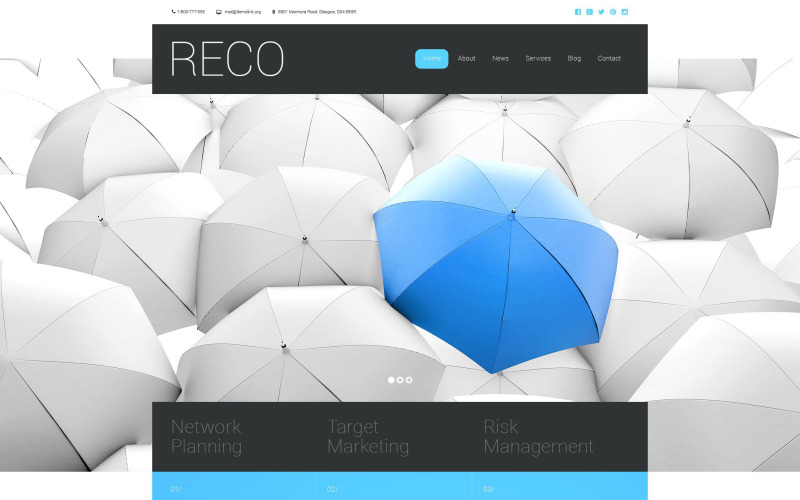
Sale RECO Website Template
 Sales:
Choose a license
Popular Services from HTML Website Templates Experts
 Get in Subscription
MonsterONE - Unlimited Downloads for $14.00/mo
 License permits using this item to create unlimited digital end products for sale during the active period of your subscription.
|
Support
Join to Download this Item for Free
License permits using this item to create unlimited digital end products for sale during the active period of your subscription.
|
Support
Join to Download this Item for Free

TemplateMonster MarketPlace
TemplateMonster is a marketplace where you as a designer or developer may sell your Web Design Software, Website Templates, Design Elements, Plugins and Extensions. Become a digital products vendor and earn up to 70% from each sale.
This is a Parallax Business Bureau website design
What is it?
A parallax scrolling effect is a method in website design when background image shifts at a less quick pace compared to a foreground content, creating the optical illusion of depth.
Why is it Good?
A website with parallax scrolling always grabs the attention of an audience and increases company's recognition thanks to the eye-catching design.
Fresh Parallax website design templates here
This Business web template is Responsive
What is it?
Responsive design means that the web page adjusts its shape and size in order to suit virtually any screen, from the tiniest phones to the widest Personalized computer screens. For any gadget, webpage components enlarge or shrink to appear perfect.
Why is it Good?
Because of the increasing fascination with smartphones, the number of persons who log on to the websites from mobile phones has expanded considerably. This type of aspect permits you to adjust websites to cellular devices and a variety of screen extensions, finally supplying mobile device owners with enhanced alternatives.
Find newest Responsive website templates here
0 Reviews for this product
0 Comments for this product
Customer Support
This rating is based on feedback from customers who have received support from the author of this product.
This value represents the average response time to a client's inquiry or request.